Most color analysis tools ask you one or two questions and give you a season. Some use a quiz. Some use a photo and a single algorithm. Some rely entirely on a visual read of your undertone. The results often contradict each other, not because color analysis itself is unreliable, but because one method is rarely enough to navigate a system with sixteen distinct outcomes.
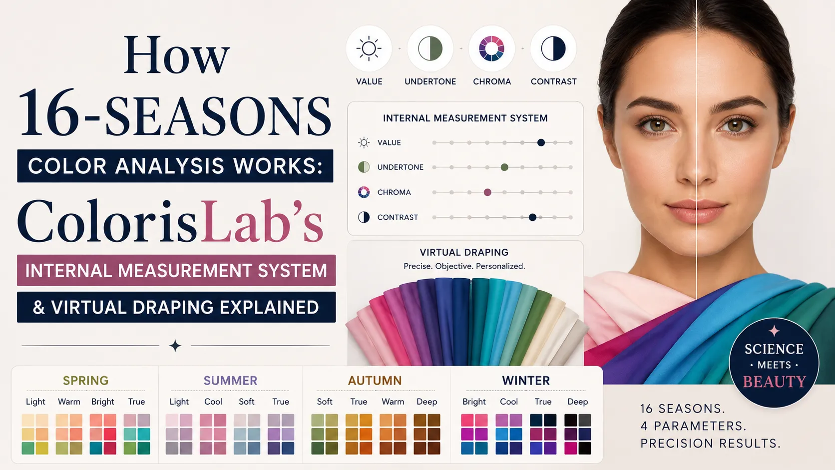
At Colorislab, we use two independent methods on every classification. The first is an internal parameter measurement system that quantifies your coloring across four precise dimensions. The second is virtual draping, where specific palette colors are placed around your face and the skin's response is observed directly. When both methods point to the same season, we are confident in the result. When they diverge, we investigate further rather than defaulting to either answer.
This guide explains how both methods work, what each one measures, and how they interact with the 16-season system we use. It also breaks down every palette in detail so you understand exactly what separates each season from its neighbors.
🔍
Why One Method Is Not Enough
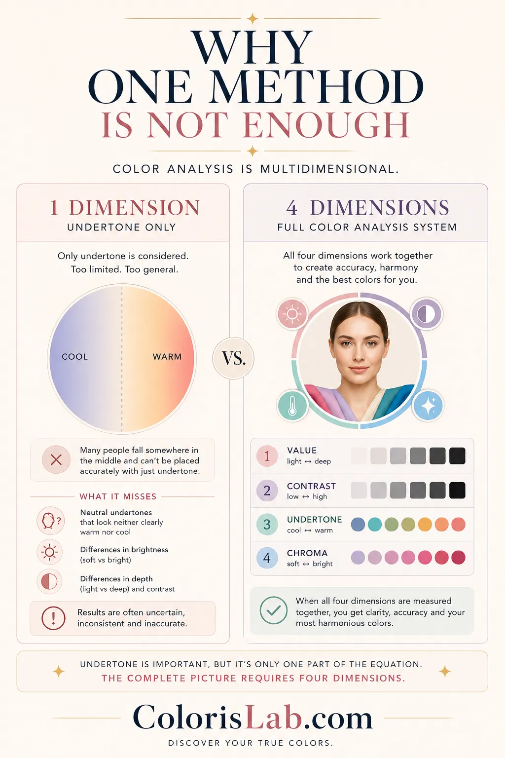
The four seasons system works reasonably well with a single undertone assessment. You determine warm or cool, and you have narrowed the field to two families. But the 16-season system requires four dimensions to be measured, not one. And several of those dimensions, particularly chroma and the neutral undertone ranges, are genuinely difficult to read visually.
Consider the neutral undertones. Someone with a neutral-warm undertone does not look clearly warm the way a True Autumn does. They may appear quite balanced at a glance. The vein test may come back ambiguous. The jewelry test may show both gold and silver looking reasonably good. Single-method analysis stops here and often defaults to the nearest obvious anchor, which is frequently wrong.
What single-method analysis misses
⚖️
Neutral undertones
Neither clearly warm nor cool. Up to 40% of people sit in neutral range.
✨
Chroma level
Bright vs soft is invisible to undertone-only analysis.
🌓
Value and contrast
Sister seasons share undertone but differ in depth and contrast tolerance.
Most tools rely on only one or two of these dimensions. That is why conflicting results are so common.
The dual-testing approach solves this by creating two independent data points. The parameter measurement system establishes what the coloring should respond to based on quantified characteristics. The draping confirms whether it actually does. Disagreement between the two is informative rather than disqualifying — it tells us where to look more carefully.
📐
Method One: The Internal Measurement System
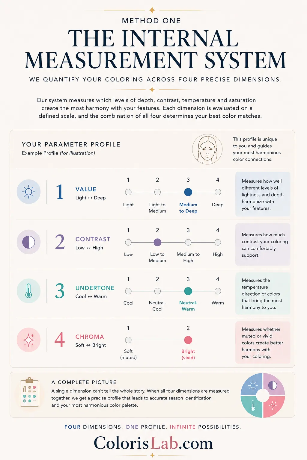
Our internal system evaluates how different color properties interact with the person’s features. Instead of assigning traits directly to the person, the system measures which levels of depth, contrast, temperature, and saturation create the most harmony when tested against the face. Each dimension is assessed on a defined scale, and the combination of all four determines which palettes and seasons are most compatible.
Regardless of which seasonal color system is used, every professional draping palette is ultimately built around these same core parameters. The difference is that we developed a system designed to measure them directly by testing how colors themselves respond against the person’s features, rather than relying only on subjective visual interpretation.
🌓
Dimension 1 — Value
4-point scale
Measures how well different levels of lightness and depth harmonize with the face. The system tests whether lighter or deeper colors create more balance, clarity, and visual harmony when applied around the features.
Light
Light to medium
Medium to deep
Deep
⚡
Dimension 2 — Contrast
4-point scale
Measures how much contrast the coloring can comfortably support. The system evaluates how different levels of separation between colors interact with the face, from soft low-contrast combinations to strong high-contrast palettes.
Low
Low to medium
Medium to high
High
🌡️
Dimension 3 — Undertone
4-point scale
Measures the temperature direction of colors that harmonize best with the coloring. Instead of reducing people into a simple warm/cool binary, the system evaluates how cool, neutral-cool, neutral-warm, or warm color temperatures interact with the face.
Cool
Neutral-cool
Neutral-warm
Warm
✨
Dimension 4 — Chroma
2-point scale
Measures whether muted or vivid colors create better harmony. Two people may tolerate similar depth and undertone ranges while reacting completely differently to saturation, which is why chroma is essential for separating soft and bright seasons.
Soft (muted)
Bright (vivid)
Together, these four dimensions produce a parameter profile that points to a specific season or a very narrow set of candidates. The measurement is not intended to label the person themselves, but to identify which combinations of color depth, contrast, temperature, and saturation create the strongest visual harmony when tested against their features.
🎨
Method Two: Classical Draping
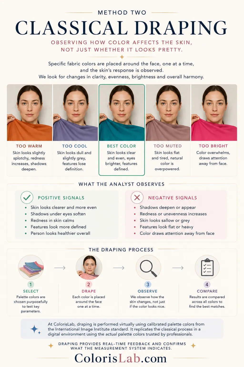
Classical draping is the method that professional color analysts have used for decades. It involves placing specific fabric colors around the face, one at a time, and observing how the skin responds to each. The observation is not about whether the color looks pretty. It is about what happens to the skin itself.
What the analyst observes during draping
Positive signals
- Skin looks clearer and more even
- Shadows under eyes soften
- Redness in skin calms
- Features look more defined
- Person looks healthier overall
Negative signals
- Shadows deepen or appear
- Redness or unevenness increases
- Skin looks sallow or grey
- Features look flat or heavy
- Color draws attention away from face
At Colorislab, draping is performed virtually using calibrated palette colors placed around the face in the analysis interface. The colors used are derived from the International Image Institute standard, the same palette system trusted by professional stylists and color analysts for decades. Our virtual draping replicates the classical process in a digital environment, using the actual hex values from each season's official draping palette.
The specific colors used in draping are not arbitrary. Each palette contains shades selected precisely because they test the relevant parameters. A Soft Summer draping palette uses cool muted tones that test whether the neutral-cool undertone and soft chroma produce the expected positive skin response. A Deep Autumn draping palette uses warm earthy depths that test the neutral-warm undertone and soft chroma at medium to high value. Matching the right test colors to the right hypotheses is what makes draping a meaningful confirmation rather than just another visual impression.
🧭
The 16-Season System: How It Expands the 12-Season System
The 12-season system uses three dimensions: undertone, value, and chroma. The 16-season system adds a fourth distinction within each family by separating the True seasons from the neighboring border seasons more precisely, and by introducing the True season as an explicitly named category within each family. In the 12-season system, the quintessential season within each family is implied. In the 16-season system, it is named and defined independently.
The result is sixteen palettes that map every possible combination of the four dimensions across the four families. Each palette has a specific value range, contrast tolerance, undertone direction, and chroma level. No two palettes share all four parameters. And every palette has one or two sister seasons that it is most commonly confused with, because they share three of the four parameters and differ only in one.
Sister seasons are the pairs most often confused in analysis. They share three parameters and differ in one. Understanding which parameter separates each pair is the fastest way to navigate the system accurately.
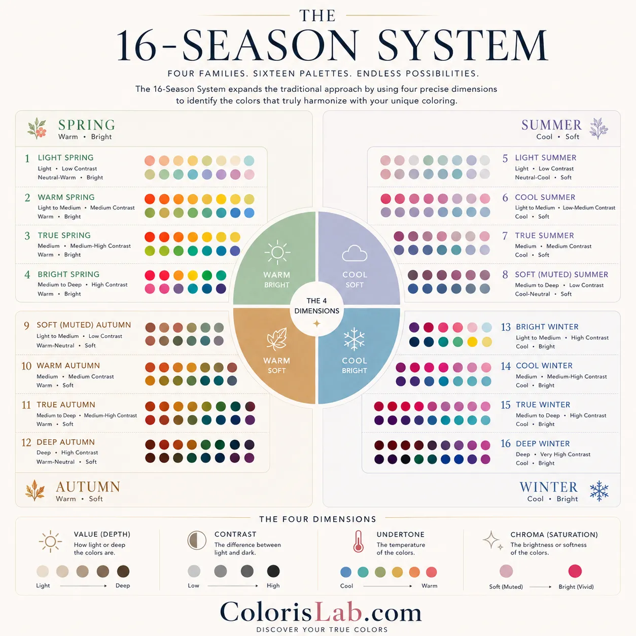
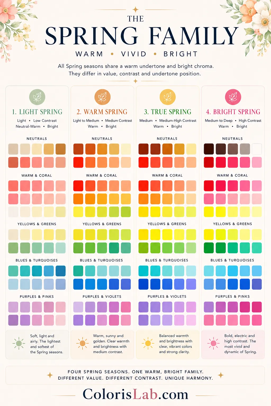
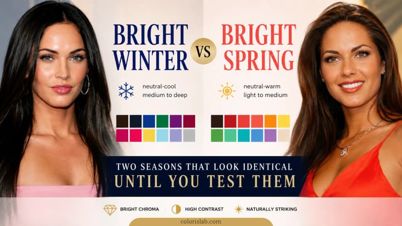
All four Spring seasons share a warm undertone direction and a bright chroma level. Every Spring palette contains clear, vivid colors that carry warmth. Muted, greyed, or strongly cool colors consistently produce negative skin responses across the entire family. What separates the four Spring seasons is value and contrast, and for one of them, the position of the neutral undertone.
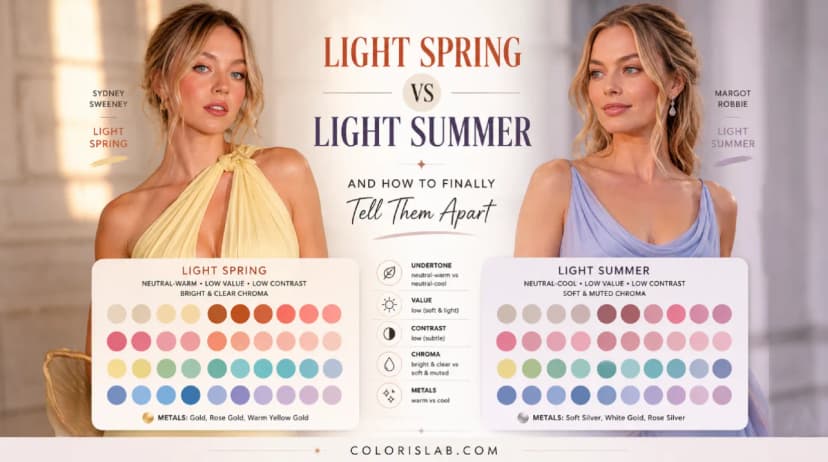
Sister season: Light Summer
The lightest and softest of the Spring seasons. Sits at the border with Summer. Warmth is present but gentle. Very saturated or deep colors overwhelm immediately. Both value and contrast are the lowest within the Spring family, keeping the palette in delicate, clear warm pastels.
Sister season: True Spring
The quintessential Spring. Warmth is unmistakable in every feature. Gold is clearly the better metal. No ambiguity in undertone direction. The palette is the fullest expression of warm clear colors in the Spring family.
Sister season: Warm Spring
Warm and vivid with slightly more range in value and contrast than Warm Spring. Handles the full warm bright palette with a little more depth tolerance. Closest to Warm Spring but with a broader color tolerance.
Sister season: Bright Winter
Sits at the border with Winter. Contrast is the highest in the Spring family. Handles vivid, saturated warm colors with striking definition. The neutral-warm undertone means some cool-leaning shades can work, unlike other Springs. The sister to Bright Winter.
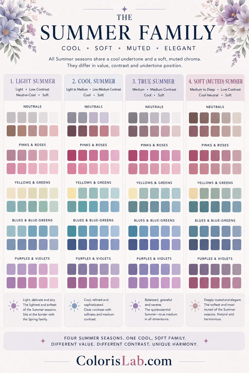
All four Summer seasons share a cool undertone direction and a soft chroma level. Every Summer palette contains muted, gentle colors with a cool base. Warm, vivid, or yellow-based colors consistently produce negative skin responses across the entire family. What separates the four Summer seasons is value, contrast, and for two of them, whether the undertone is fully cool or neutral-cool.
Sister season: Light Spring
The lightest of all sixteen seasons. Sits at the border with Spring. Coloring is airy, delicate, and ethereal. The neutral-cool undertone means it is not as strongly cool as True Summer. The distinction from Light Spring is not warmth versus coolness at a glance — it is how warm tones land on the skin during draping.
Sister season: True Summer
Sits at the border with Winter. The coolness is unmistakable, making it the most clearly cool Summer. The palette is soft overall but carries slightly more icy influence and definition than True Summer. Slightly icier colors work where they would not on other Summers.
Sister season: Cool Summer
The pure center of the Summer family. Soft, cool, and balanced without borrowing from any neighboring season. The palette is the most watercolor-like of all Summer seasons — gentle, blended, and refined. No influence from Winter or Spring.
Sister season: Soft Autumn
Sits at the border with Autumn. The most muted of all Summer seasons. Everything blends and harmonizes. The neutral-cool undertone means it sits closer to Soft Autumn than any other Summer. The distinction is entirely in which muted tones land well — cool dusty shades work, warm earthy tones do not.
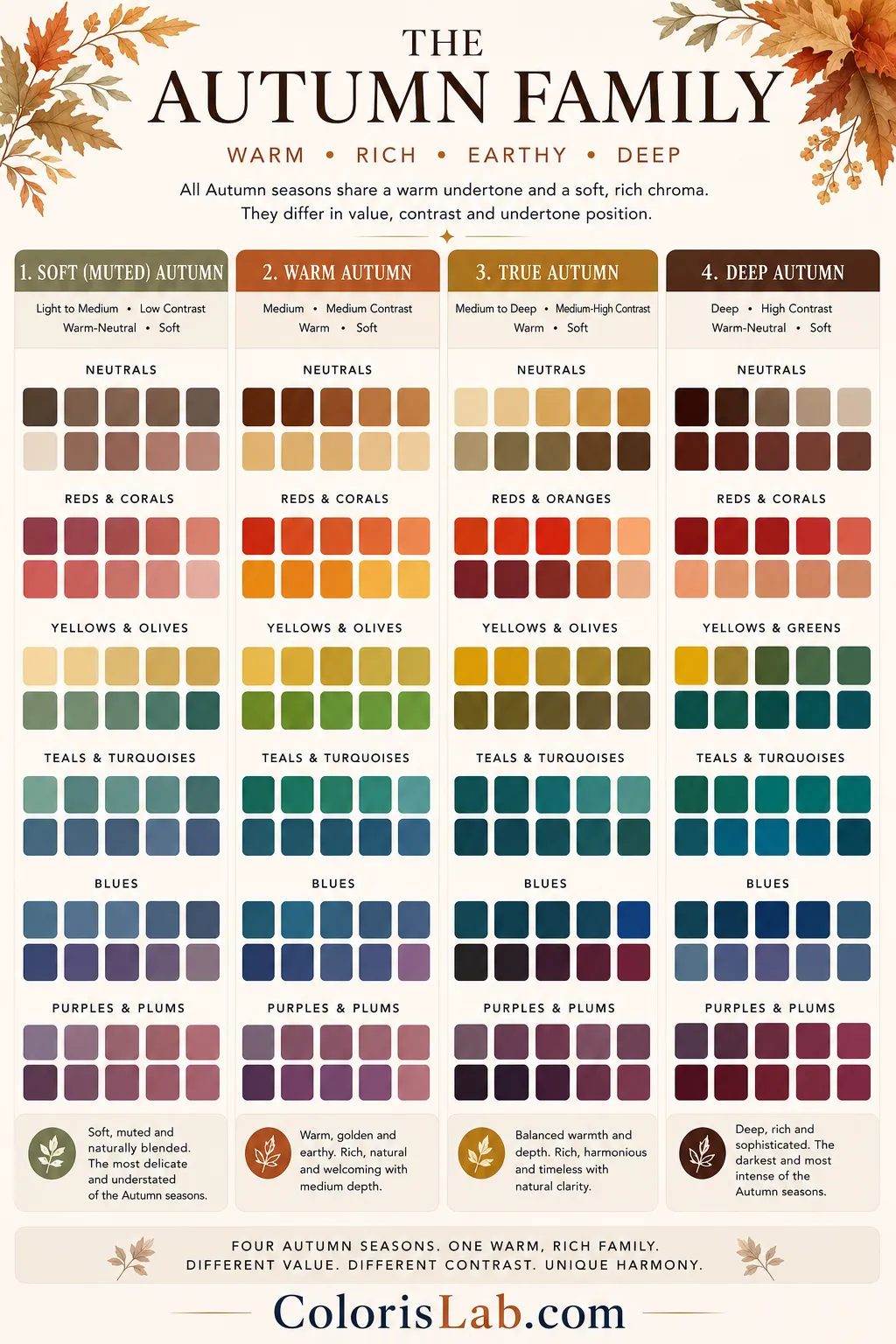
All four Autumn seasons share a warm undertone direction and a soft chroma level. Every Autumn palette contains muted, earthy colors that carry warmth. Cool, grey-based, or highly saturated colors consistently produce negative responses across the family. What separates the four Autumn seasons is value, contrast, and for two of them, whether the undertone is fully warm or neutral-warm.
Sister season: Soft Summer
Sits at the border with Summer. The neutral-warm undertone means it is the most accessible Autumn. Everything is muted and earthy but not as richly warm as True Autumn. Confused with Soft Summer because both are muted — the test is entirely in warm versus cool muted tones.
Sister season: Warm Autumn
The pure center of the Autumn family. Rich, warm, and earthy without borrowing from neighbors. The palette is the most complete expression of warm muted color — terracotta, mustard, olive, rust, chocolate. Gold jewelry is the obvious choice. Cool shades are immediately wrong.
Sister season: True Autumn
The highest contrast within the Autumn family. Richly warm with strong feature separation. The palette pushes into deeper, more saturated warm territory compared to True Autumn. Copper and amber are natural territory. Cool colors are immediately wrong.
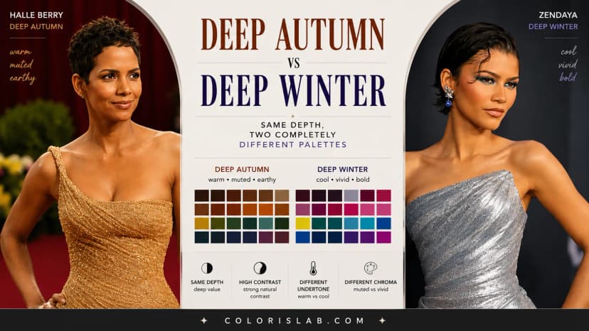
Sister season: Deep Winter
Sits at the border with Winter. The deepest Autumn. Deep value and high contrast with warm muted colors. Confused with Deep Winter because of shared depth and contrast — the distinction is entirely in chroma and undertone direction.
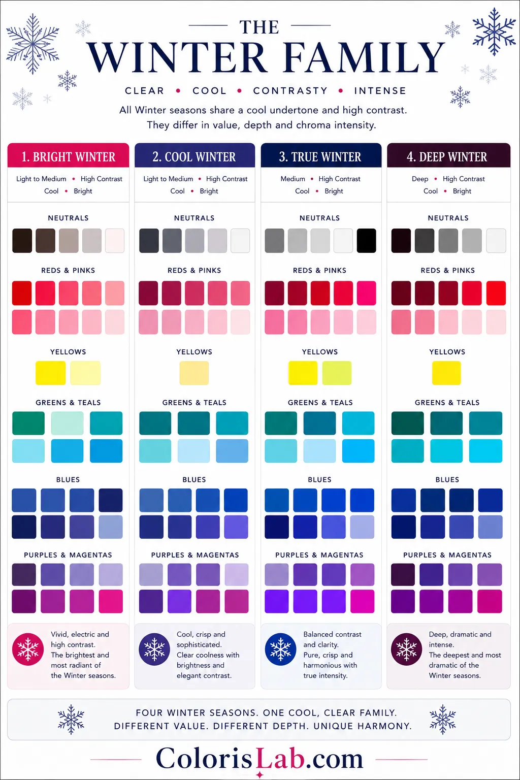
All four Winter seasons share a cool undertone direction and a bright chroma level. Every Winter palette contains vivid, clear colors with a cool base. Warm, earthy, or muted colors consistently produce negative responses across the family. What separates the four Winter seasons is value and contrast, and for two of them, whether the undertone is fully cool or neutral-cool.
Sister season: Bright Spring
Sits at the border with Spring. Clarity is the defining quality, with sharp, vivid colors and strong feature definition. The neutral-cool undertone means it is not as strictly cool as True Winter. The sister to Bright Spring — separated by value and undertone direction, not by chroma or contrast.
Sister season: Cool Winter
The pure center of the Winter family. Cool, vivid, and striking without borrowing from neighbors. True black, pure white, and fully saturated jewel tones. Silver is the obvious metal and gold reads as visibly wrong. The palette is the most complete expression of cool bright color.
Sister season: True Winter
The highest contrast Winter. Fully cool and fully saturated with the sharpest feature separation in the family. The palette is the strictest in terms of undertone — warm tones read as immediately wrong more than in any other Winter. Icy tones and cool jewels are natural territory.
Sister season: Deep Autumn
Sits at the border with Autumn. The deepest Winter. Deep value and high contrast with vivid cool colors. Confused with Deep Autumn because of shared depth and contrast — the distinction is in chroma and undertone, the same parameters that always separate sister seasons across the Autumn-Winter border.
🔄
The Sister Season Pattern
Every season has one sister season — the season it is most commonly confused with. In every case, sister seasons share three of four parameters and differ in exactly one. Understanding that one parameter is what makes the distinction visible.
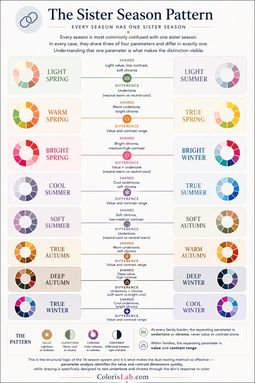
Every sister season pair and the parameter that separates them
| Sister Pair |
Shared |
Separating parameter |
| Light Spring / Light Summer |
Light value, low contrast, soft chroma |
Undertone (neutral-warm vs neutral-cool) |
| Warm Spring / True Spring |
Warm undertone, bright chroma |
Value and contrast range |
| Bright Spring / Bright Winter |
Bright chroma, medium-high contrast |
Value + undertone (neutral-warm vs neutral-cool) |
| Cool Summer / True Summer |
Cool undertone, soft chroma |
Value and contrast range |
| Soft Summer / Soft Autumn |
Soft chroma, low-medium contrast |
Undertone (neutral-cool vs neutral-warm) |
| True Autumn / Warm Autumn |
Warm undertone, soft chroma |
Value and contrast range |
| Deep Autumn / Deep Winter |
Deep value, high contrast |
Undertone + chroma (soft warm vs bright cool) |
| True Winter / Cool Winter |
Cool undertone, bright chroma |
Value and contrast range |
Notice the pattern. At every family border, the separating parameter is undertone or chroma, never value or contrast alone. Within families, the separating parameter is value and contrast range. This is the structural logic of the 16-season system and it is what makes the dual-testing method so effective — parameter analysis identifies the value and contrast dimensions quickly, while draping is specifically designed to test undertone and chroma through the skin's response to color.
🤖
Ready to find your season?
Our free AI tool runs the first pass of the dual-testing method on your photo. It measures undertone direction and chroma level to narrow down your season before you go further.
Try the Free AI Tool →
❓
Frequently Asked Questions
What is the difference between the 12-season and 16-season system?
+
The 12-season system uses three dimensions — undertone, value, and chroma, to produce twelve distinct palettes. The 16-season system adds a fourth distinction by naming the True season within each family as its own category, rather than leaving it implied. The result is four additional palettes that more precisely describe the centre of each family, and a system where every possible combination of all four parameters has a named outcome.
Why do different color analysis tools give me conflicting results?
+
Most tools measure only one or two of the four parameters, usually undertone alone. In the 16-season system, four dimensions need to be assessed: value, contrast, undertone, and chroma. If a tool skips chroma or reads your neutral undertone as a hard warm or cool, it will point to the wrong season. Conflicting results almost always indicate that you sit in a neutral undertone range, or that chroma was not evaluated at all.
What is a sister season and why does it matter?
+
A sister season is the one season you are most likely to be confused with. Every season shares three of four parameters with its sister and differs in exactly one. Knowing your sister season tells you which single parameter is hardest to read in your coloring, and which test, draping, jewelry, or parameter measurement is most likely to resolve the question.Your sister season is also the palette family you can borrow from most successfully. Because the two seasons are structurally so close, some colors from the sister palette may still harmonize well even if they are not your absolute best colors.
Can I have a neutral undertone and still get a clear seasonal result?
+
Yes. The 16-season system explicitly includes neutral-warm and neutral-cool as named undertone categories, not edge cases. Seasons like Light Spring, Light Summer, Soft Summer, Soft Autumn, Bright Spring, Bright Winter, Deep Autumn, and Deep Winter all sit on neutral undertone ranges. A neutral undertone does not make classification impossible, it means the other three parameters (value, contrast, and chroma) carry more of the diagnostic weight.
What is the difference between chroma and contrast?
+
Chroma refers to saturation — how vivid or muted a color is. Contrast refers to how much separation exists between colors used together. You can have high contrast with muted colors (dark olive and cream, for example), and you can have low contrast with vivid colors (two equally bright shades that are close in value). They are independent dimensions. Spring and Winter seasons share bright chroma; Summer and Autumn seasons share soft chroma. Contrast separates seasons within and across those groupings.
How accurate is virtual draping compared to in-person draping?
+
Virtual draping can be highly reliable when the system itself is built on accurate seasonal palettes and interpreted through a strong understanding of undertone, value, contrast, and chroma interaction. The key factor is not whether the draping is digital or physical, but whether the methodology correctly evaluates how different color parameters respond against the person’s features. In practice, the quality of the system and the skill of the analyst matter far more than the format itself. A poorly constructed in-person draping process can produce less accurate results than a well-calibrated virtual system, while a strong methodology can remain highly effective across both environments. Physical draping may still offer an advantage in extremely borderline cases where very subtle chroma or temperature shifts need to be evaluated under controlled lighting conditions.