Undertone in Color Analysis: Warm, Cool, or Neutral — And Why Most People Get It Wrong
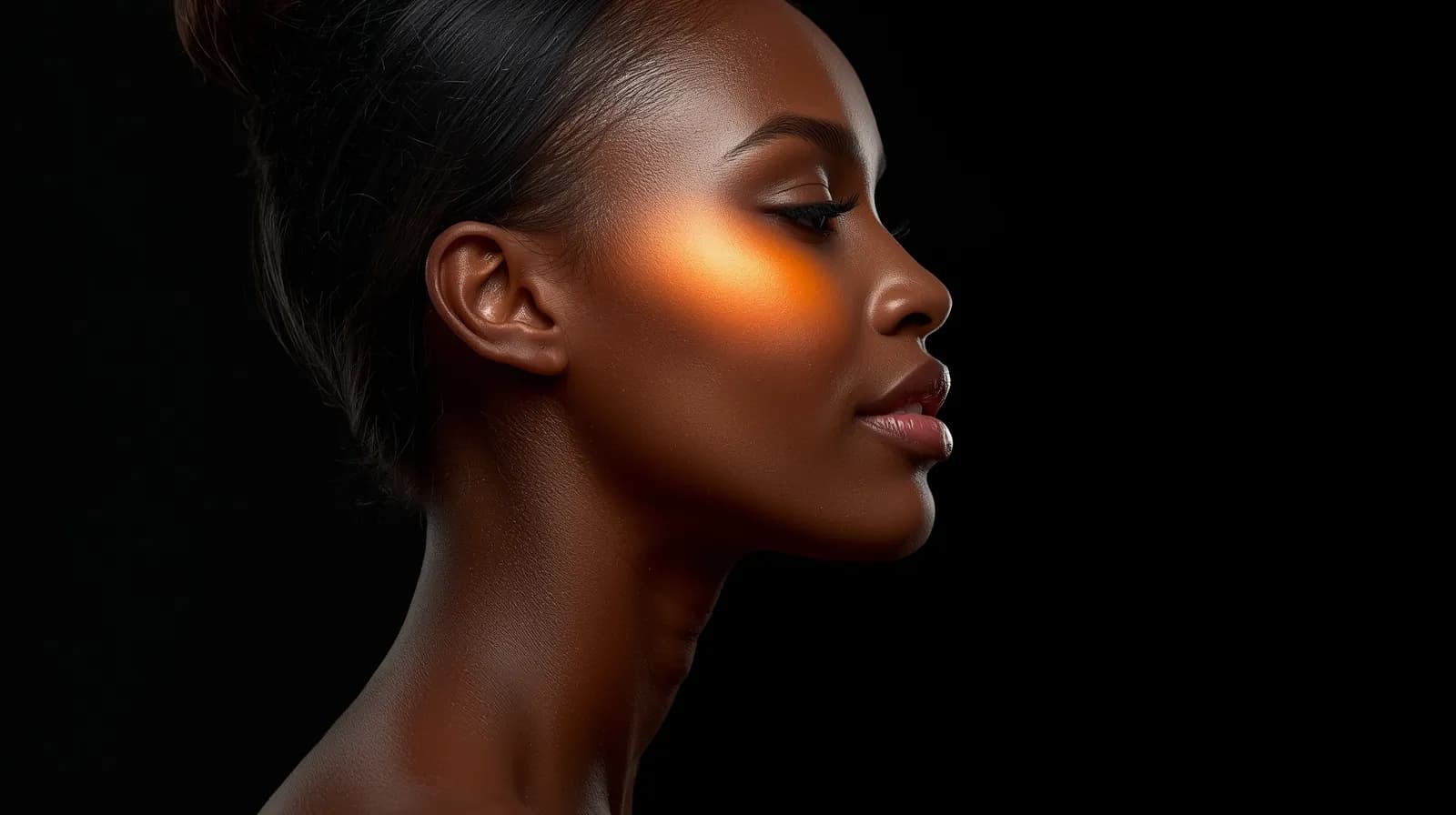
We all like to look good, receive compliments, and do our makeup in a way that highlights the best in us. Anyone who says they do not care about how they look, with all due respect, we believe is not being fully honest.
But this is a safe place to be honest with yourself, to openly accept your emotions and express the desire to look your best. One of the best ways to achieve that is by knowing your undertone.
We are a brand focused on color analysis, developing tools for color analysis, and educating people on how to look their best. However, if you want to learn just one thing and base your fashion and makeup choices on it, let it be undertone.
In color analysis, every person belongs to a specific subseason, but there are always colors that can be borrowed from neighboring subseasons. Building a wardrobe within your palette solves many problems, even if you decide never to wear makeup again or stop coloring your hair. But for many people, this can feel complex and require too much effort or restriction. Most people simply want to avoid looking bad, to prevent their under-eye circles from being emphasized by a favorite shirt, or their jawline being overshadowed by a new dress. In that case, understanding undertone is the best option. Even if you are not wearing your ideal colors, colors that match your undertone will still help you look good.
If there is one thing that decides whether a color truly flatters you, it is your undertone. Not your eye color. Not your hair color. Your undertone. It is the difference between a foundation shade that disappears into your skin and one that sits awkwardly on top of it. It is the difference between an outfit that makes people say you look radiant and one that simply gets complimented as a nice top.
Undertone is the subtle underlying hue beneath your skin that stays constant regardless of tan, season, or age. Everything in color analysis is built on it. Get this right, and the rest follows naturally.
Warm, Cool, or Neutral
There are three main undertone categories. Warm undertones carry yellow, golden, or peach hues. Cool undertones have pink, red, or blue hints. Neutral sits somewhere in between, a balanced mix of both. However, in practice, based on our experience with hundreds of clients, no one has a perfectly balanced tolerance for both warm and cool shades during draping. A completely neutral undertone does not truly exist. Every person leans, even slightly, toward one side of the spectrum, either warmer or cooler.
Warm
Yellow, golden, or peach hues
Cool
Pink, red, or blue hints
Neutral
A balance of both, or in reality a tolerance for both warm and cool colors up to a certain point
Examples from professional color analysis show that Soft Summer is technically neutral but leans cool, while Soft Autumn leans warm. Knowing which direction you lean allows for a precise result instead of a vague middle-ground answer.
Undertone vs. Overtone: The Distinction That Confuses Many People
Overtone, also called skin tone, is what you see in the mirror: fair, medium, deep, olive, reddish, peachy. It is the surface color of your skin, shaped by melanin, carotene, and the visibility of blood vessels beneath the surface. It can shift with sun exposure, skincare, hormones, and age. Undertone is what sits beneath it, the fixed warm or cool base that never changes.
Overtone
The surface colour you see in the mirror. Fair, medium, deep, olive, reddish, peachy. Changes with sun, hormones, medical conditions, and age.
Undertone
The fixed warm or cool base beneath the surface. Never changes. The foundation of every color season.
The two can point in completely opposite directions, and this is where confusion begins.
A classic example is olive skin. Most people assume olive means warm because the surface appears greenish or golden. But olive results from cooler blue-grey pigment interacting with yellow melanin beneath the skin, which is why many people with olive skin are actually cool-toned and belong to Winter or Summer seasons. The surface suggests warmth. The undertone tells a different story.
The reverse confusion is just as common and often more misleading. Many people with a warm undertone have a pink or reddish overtone. Their skin flushes easily, their cheeks appear rosy, and everything about their appearance suggests coolness. They assume they belong to Summer or Winter, try cool palettes, and something always feels slightly off. The colors are not necessarily unflattering, but they do not enhance their appearance either.
The Spring Paradox
A warm undertone combined with a pink or flushed surface is one of the most recognizable traits of many Spring complexions, yet it often leads to misclassification. Draping reveals that warm colors such as peachy corals, golden yellows, and warm ivories calm redness and create a balanced, clear complexion. Cool colors do the opposite. They emphasize redness and make the skin look reactive and uneven. The skin responds to what lies beneath the surface, not what is visible on top.
The same pattern appears in other seasons as well. Some Autumn types have a cooler surface tone that leads to being misclassified as Summer. Some True Winters have strong yellow pigment in their skin, making gold jewelry appear flattering even though their undertone is cool. Light Springs can appear soft enough to be mistaken for Light Summers. In every case, overtone redirects the analysis away from the correct result.
This is why vein tests and jewelry tests have clear limitations. Both rely on visual observation, and the eye naturally focuses on overtone, which is visible, rather than undertone, which is not. As a result, many people end up evaluating the wrong factor.
How to Find Your Undertone
The two most common starting methods are the vein test and the jewelry test.
The Vein Test
Look at the inside of your wrist in natural daylight. Blue or purple veins suggest cool undertones. Green suggests warm. If it is difficult to determine, neutral may be possible.
The Jewelry Test
Hold silver and gold near your face and observe which one makes your skin look clearer and more even. Silver typically flatters cool undertones, gold flatters warm undertones, and if both look equally good, you may lean neutral.
Draping
The most reliable method, including virtual draping. A trained analyst places colored fabrics around your face and observes how your skin reacts. Does it become clearer or duller? Do shadows soften or deepen? Does redness calm or intensify? Virtual draping replicates this process digitally. The color reveals the answer, not vein color or jewelry preference. By observing how the skin responds, draping bypasses overtone and identifies what lies beneath.
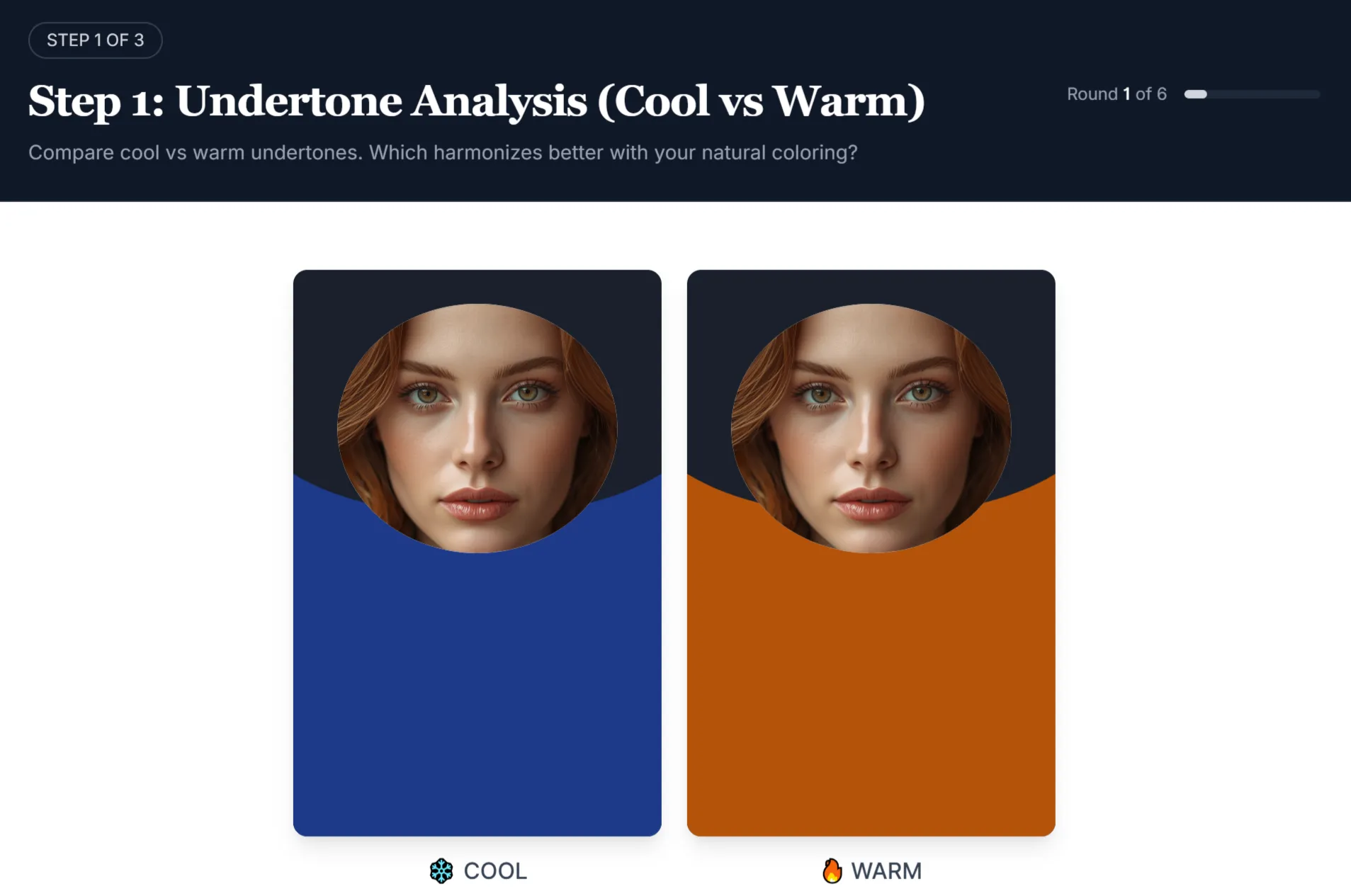
The vein and jewelry tests are useful starting points, but their limitations are significant. Neither test isolates undertone cleanly, and both are vulnerable to lighting conditions, screen calibration, and the subjective nature of self-assessment. If your results from these tests have ever felt inconclusive or slightly off, that is likely why.
Not sure about your undertone?
Our free AI tool analyzes your photo and identifies your undertone, contrast level, and most likely season in minutes. No quiz, no guesswork.
Try the Free AI Tool →Why Undertone Matters
Undertone explains why two people can wear the same color and look completely different. One appears radiant, the other looks tired. The color is the same. The undertone is not.
Even without knowing your full season, getting your undertone right does most of the work. Wearing colors that match your undertone makes your skin appear more even and your features more defined. Season adds precision, but undertone alone is already a significant improvement over guessing.
When it matches
- Skin looks clear and even
- Features appear more defined
- Colors feel natural and effortless
When it doesn't
- Skin appears grey, red, or uneven
- You look more tired than you are
- Makeup cannot fully correct it
Common Mistakes
Confusing skin depth with undertone
You can have deep skin and a cool undertone, or fair skin and a warm undertone. These are separate dimensions, and confusing them leads to incorrect conclusions.
Falling into the overtone trap
Seeing a pink or reddish surface and assuming cool. Seeing golden or olive skin and assuming warm. If your assigned season feels slightly off, this is the first thing to question.
Testing in artificial light or on screens
Color analysis depends on how light reflects on real skin. Camera processing and screen settings distort results.
Treating one test as final
Undertone identification is a process, not a one-time answer. If something feels wrong, it is worth reassessing.
See your undertone in action
Try warm and cool palettes on your own photo and observe how your skin reacts. The same principle used in professional analysis, accessible to everyone.
Open Virtual Draping Studio →What Comes Next
Undertone is the foundation, but it is only the first step. Once you know whether you are warm, cool, or neutral, the next step is understanding value and chroma: how light or deep your features are, and whether your coloring is soft or vivid. These three elements together determine your full color season, and your season defines the complete set of colors that truly work for you.
Want a definitive result?
A trained analyst evaluates your undertone and overall coloring in detail, considering factors that are easy to miss, and provides a result you can rely on long-term.
Learn about Professional Analysis →Frequently Asked Questions About Undertone
What is undertone in color analysis? ↓
What is the difference between undertone and overtone? ↓
What are the three undertone categories? ↓
Why does my skin look pink or red if I have a warm undertone? ↓
Is olive skin warm or cool? ↓
What is the most accurate way to find my undertone? ↓
Can your undertone change over time? ↓
What happens if I wear the wrong undertone? ↓
Do I need to know my full season to use my undertone? ↓
What is the most common undertone mistake people make? ↓
ColorisLab Team
Color Analysis ExpertsWe're a team of color analysis enthusiasts dedicated to helping people discover their best colors and build confidence through personalized color advice.