Clear/Bright Spring Overview
Value
Light to Medium
Contrast
Medium to High
Undertone
Neutral-warm
Chroma
Bright
Sister season
Clear Winter

Clear or Bright Spring sits at one of the most interesting positions in the entire 12-season system. It is technically a Spring, but it borrows something from Winter that the other two Spring sub-seasons do not have: a clarity and contrast that makes vivid, electric colors look completely natural. If you have always felt that warm tones are obviously right for you, but that the softer end of the Spring palette felt a little flat or washed out, this is the likely reason. Your coloring needs more intensity than Light Spring or even Warm Spring can offer.
The dominant characteristic of Clear Spring is brightness, not warmth. Warmth is the secondary characteristic. This is an important distinction because it shapes the entire palette. It means Clear Spring can reach into color territory that other Springs cannot touch: brighter blues, more vivid pinks, higher-contrast combinations. It also means that the muted, dusty, or gently warm colors that work beautifully on other warm seasons fall flat here.
Clear Spring is the Spring season most likely to be misidentified as a Winter. The two families overlap at this border, and the confusion is understandable. Read the full 12 seasons guide if you want to understand how border seasons work before going further.
Clear Spring
Spring family · Borders Winter
Metals
Gold, bright silver
Clear Spring is the only Spring sub-season that genuinely borders a Winter season. This matters because it means Clear Spring can borrow from Clear Winter in a way that Light Spring and Warm Spring cannot. Bright white, vivid jewel tones, and high-contrast combinations all sit comfortably in the Clear Spring palette precisely because of this Winter adjacency. It also means this season is frequently misidentified as a Winter, which is a confusion worth understanding in detail.
🌿
Clear Spring Coloring: What to Look For
The defining quality of Clear Spring coloring is clarity, a translucent, almost glowing quality that is immediately noticeable and that cannot easily be faked with clothing or makeup. Features are warm but also vivid. The contrast between features is medium to high, which is higher than any other Spring sub-season. There is something luminous and alive about this coloring that draws the eye, and the eyes in particular are often the most striking feature.
🧴
Skin
Clear Spring skin has a neutral-warm undertone. The warmth is present but not as overtly golden as in Warm Spring. What stands out instead is the clarity: a translucent, luminous quality that makes the skin look as if it is lit from within. The range runs from fair to medium warm, and the skin tends to take on a healthy, clear glow in the sun rather than a deep or heavy tan. Freckles, when present, are warm and clear rather than muddy or ashy.
Fair luminous
Light golden beige
Warm honey tawny
Medium warm olive
💇
Hair
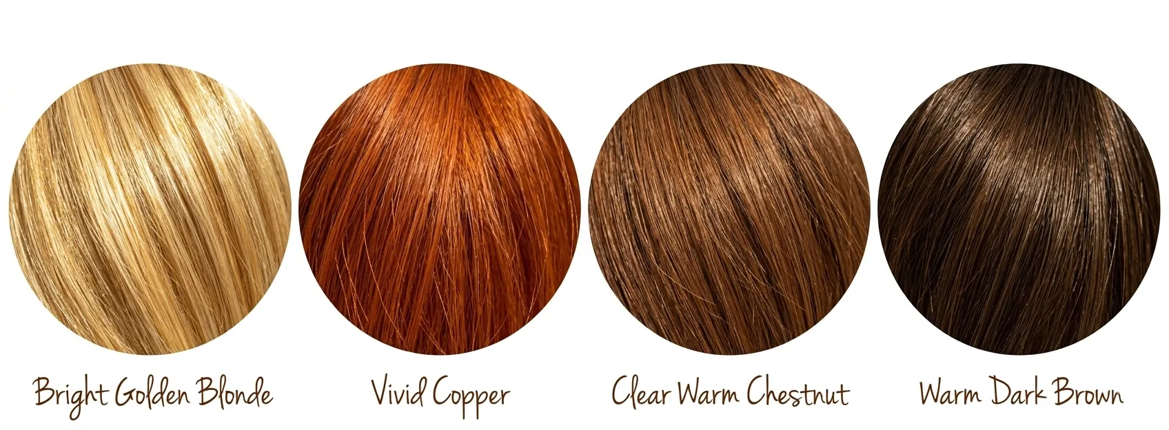
Clear Spring hair is warm and has a shiny, healthy quality that reflects light and looks alive. It is never mousy, ashy, or flat. Blondes are bright golden or champagne, never platinum or cool. Reds are vivid copper or bright auburn. Browns are clear warm brown or bright chestnut. Where dark hair appears, it carries warm brown or gold undertones, not the cool blue-black associated with Winter seasons.
Bright golden blonde
Vivid copper
Clear warm chestnut
Warm dark brown
👁️
Eyes
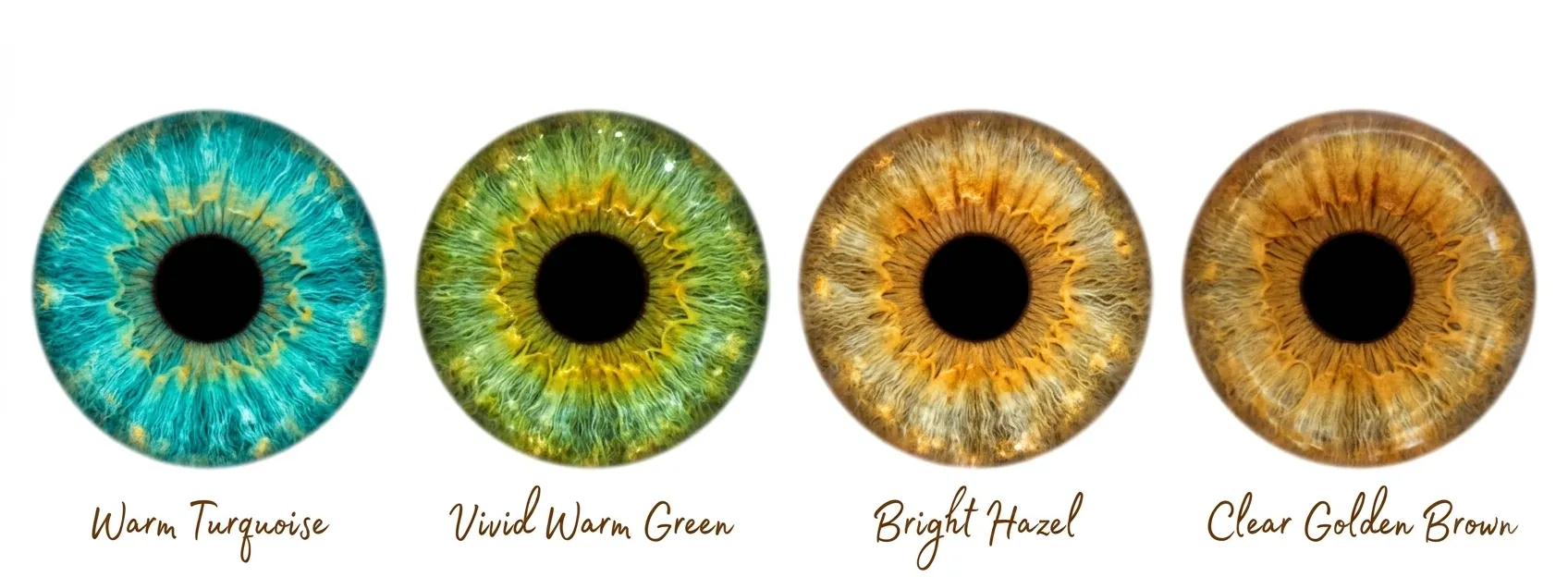
Clear Spring eyes are arguably the most striking feature of this season. They are bright, clear, and often seem to catch the light in a way that makes them appear to sparkle. There is a visible contrast between the iris and the white of the eye that does not appear in other Spring sub-seasons. Blues lean toward turquoise, aqua, or a warm electric blue. Greens are vivid and warm. Hazels have visible contrasts between gold, green, and brown. Even brown eyes carry a clear, warm topaz quality rather than reading as dark or flat.
Warm turquoise
Vivid warm green
Bright hazel
Clear golden brown
🎨
The Clear Spring Color Palette
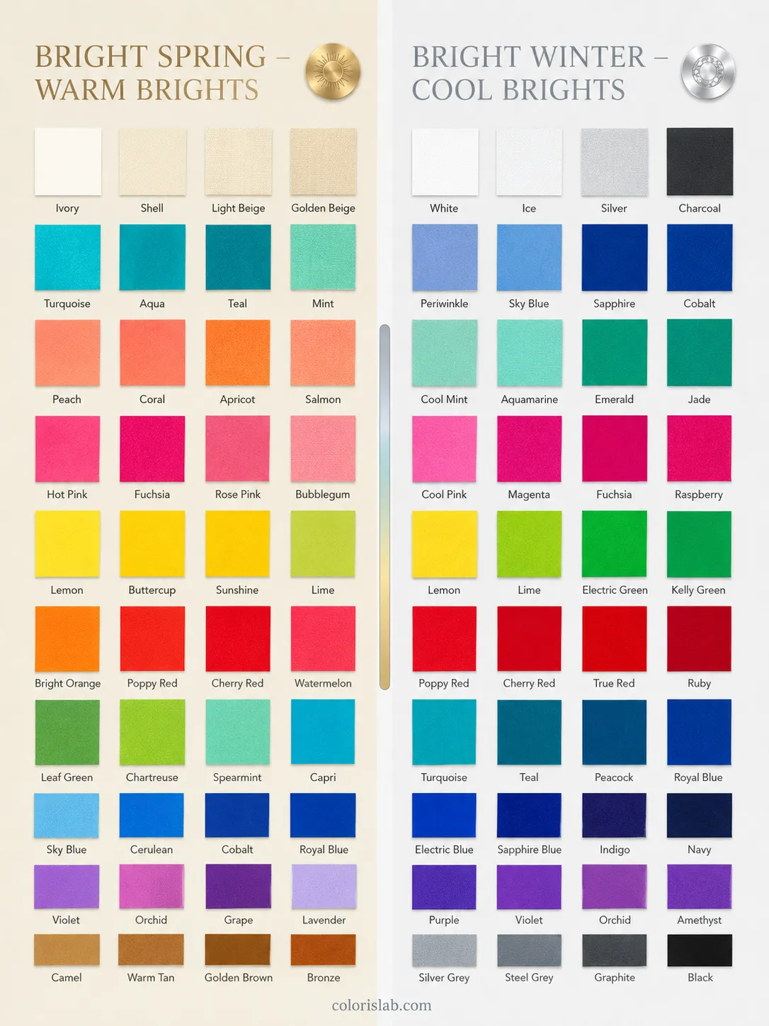
Clear Spring colors are warm, clear, and vivid. They sit at the highest chroma level of the three Spring sub-seasons. Think of a tropical reef in full sunlight: clear turquoise water, bright coral, vivid lime, electric blue sky. The palette borrows its intensity from the Winter adjacency and its warmth from the Spring base. This is the only Spring palette that can genuinely accommodate bright white, vivid jewel tones, and high-contrast combinations without overwhelming the coloring.
✓ Colors that work
Bright white
Warm turquoise
Bright coral
Vivid orange
Sunny golden yellow
Hot pink (warm)
Clear emerald green
Bright true red
Electric warm blue
Vivid lime
Cream
Warm bright navy
✗ Colors that don't work
Dusty muted tones
Soft pastels
Icy cool blues
Earthy rust and olive
Deep chocolate brown
Cool fuchsia
Smoky grey
Muted mauve
Greyed-down warm tones
Mustard
Burgundy
Ash brown
Colors fail on Clear Spring in two directions. Cool colors make the warmth in the skin look sallow. Muted or dusty colors drain the natural vibrancy and make the coloring look flat and tired. The palette needs to stay warm and vivid simultaneously. When in doubt, hold the color to your face in natural light: if the skin looks clear and alive and the eyes seem brighter, the color is right. If the face looks dulled or slightly greenish, the color is wrong.
Clear Spring is the one Spring sub-season where both gold and silver genuinely work, and where the choice matters less than the finish. The key requirement is that the metal looks polished and bright. Matte, antique, or oxidised finishes look dull against this coloring. Yellow gold is the warmest and most harmonious choice. Bright polished silver works in a way that it does not for the other Spring sub-seasons, because the Winter adjacency gives this coloring enough clarity to carry it. Rose gold and champagne gold sit in a comfortable middle ground.
Yellow gold
Rose gold
Bright polished silver
Champagne gold
Warm copper (polished)
Matte silver
Dark antique metals
Gunmetal
For gemstones, bright and clear reads best: citrine, peridot, bright aquamarine, turquoise, clear garnet, coral, and vivid topaz. The finish matters here too. Faceted, sparkly stones suit this season far better than cabochon or matte-cut stones. Cool gems like sapphire and amethyst in their standard cool versions will look slightly off; warm versions of these stones work better.
💄
Makeup for Clear Spring
Clear Spring makeup should enhance the natural clarity and brightness rather than soften it. This is not a season that benefits from heavily blended, smoky, or muted approaches. The goal is skin that looks luminous and alive, with color that reads as fresh and vivid. Heavy matte coverage, cool-toned pigments, and anything with a grey or blue base all work against the natural quality of this coloring.
Look for neutral-warm or golden undertoned formulas with a luminous or radiant finish. Descriptors like warm, brightening, radiant, or golden are reliable guides. Avoid anything pink-based, cool, or heavy matte. A dewy or satin finish enhances the natural clarity of the skin far better than heavy coverage.
warm golden
radiant beige
luminous ivory
Bright coral, vivid peach, clear warm pink, and soft warm fuchsia. Unlike the other Spring sub-seasons, Clear Spring can carry more blush intensity without it looking overdone. Apply to the apples of the cheeks for a fresh, vivid flush. Avoid deep roses, muted mauves, or anything with a grey undertone.
bright coral
vivid peach
warm fuchsia
Champagne, bright gold, clear bronze, and warm taupe for everyday. Clear Spring can carry bolder eye looks than the other Springs: vivid turquoise, bright coral, clear warm green, or warm purple on the lid all look alive rather than overdone. Eyeliner in warm brown or even soft black works here. Jet black mascara is fine and can add to the natural contrast of the eyes.
bright gold
vivid turquoise
clear bronze
Bright coral, vivid warm pink, clear red, hot pink, and warm fuchsia. Glossy and satin finishes suit this season well, and Clear Spring can carry a bolder lip than the other Springs without it looking heavy. Avoid muted nudes, browns, cool blue-based reds, and anything with a grey or mauve undertone.
bright coral
clear red
hot pink
⚖️
Clear Spring vs. Neighboring Seasons
Clear Spring is most commonly confused with three seasons: Warm Spring, Clear Winter, and Light Spring. The Winter confusion is the most important to understand, because it is the most common and the most consequential for getting the palette right.
Warm undertone. The palette is vivid and clear, but all the bright colors have a warm base. Cool fuchsia looks slightly sallow. Warm turquoise and coral look completely natural. Gold feels more harmonious than silver.
Cool undertone. The palette is equally vivid, but the bright colors have a cool base. Warm turquoise can look slightly muddy. Cool fuchsia, royal blue, and icy jewel tones look completely natural. Silver feels more harmonious than gold.
The test: Hold a cool fuchsia next to your face. If it makes the skin look sallow or slightly grey, you are Clear Spring. If it makes the skin look bright and alive, you are Clear Winter. Then try a warm coral: if it glows, you are Clear Spring.
Brightness dominates. The palette reaches into electric territory. High-contrast combinations look alive. Vivid jewel tones in warm versions look natural. Softer, more golden tones can feel slightly flat.
Warmth dominates. The palette is medium in depth and temperature-driven. Electric or very high-contrast colors can feel slightly sharp or cold. The golden warmth of the palette is its defining quality.
The test: Try a vivid electric blue next to a warm golden turquoise. If the electric blue looks sharp or slightly cool, you lean Warm Spring. If it looks alive and energising, you are likely Clear Spring.
Vivid and high contrast. The coloring has an electric quality. Soft, delicate, or airy colors feel flat and underwhelming. The palette needs intensity to match the natural brightness of the features.
Delicate and low contrast. The coloring has a fresh, airy quality. Vivid or electric colors feel too intense and overwhelming. The palette needs to stay gentle to match the natural softness of the features.
The test: Try a vivid hot pink and a soft blush pink side by side. If the hot pink looks alive and the blush pink looks flat, you are Clear Spring. If the blush pink looks right and the hot pink is too much, you are Light Spring.
👗
Building a Clear Spring Wardrobe
A Clear Spring wardrobe is built differently from the other Spring sub-seasons. Bright white is a genuine neutral here, not a colour that overwhelms. High-contrast combinations are a strength, not something to be softened. The starting point is a neutral foundation that is clean and bright rather than warm and muted.
Bright white and cream are your primary neutrals. Clear grey works where other Springs would reach for warm taupe. Warm bright navy and camel round out the foundation. These give you a base that is clean and luminous rather than soft or warm-toned. A bright white shirt, cream trousers, and a clear navy blazer create combinations that look sharp and alive on this coloring.
Bright white
Cream
Warm bright navy
Camel
These are the colors that generate the strongest response. A vivid coral blouse, a warm turquoise coat, a hot pink dress. These pieces look immediately right in a way that cannot be achieved with softer versions of the same hues. The intensity is not too much for this coloring. It is exactly the right amount.
Bright coral
Warm turquoise
Hot pink
Clear emerald
Sunny yellow
Clear Spring has medium to high natural contrast, which means clothing combinations can carry more visual weight than the other Spring sub-seasons. Color blocking in vivid tones: coral with turquoise, hot pink with bright white, sunny yellow with warm navy, all look alive rather than loud. Graphic prints, bold florals, geometric patterns, and high-contrast motifs are all well-suited to this coloring. Soft watercolor prints, blurred patterns, and anything with a dusty or gentle quality will look underwhelming.
🤖
Still unsure if you're a Clear Spring?
The most common confusion is the border with Clear Winter. Both seasons are vivid and high-contrast. The difference is temperature. Our AI tool analyzes your photo for undertone and gives you a starting point before going further into either guide.
Try the Free AI Tool →
❓
Frequently Asked Questions
Is Clear Spring the same as Bright Spring?
↓
In the 12-season system, yes. Clear Spring and Bright Spring are two names for the same sub-season: the one where brightness is the dominant characteristic and warmth is secondary, sitting at the border between Spring and Winter. Some systems use Bright Spring to emphasize the high chroma quality of the season; others use Clear Spring to highlight the translucent, luminous quality of the coloring. The palette and coloring description are identical. In a 16-season system, the two names can refer to different things, as that system subdivides further and the position within the bright Spring range may shift.
Why is Clear Spring so often confused with Winter?
↓
Because the two seasons share the same dominant characteristic: brightness. Both Clear Spring and
Clear Winter need vivid, high-chroma colors to look their best. The difference is temperature. Clear Spring is warm; Clear Winter is cool. This distinction is easy to see in draping but harder to identify from features alone, because both seasons have high contrast and striking eyes. Holding warm versus cool bright colors side by side against the face is the most reliable test.
Can a Clear Spring wear black?
↓
Of all the Spring sub-seasons, Clear Spring is the one that can come closest to wearing black. The higher contrast of this season means that black does not create as jarring a disconnect as it does for
Light Spring or
Warm Spring. That said, warm dark brown, deep warm charcoal, or bright navy will always look more natural. Black remains a cooler choice and will always be slightly less harmonious than a warm dark alternative.
Is Clear Spring a warm or a cool season?
↓
Clear Spring is a warm season. Warmth is the secondary characteristic, and the
undertone is neutral-warm. This is what distinguishes it from Clear Winter, which is cool. The confusion arises because Clear Spring's dominant characteristic, brightness, is shared with several Winter seasons, and because the palette includes colors like bright white and high-contrast combinations that are more commonly associated with Winter. But the warmth of the undertone determines the temperature of the season, and on Clear Spring, it is definitively warm.
Can a Clear Spring borrow colors from Winter palettes?
↓
To a limited extent, yes. Because Clear Spring borders Clear Winter, it can occasionally wear the warmest colors from that palette without significant disharmony. Bright white, vivid warm jewel tones, and some high-contrast combinations cross over successfully. What does not cross over is anything cool-based: cool fuchsia, icy blue, cool emerald, or blue-based reds will all make the warm undertone look sallow. The rule of thumb is that anything borrowed from Winter needs to be the warmest version of that color.
What makes Clear Spring different from Warm Spring if both are warm?
↓
The difference is what the dominant characteristic does to the palette. In
Warm Spring, warmth is dominant and shapes everything: the colors need to be warm first and clear second. In Clear Spring, brightness is dominant: the colors need to be vivid first and warm second. This means Clear Spring can wear brighter, more intense, and more high-contrast colors than Warm Spring. It also means that some of the softer, more purely golden warm tones of Warm Spring will feel flat on Clear Spring coloring.