
Spring Color Analysis: The Complete Guide to Your Warm and Radiant Palette
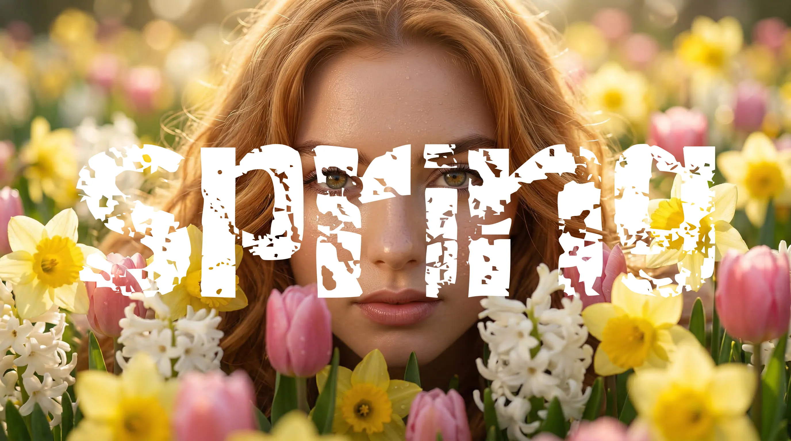
Spring is warm and light. Of the four seasons, it is the one that reads most clearly as golden, fresh and alive. If you are a Spring, your coloring has a particular clarity and warmth to it that responds immediately to the right colors and just as immediately to the wrong ones. This guide covers everything: your features, your palette, how to build a wardrobe, and how to approach makeup and jewelry from a Spring starting point.
If you are still working out whether Spring is your season, the guides on undertone, contrast and chroma will help you get there. The four seasons overview is also a good place to start if you want the broader picture before going deeper into Spring specifically.
Who is a Spring?
Spring is defined by two qualities above everything else: warmth and clarity. The undertone is warm, meaning the skin has a golden, peachy or yellow-based quality rather than a pink or blue one. The chroma is clear rather than muted, meaning the coloring reads as fresh and bright rather than soft and dusty. These two qualities together produce a look that is distinctly alive and golden.
Spring sits in the warm and light quadrant of the four season system. It shares warmth with Autumn but differs in depth and saturation. Where Autumn is rich, earthy and toned down, Spring is lighter and more vivid. The palette that works for one actively conflicts with the other, even though the underlying undertone direction is the same.
Undertone
Warm: golden, peachy or yellow-based
Value
Light to medium, never very deep
Chroma
Clear and bright, not muted or dusty
Spring Features: What to Look For
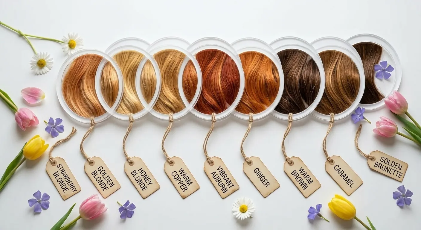
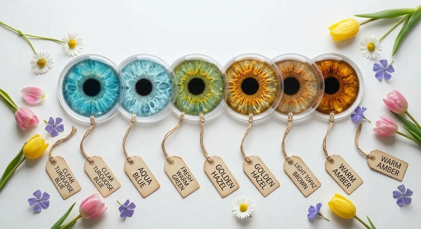
Not sure if you are a Spring?
Our free AI tool analyzes your photo and identifies your most likely season, undertone, contrast and chroma in minutes. No quiz, no guesswork.
Try the Free AI Tool →The Spring Palette
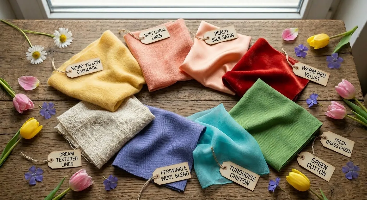
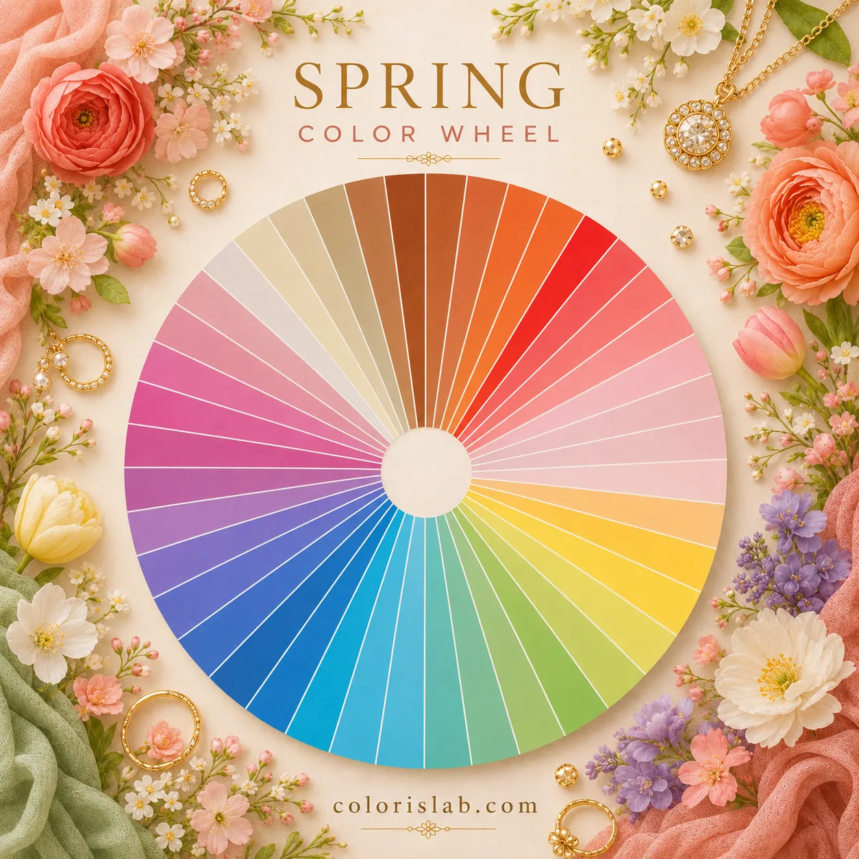
Spring colors are warm, clear and light to medium in depth. They have the same golden freshness that the coloring itself has. The palette draws from the same visual world as Spring coloring: clear yellows, warm corals, fresh greens, turquoise blues and warm creamy neutrals. Nothing is dusty, icy or muddy.
Spring Palette
Sunny yellow, coral, peach, apricot, warm orange, clear warm red, fresh grass green, lime, warm turquoise, aqua, periwinkle, cream, camel, warm off-white, light golden tan
Stark white, jet black, icy cool pastels, dusty muted tones, olive, rust, mustard, deep burgundy, cool blue-based pinks
The neutrals deserve particular attention because they are where most people spend the majority of their wardrobe budget. For Spring, the neutrals are cream rather than white, warm brown and camel rather than grey or black, and warm greige rather than cool taupe. Getting these right has more impact on how a wardrobe feels day to day than almost anything else.
Building a Spring Wardrobe
Spring coloring is light to medium in contrast. This means the most harmonious outfits are ones where the relationship between pieces mirrors that natural contrast level. Very stark combinations like bright white and jet black sit at a higher contrast than Spring coloring naturally has, which is why they can feel disconnected or overpowering. Pairing cream with chocolate brown, camel with turquoise, or peach with warm red produces a much more integrated result.
Floral prints are a particular strength for Spring, especially those that use the warm, clear colors of the palette. The combination of multiple Spring colors in a print creates the same harmony as wearing them separately. Polka dots and geometric patterns also work well as long as the colors are right.
- Cream top with warm brown trousers
- Coral blouse with camel jacket
- Turquoise top with warm white linen
- Peach dress with golden accessories
- Warm red with fresh green accent
- Stark white with jet black
- Cool grey with icy blue
- Dusty mauve with charcoal
- Olive green with cool navy
- Deep burgundy with black
For fabrics, the best choices for Spring are those with a natural lightness and life: linen, cotton, silk, chambray and lightweight wools. The goal is clothing that feels fresh and un-fussy, which mirrors the quality of the coloring itself.
Jewelry for Spring
Jewelry is one of the fastest ways to see whether your coloring is warm or cool. Hold a piece of yellow gold against your face in natural light, then hold a piece of silver. For Spring, the gold integrates with the skin and looks natural. The silver creates a visible separation, sitting on the skin rather than merging with it.
Best metals
Yellow gold, rose gold and bronze all work beautifully. They harmonize with the golden undertone and give the skin a radiant, healthy glow.
Metals to avoid
Cool silver and platinum sit separately against warm skin rather than integrating with it. They tend to make Spring coloring look slightly dull by comparison.
For gemstones, the best choices are warm and bright: citrine, peridot, aquamarine, coral and turquoise. These have the same warm clarity that Spring coloring does and sit naturally against the skin.
Spring Makeup
Spring makeup should enhance the natural freshness of the coloring, not work against it. The goal is a healthy, glowing result rather than a heavy or dramatic one. Every product choice follows the same principle as the wardrobe: warm, clear and light to medium in intensity.
Foundation
Look for foundations with a warm, golden or peachy undertone. Shade descriptors like warm, golden or beige are reliable indicators. Avoid foundations with a pink or neutral grey base, which will sit on top of the skin rather than integrating with it.
Blush
Peach, apricot, coral and soft warm pink all work well. Applied to the apples of the cheeks they create a healthy, youthful flush that reads as natural rather than painted on.
Eyeshadow
Warm neutrals are the everyday base: champagne, peach, light bronze, warm brown and soft gold. For more color, turquoise or jade green on the lower lash line picks up the warmth and brightness of Spring eyes particularly well.
Lips
Coral, peach, warm pink, clear red with an orange base and soft melon are all strong choices. A glossy finish enhances the natural brightness of Spring coloring. Deep berry, plum, beige-nude and cool blue-based pinks all work against the undertone.
Common Spring Misconceptions
All Springs are blonde
Spring coloring includes redheads and warm brunettes. The defining quality is warmth, not lightness. A Spring with dark warm brown hair and golden hazel eyes is just as much a Spring as a strawberry blonde.
Springs can only wear bright colors
The palette includes a full range of warm neutrals: cream, camel, warm brown and warm greige. These are everyday essentials and just as much Spring colors as coral and turquoise.
A flushed complexion means cool undertone
Surface redness is an overtone, not an undertone. Many Spring types have visible pink or reddish flush on the surface while their true undertone is warm. Wearing warm colors calms the redness. Wearing cool colors intensifies it.
Spring and Autumn are interchangeable because both are warm
Both seasons share a warm undertone but differ significantly in value and chroma. Autumn is deeper and more muted. Spring is lighter and clearer. Mustard works for Autumn but overwhelms Spring. Bright coral works for Spring but reads as too light and vivid for Autumn.
See your Spring palette in action
Cycle through warm and bright palettes on your own photo and watch how your skin responds to each one. The same method a professional uses, free for everyone.
Open Virtual Draping Studio →Frequently Asked Questions About Spring
What makes someone a Spring in color analysis? ↓
Can a Spring wear black? ↓
What is the difference between Spring and Autumn? ↓
Can a Spring have dark hair? ↓
What are the Spring subtypes in the 12 season system? ↓
Why do warm colors help with redness in Spring types? ↓
The Spring Subtypes
In the 12 season system, Spring divides into three subtypes. All three are warm and clear, but they differ in which secondary quality shapes the palette most. If the Spring palette above feels broadly right but something is slightly off in one direction, one of the subtypes is likely a closer fit.
ColorisLab Team
Color Analysis ExpertsWe're a team of color analysis enthusiasts dedicated to helping people discover their best colors and build confidence through personalized color advice.