Chroma in Color Analysis: How to Tell If You Need Bright or Muted Colors
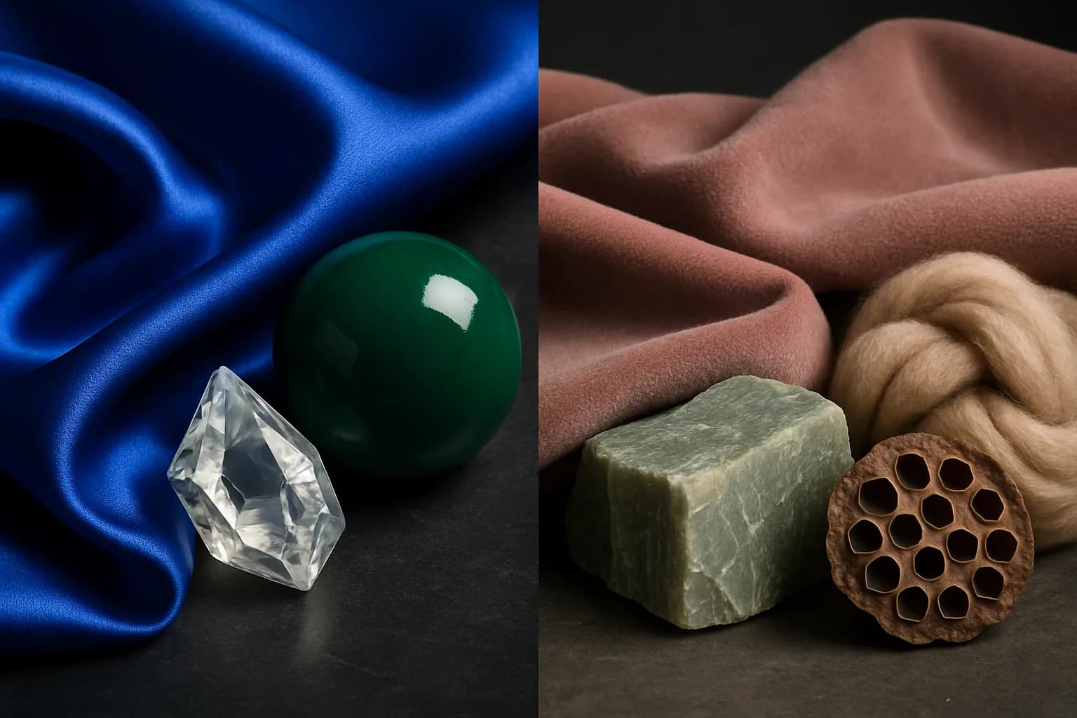
There is a specific frustration that many people hit partway through learning about color analysis. They know their undertone. They have read about their season. And yet something still feels slightly off. They try a color from their palette and it sits on them strangely, present but not quite right.
Most of the time, the missing piece is chroma.
Chroma is the dimension of color analysis that deals with intensity. Not whether a color is warm or cool, and not whether it is light or dark. Specifically how vivid, saturated, or pure it is. And your natural coloring has a chroma level of its own that determines whether clear, vibrant colors make you look radiant or muted, dusty tones suit you far better.
What Chroma Actually Means
Chroma covers two related but distinct concepts: saturation and clarity.
Saturation
The intensity of a color. A highly saturated color is pure, rich, and vibrant. A desaturated color has been toned down, like a brick red or a dusty rose.
Clarity
How clean or soft a color appears. Clear colors are bright and crisp. Soft colors appear to have a veil of grey over them, making them calm and muted.
In practice these two things tend to move together. Clear colors are usually also saturated. Soft colors are usually also muted. The result is two broad chroma categories: bright and clear on one end, soft and muted on the other.
Bright and Clear Coloring
Bright coloring has a luminosity to it. There is something crisp and defined about the features, a clarity that reads even before you start thinking analytically about undertone or season.
This often shows up as skin that looks fresh and translucent, eyes that are particularly vivid or sharply defined where the iris meets the white, and an overall impression that everything is in focus. The features have a sparkle that is not manufactured. It is simply there.
The Common Mistake
Wearing muted, greyed-down colors. The colors absorb into the complexion rather than working with it, and the result is a flatness that makes the person look more tired than they are. The coloring needs an equal level of clarity in the palette to come alive.
What works is staying with colors at their full intensity. Jewel tones, true primary colors, clean whites, and deep clear shades all perform well because they match the natural vividness of the features. The colors should feel crisp and un-muddied, because that is exactly what the coloring itself is.
Colors that work well
Soft and Muted Coloring
Soft coloring has a smokiness and a gentleness to it. The features harmonize rather than contrast. The hair, skin, and eyes carry a blend of tones rather than a single clear one, and the overall impression is one of subtle depth rather than sharpness.
This often shows up as skin with neutral or slightly ashy tones, eyes that carry multiple colors within them, hazel rather than clear green, grey-blue rather than bright blue, and hair that has natural dimension rather than a single definite shade. Nothing screams for attention. Everything works together softly.
The Common Mistake
Wearing highly saturated, vivid colors. The colors overpower the features rather than supporting them, and the result is that the outfit becomes the statement instead of the person. The coloring needs an equivalent level of softness in the palette to find its balance.
What works is colors that have been toned down with grey. Dusty lavender rather than violet, sage rather than bright green, soft teal rather than turquoise, warm taupe rather than beige. These colors carry the same underlying hues but at a level of intensity that harmonizes with soft coloring rather than overpowering it.
Colors that work well
Why This Is Often the Missing Piece
Chroma is frequently the thing that explains leftover confusion after someone has identified their undertone. A warm-toned person who finds that mustard yellow looks wrong on them is not necessarily in the wrong undertone family. They may simply need a softer, more toned-down version of that yellow, a curry or an ochre rather than a bright clear mustard. The warmth was right. The saturation was not.
This is also why color analysis produces specific seasonal palettes rather than simply warm or cool guidelines. Two people can share an undertone and differ significantly in chroma. A Soft Autumn and a True Autumn are both warm, but their palettes look quite different. The Soft Autumn needs lower saturation and more grey in the tones. The True Autumn can carry more richness and depth. Undertone points you in the right direction. Chroma tells you how far to go.
See your chroma in action
Cycle through bright and muted palettes on your own photo and watch which ones make your complexion come alive. The same method a professional uses, free for everyone.
Open Virtual Draping Studio →Frequently Asked Questions About Chroma
What is chroma in color analysis? ↓
What is the difference between saturation and clarity? ↓
How do I know if I have bright or soft coloring? ↓
Can someone be warm-toned and soft? ↓
What happens if I wear colors with the wrong chroma? ↓
Does chroma affect which neutrals I should wear? ↓
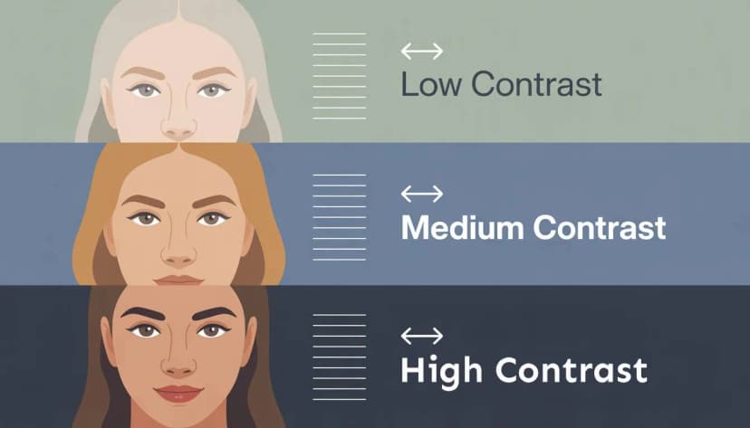
Is chroma the same thing as contrast? ↓
ColorisLab Team
Color Analysis ExpertsWe're a team of color analysis enthusiasts dedicated to helping people discover their best colors and build confidence through personalized color advice.