Warm Spring vs True Spring: What Is the Actual Difference?
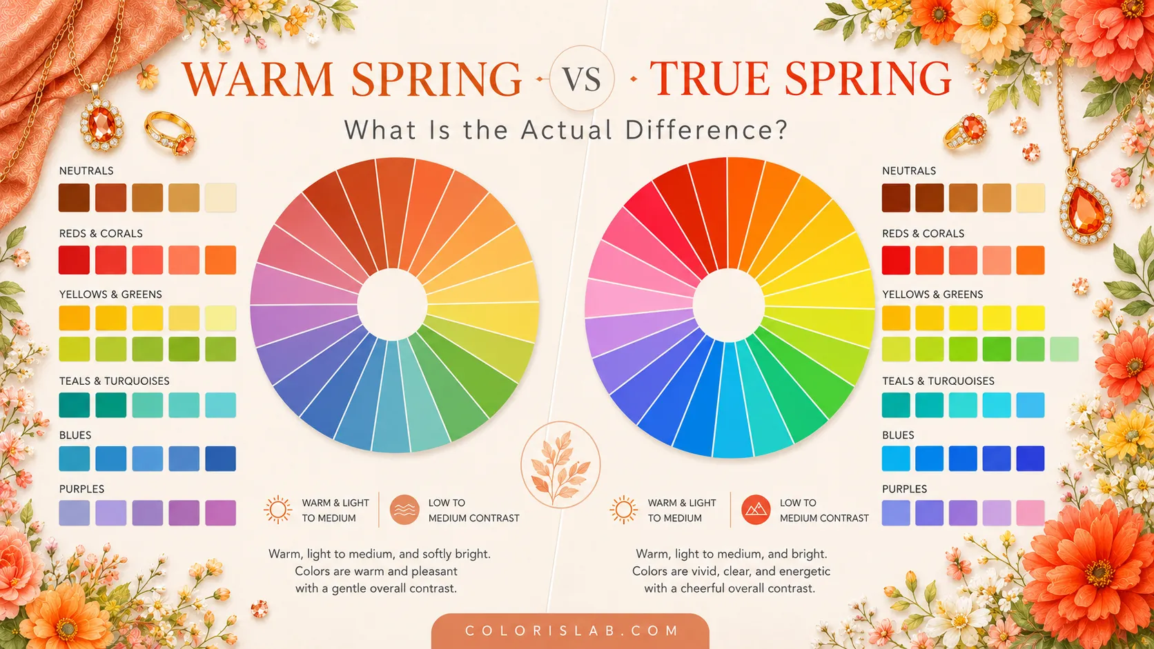
One of the most common points of confusion in color analysis is the difference between Warm Spring and True Spring. In many online spaces these names are used interchangeably, which leads to a lot of mistyping and frustration when palettes do not seem to work as expected.
In the 12-season system, Warm Spring and True Spring are often treated as the same season. In the 16-season system, however, they are separated into two distinct subseasons with different priorities, different palette behavior, and different relationships to warmth and brightness.
This article follows the 16-season approach. If you have ever felt stuck between these two categories, or if your results seem inconsistent across different analyses, this guide will help you understand what actually separates them.
The Core Difference
Both Warm Spring and True Spring belong to the Spring family. Both are fully warm-toned. Both are bright. Neither harmonizes with cool icy colors, dusty muted tones, or heavy earthy depth. But within the Spring spectrum, they sit at different points, and that positioning changes how they respond to color during draping.
Within the Spring family, the order runs: Light Spring → Warm Spring → True Spring → Bright Spring. Warm Spring sits closer to the lighter, softer end of the family, while True Spring moves toward greater contrast and more visual energy.
The easiest way to understand the distinction:
Warm Spring
Light in value, low to medium contrast. The warmest, most golden Spring, sits closest to Light Spring and carries a soft, radiant quality.
True Spring
Low to medium value, low to medium contrast. Moves toward greater depth and energy, sits closer to Bright Spring.
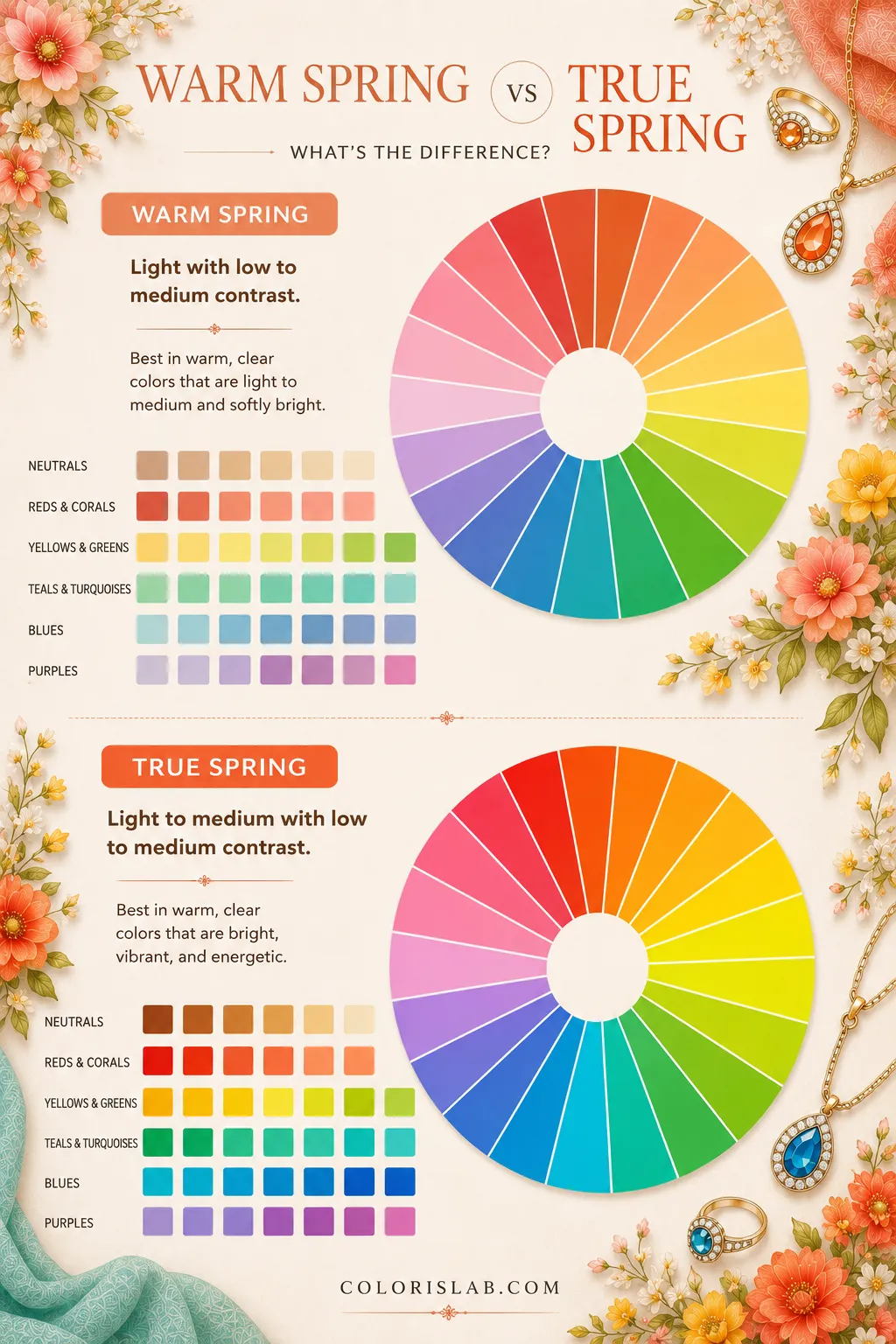
Many people assume these two seasons are nearly identical. In reality, they react differently the moment you begin testing value and contrast during draping.
Warm Spring feels golden, soft, and luminously radiant. True Spring feels warmer but fuller, more energy, slightly more depth, and a stronger presence overall. Both are Spring. But they create different kinds of Spring beauty.
Warm Spring: The Golden, Light Spring
Warm Spring is the lightest, most golden expression of the Spring family. It sits directly after Light Spring in the spectrum, which means it stays low in value and low to medium in contrast. The warmth is fully present and unmistakable, but everything remains light, fresh, and soft rather than deep or saturated.
The defining quality of Warm Spring is light warmth combined with freshness. The palette is vibrant, but not electric. Clear, but not sharp. Warm, but still distinctly Spring-like in its softness and lightness. When Warm Spring wears the correct colors, the skin appears glowing, the eyes brighten, and the entire face looks fresher and more alive.
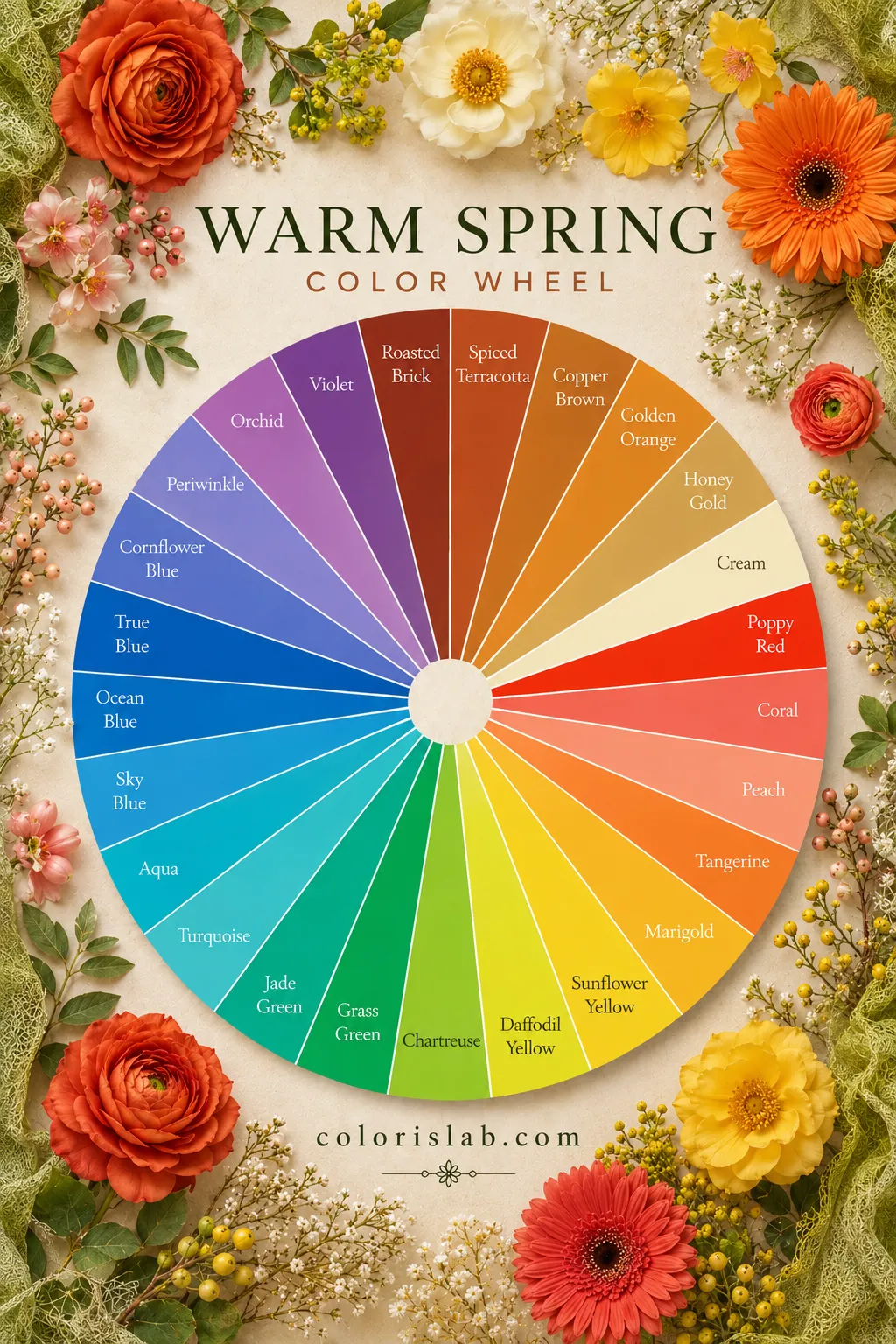
Typical Warm Spring colors
The overall effect is sunny, healthy, and naturally radiant. Warm Spring coloring has an almost effortless golden glow, the kind of warmth that looks like it comes from within rather than from color alone.
True Spring: The Fuller, More Energetic Spring
True Spring moves further along the Spring spectrum. It sits between Warm Spring and Bright Spring, which means it carries slightly more value depth and a touch more contrast than Warm Spring, while still remaining fully warm and bright. It is not as light and airy as Warm Spring, and not as high-contrast as Bright Spring, but it brings more visual presence and energy than either of its lighter neighbors.
True Spring coloring carries more presence than Warm Spring. The extra value depth means it can handle richer, slightly fuller colors without looking heavy. The slightly higher contrast range allows for more defined combinations. Everything stays warm, fresh, and bright, but with more substance behind it.
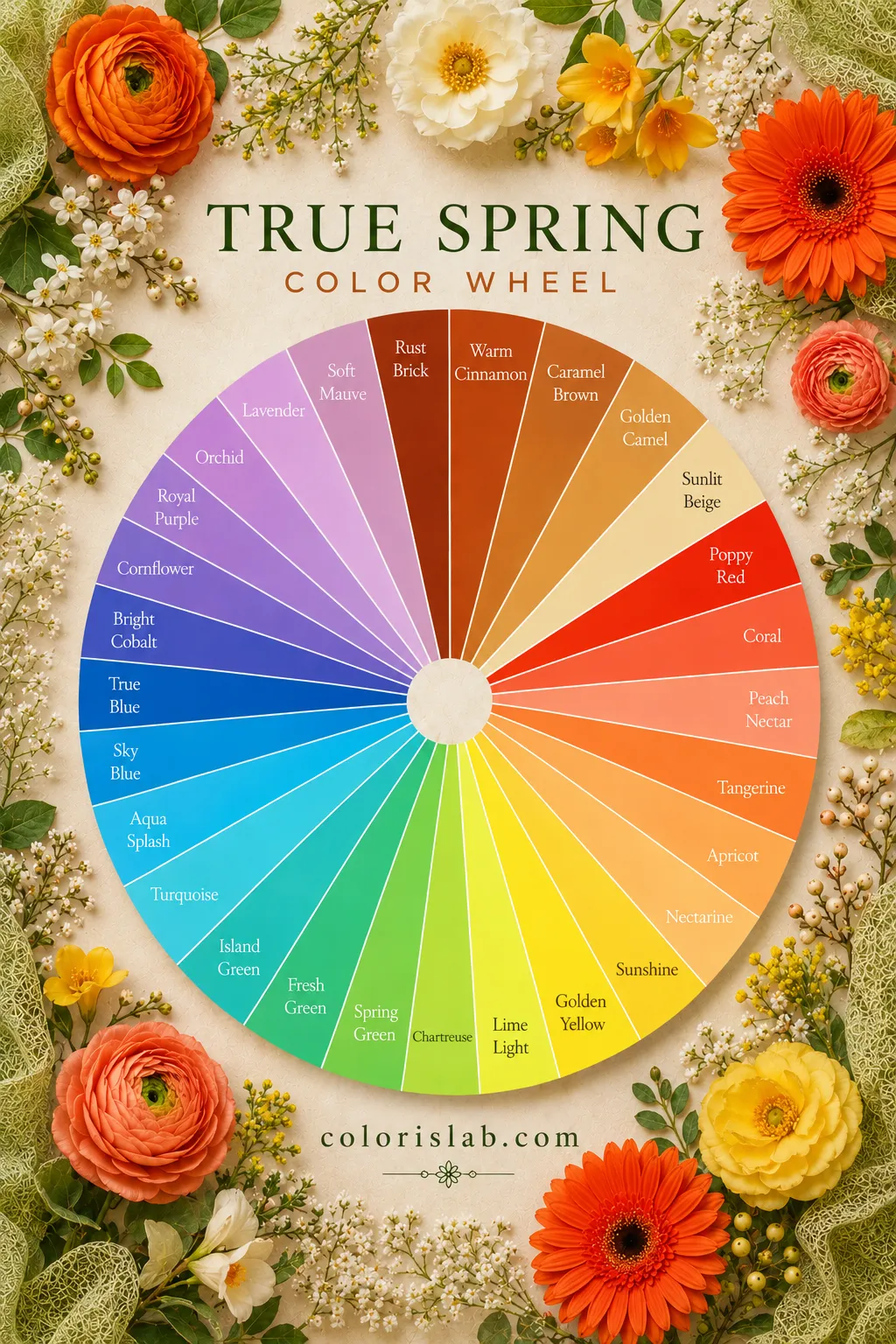
Typical True Spring colors
The overall effect is energetic, fresh, and visibly alive. True Spring coloring has a natural Spring vitality that comes across immediately, warm, clear, and full of life. Catherine, Princess of Wales is a well-known True Spring reference. Her coloring responds beautifully to the warm, clear, and moderately contrasted palette of this season.
The Biggest Difference: Value and Contrast
The easiest way to separate these seasons is value and contrast depth. Both are warm. Both are bright. But Warm Spring stays distinctly light and low-contrast, while True Spring moves into a slightly fuller value range with more contrast capacity.
The difference is not chroma, both seasons are bright. The difference is value and contrast range. True Spring simply carries more of both.
Warm Spring vs True Spring in Draping
This distinction becomes clearest when you test similar warm colors at different value and contrast levels. The difference shows up immediately with corals, greens, and warm reds.
A Warm Spring often looks exceptional in warm jade or golden olive. A True Spring may suddenly come alive in fresh lime or bright clear teal. Both are warm and green, but one carries more value and contrast, and that is exactly what True Spring needs.
Test the difference on your own photo
Drape Warm Spring and True Spring palettes side by side and see exactly how your skin responds to each value and contrast level.
Open Virtual Draping Studio →Neutrals and Contrast Styling
Neither season truly belongs in black the way Winter does. But True Spring's slightly extended contrast range means it can handle more defined combinations than Warm Spring.
Warm Spring usually looks best in
- Cream instead of white
- Warm camel and tan
- Soft warm brown
- Golden contrast combinations
True Spring can naturally wear
- Brighter warm white
- Stronger color blocking
- More vivid contrast pairings
- Fuller warm combinations
On Warm Spring, very sharp or heavy contrast combinations can occasionally start looking out of place against such light, soft coloring. On True Spring, those slightly stronger combinations often feel completely natural, the season has just enough contrast range to carry them.
Palette Structure
Many people expect the palettes to look dramatically different. They do not. Both are warm and bright, the difference is primarily in value depth and contrast range, not in the color families themselves.
Warm Spring palette
- Warm and bright
- Light value
- Low to medium contrast
- Soft, golden warmth
- Radiant, luminous colors
True Spring palette
- Warm and bright
- Low to medium value
- Low to medium contrast
- Fuller, energetic warmth
- Vivid, clear colors
Warm Spring resembles sunlight filtering through honey, light, golden, and luminous. True Spring resembles warm sunlight on clear tropical water, still warm and bright, but with more depth and energy behind it.
Overall Appearance
Color analysis should never rely purely on appearance stereotypes, but certain patterns do appear frequently across both seasons.
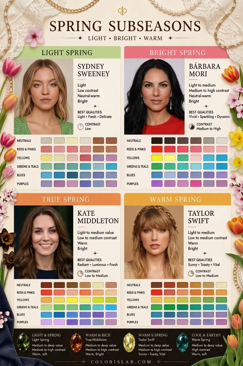
Warm Spring often has
- Light, golden skin quality
- Soft warmth throughout features
- Natural glow and radiance
- Low to medium feature contrast
- A delicate, luminous appearance
True Spring often has
- Fuller warm coloring
- More visible feature definition
- Stronger natural energy
- Low to medium contrast overall
- A brighter, more vivid freshness
This is why some people who initially identify as Warm Spring actually turn out to be True Spring after proper draping, their coloring simply carries a touch more depth and contrast than the lightest Spring palette provides.
Makeup Differences
This is one of the clearest real-life indicators of which season you belong to.
When a Warm Spring wears brighter, more defined True Spring makeup, it can occasionally start overpowering the lighter, softer features. When a True Spring wears softer Warm Spring makeup without enough clarity, the features can look slightly muted and underdefined.
Jewelry and Metals
Both seasons suit gold-based metals best. Cool silver and platinum feel jarring against the warmth of both palettes. The difference between the two seasons is in the finish and brightness of the gold itself.
Warm Spring jewelry
- Classic yellow gold
- Warm bronze
- Soft rose gold
- Matte or brushed golden finishes
True Spring jewelry
- Bright polished yellow gold
- Shiny rose gold
- Clear, reflective gold finishes
- Higher-shine warm metals
Warm Spring can tolerate slightly softer, more matte golden finishes without losing harmony. True Spring tends to look better with a brighter, more polished gold, the extra shine matches the season's greater visual energy.
Why the Confusion Happens
The confusion exists because many systems combine these seasons entirely. And visually, the overlap is real. Both are warm and bright compared to seasons like Soft Autumn or Cool Summer. The four-season system and many older approaches treat all warm bright coloring as simply Spring, without distinguishing between the light, softer warmth of Warm Spring and the fuller, slightly more contrasted warmth of True Spring.
But the moment value depth and contrast are tested properly during draping, the difference becomes visible. Warm Spring reaches a point where colors with more depth start looking heavy against its lightness. True Spring keeps improving as the value and contrast increase slightly. That is the key distinction.
Final Comparison
Both seasons are unmistakably Spring, warm, bright, and fresh. But they create different kinds of Spring beauty. Warm Spring creates radiant golden softness. True Spring creates vivid, energetic freshness. That difference may sound subtle on paper, but during professional draping it becomes immediately visible.
Still unsure which Spring you are?
Our AI tool analyzes your photo for undertone, contrast, and value depth and gives you a starting point before going deeper into Spring subseasons.
Try the Free AI Tool →Frequently Asked Questions
Is Warm Spring the same as True Spring? ↓
Which Spring season has the highest contrast? ↓
Can Warm Spring wear black? ↓
Can True Spring wear softer, lighter colors? ↓
How do I know if I am Warm Spring or True Spring? ↓
Not sure which Spring subseason fits you? Our AI tool analyzes your photo for undertone, contrast, and value depth to give you a starting point.
Try the Free AI Analysis →Why do some systems combine Warm Spring and True Spring? ↓
Can Warm Spring wear very bright colors? ↓
What metals look best on True Spring? ↓
Why do some Warm Springs feel overwhelmed by Bright Spring colors? ↓
Want to test exactly where you land between Warm Spring and Bright Spring? Use the Virtual Draping Studio to compare palettes side by side on your own photo.
Open Virtual Draping Studio →Can True Spring wear muted makeup? ↓
ColorisLab Team
Color Analysis ExpertsWe're a team of color analysis enthusiasts dedicated to helping people discover their best colors and build confidence through personalized color advice.