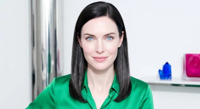
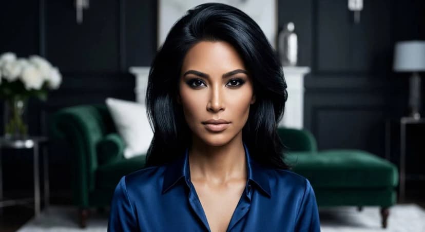
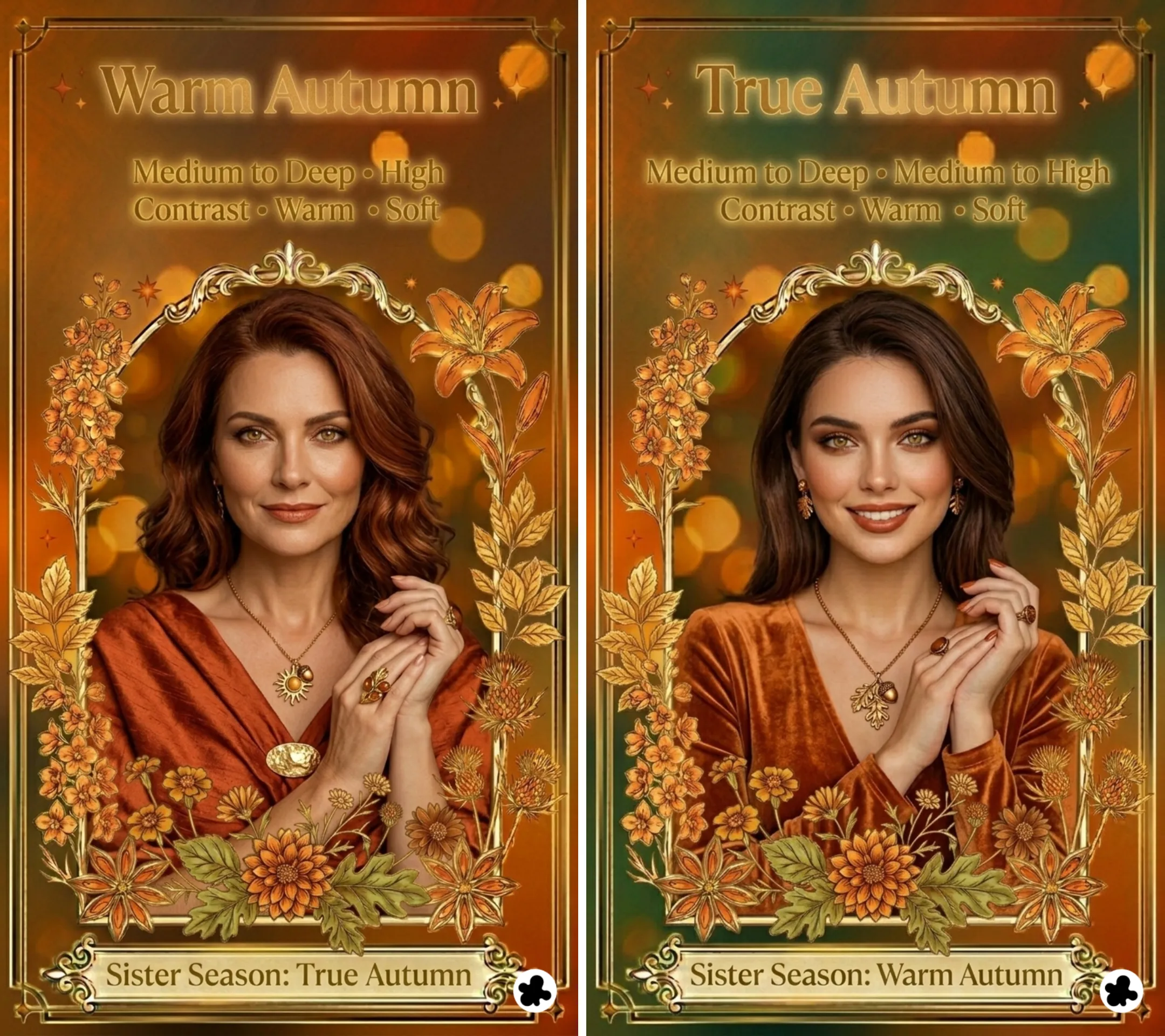
In the 12-season system, True Autumn and Warm Autumn are often used interchangeably. In the 16-season system, they are treated as distinct seasons.
True Autumn
Value
Medium to deep
Contrast
Medium to high
Undertone
Warm
Chroma
Soft
Sister season
Warm Autumn
Warm Autumn
Value
Medium to deep
Contrast
High
Undertone
Warm
Chroma
Soft
Sister season
True Autumn
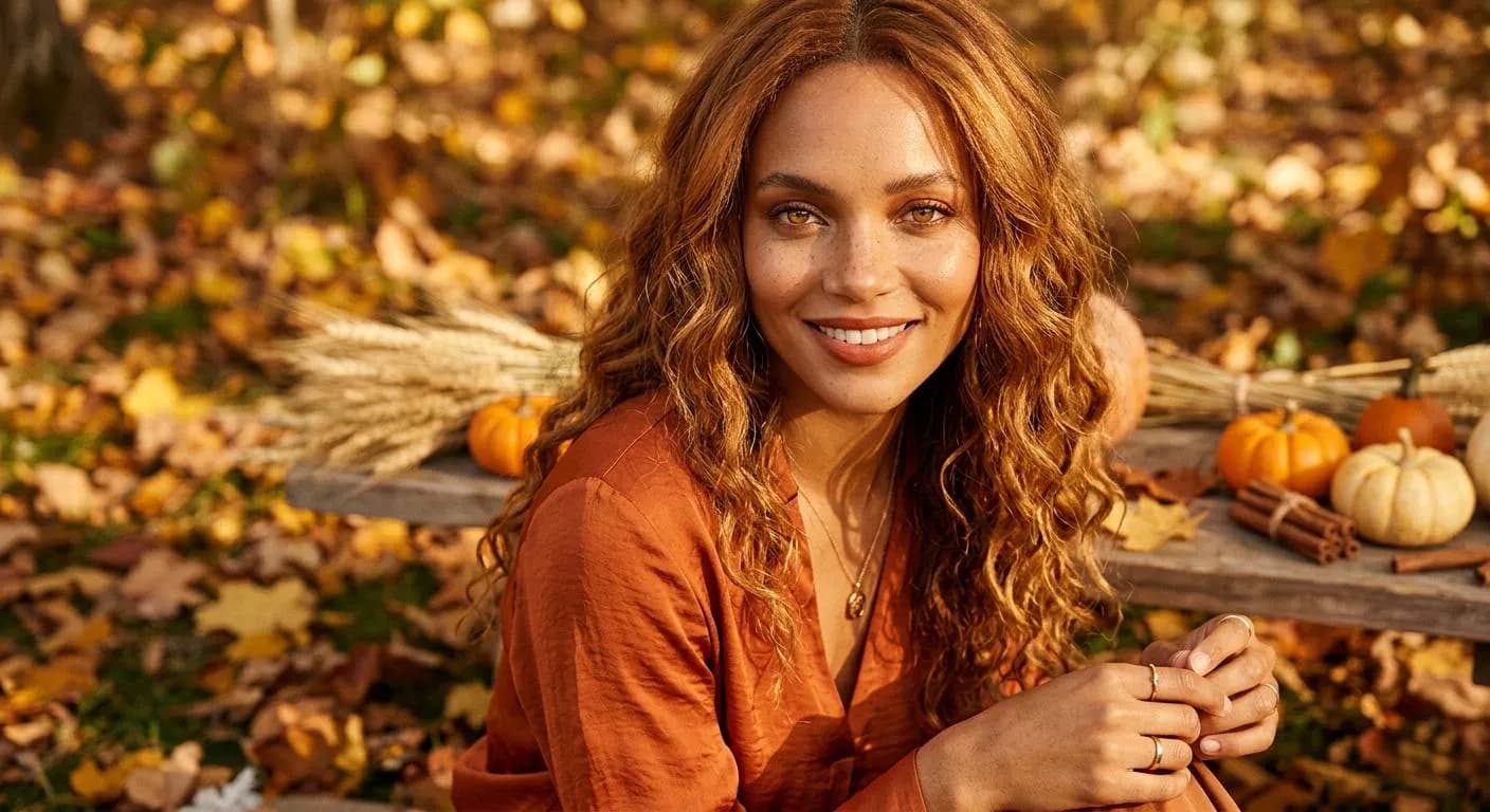
Warm Autumn or True Autumn is the season at the heart of the Autumn family. Where Soft Autumn is defined by its mutedness first and Deep Autumn by its depth, Warm Autumn is defined by warmth above all else. The warmth is not the bright, clear warmth of a Spring season. It is rich and grounded. But it is clearly and unmistakably warm, and it shapes the entire palette.
The dominant characteristic is warmth in hue. Before anything else, your coloring reads as golden and warm. The secondary characteristic is depth: your palette is rich and grounded rather than light or airy. Together they produce a season that is the purest expression of what Autumn is: earthy, golden, and luminous in warm light.
Warm Autumn does not border another family in the way Soft Autumn borders Summer. It sits at the center of the Autumn family, which means its palette stays consistently warm and grounded throughout. Read the 12 seasons guide if you want to understand how this fits into the full system.
Warm Autumn
Autumn family · True season
Metals
Yellow gold, bronze
🌿
Warm Autumn Coloring: What to Look For
The most reliable way to identify Warm Autumn coloring is the immediate impression of warmth combined with a richness that stops short of being dark or heavy. Features are clearly warm in temperature and medium in depth. The overall effect is grounded and luminous in warm light. When you look at someone who is a Warm Autumn, the first words that come to mind are usually golden, earthy, or inviting rather than delicate, striking, or cool.
🧴
Skin
Warm Autumn skin has unmistakable warm undertones: golden, peachy, or honeyed. There is no trace of pink or cool quality anywhere. The range runs from fair to medium-deep, always with that defining golden warmth. Freckles are common in this season and, when present, are warm and golden-brown rather than ashy or cool. In the sun, Warm Autumn skin tans easily and beautifully, building a golden glow without much difficulty.
Fair golden beige
Medium honey tawny
Warm olive golden
Warm chestnut bronze
💇
Hair
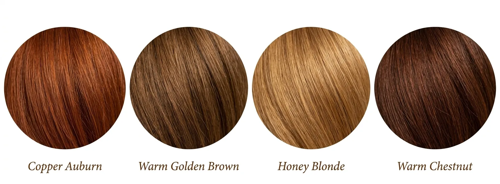
Warm Autumn hair is never ashy or mousy. It has obvious, rich warmth at every depth level: blondes are golden or strawberry, never platinum; browns are warm chestnut or caramel, never cool or flat; reds are copper and auburn, never burgundy or cool-toned. Many Warm Autumns were strawberry blonde or copper-haired children who deepened with age but kept that warm, glowing quality in their hair. In natural light, Warm Autumn hair picks up golden or copper highlights and reads as alive and rich.
Copper auburn
Warm golden brown
Honey blonde
Warm chestnut
👁️
Eyes
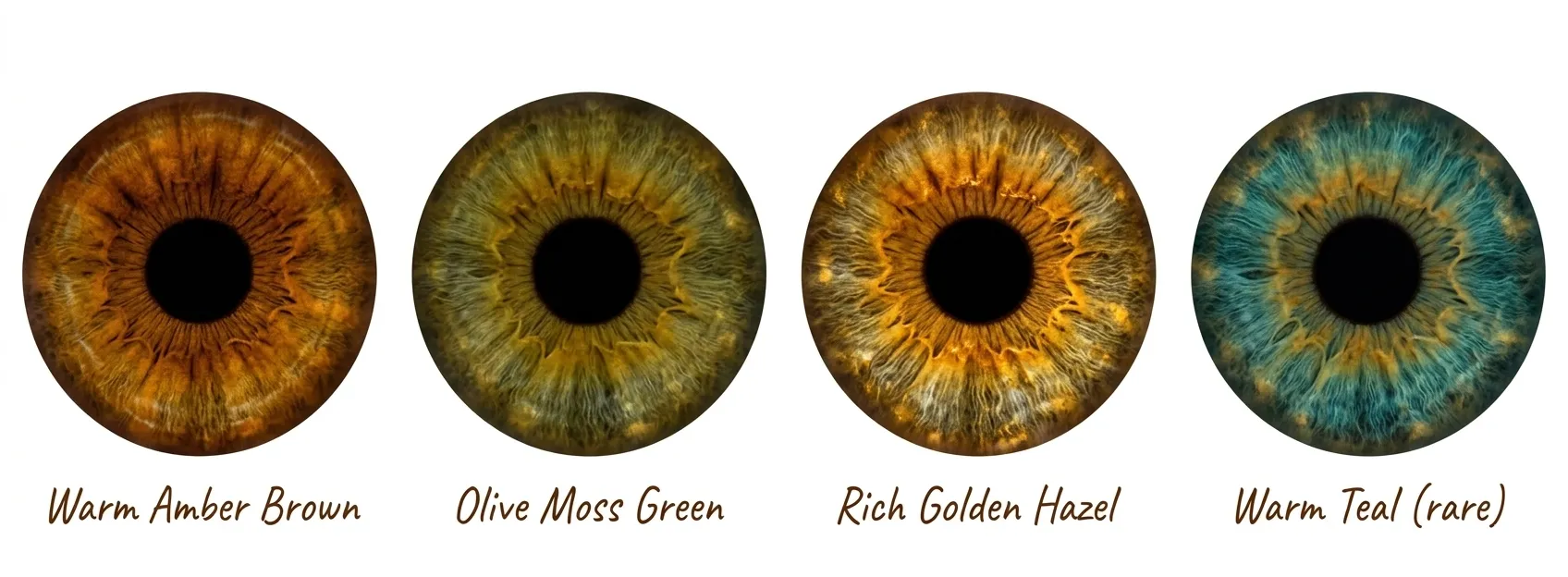
Warm Autumn eyes are warm, rich, and often have a penetrating, earthy quality. Browns are translucent and warm, often with visible golden or amber flecks. Greens are olive, moss, or golden-green rather than vivid or cool. Hazels have a rich sunburst pattern mixing brown, green, and gold. Blue eyes in this season are rare but when present carry a warm, teal, or aqua quality rather than any cool or grey quality. The eyes often appear to glow slightly in warm light.
Warm amber brown
Olive moss green
Rich golden hazel
Warm teal (rare)
🎨
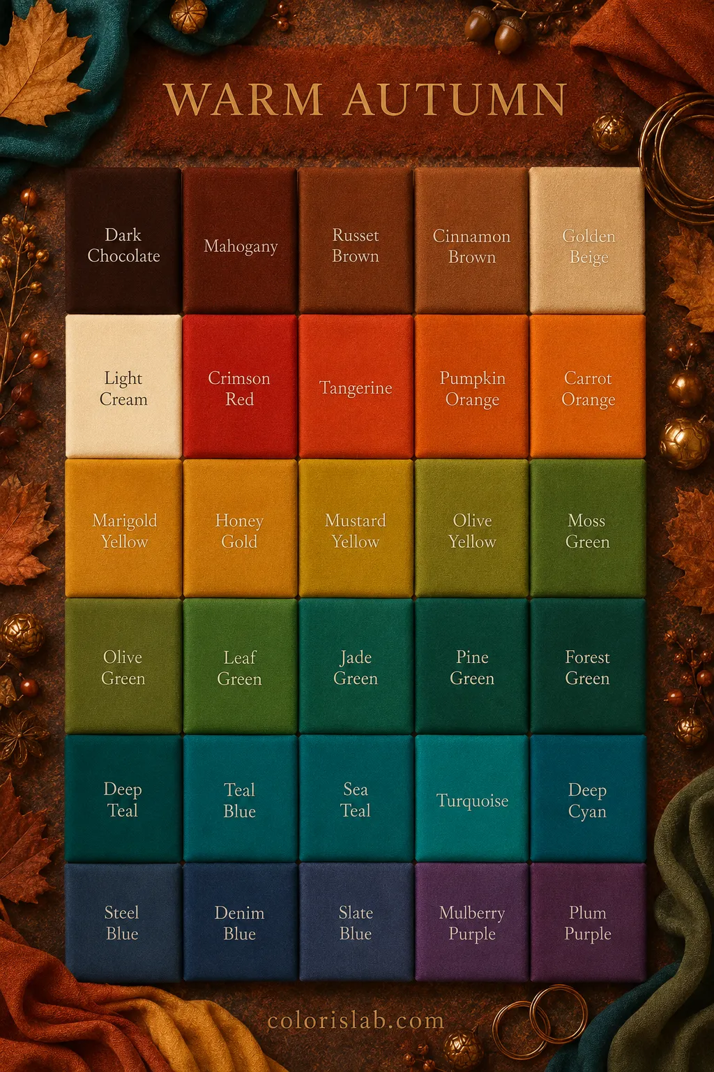
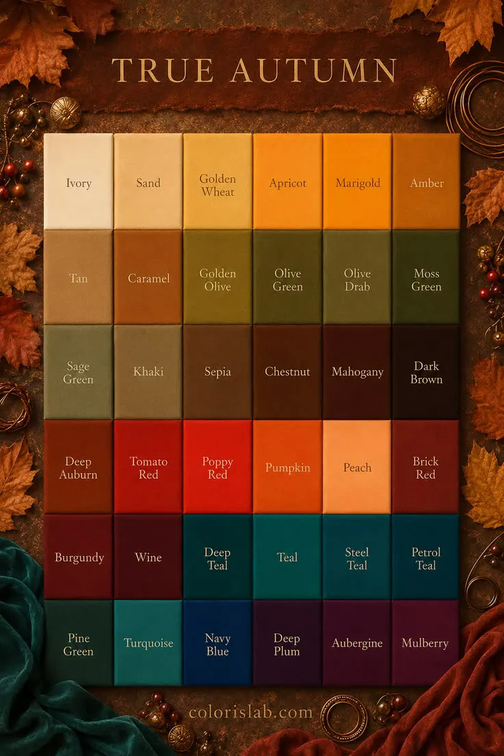
The Warm Autumn Color Palette
Warm Autumn colors share one quality above all others: they are warm and richly grounded. Every color in the palette has a golden, yellow, or orange quality that gives it warmth and depth. Think of the colors of an autumn forest at full peak: ripe pumpkins, falling copper leaves, tree bark, moss-covered stone. This is the warmest palette in the Autumn family, warmer than Soft Autumn and more vibrant at medium depth than Deep Autumn.
The palette is medium to medium-deep in value. Colors are rich and grounded but not extreme in depth. Both very light, airy tones and very dark, heavy tones feel slightly mismatched. The sweet spot is always warm, clear within its warmth, and medium in depth. Chroma here is medium to high, which distinguishes Warm Autumn from Soft Autumn most clearly.
✓ Colors that work
Rust
Terracotta
Pumpkin orange
Olive green
Moss green
Mustard
Warm camel
Chocolate brown
Warm red
Burnt orange
Golden yellow
Cream and ecru
✗ Colors that don't work
True black
Pure white
Icy pastels
Cool grey
Cool blue
Cool lavender
Fuchsia
Magenta
Navy blue
Silver grey
Soft cool pink
Cool beige
Colors fail on Warm Autumn in two clear ways. Cool colors conflict immediately with the warm undertone, making the skin look grey, sallow, or flat. Very light or pastel colors lack the depth and richness the coloring needs and leave the face looking washed out against the clothing. The palette is always warm, always grounded, and always alive with golden quality. When in doubt, hold the color up to your face in natural light: if the skin glows and the eyes warm up, the color is right.
A note on neutrals
Black and pure white are the two neutrals that work least well for Warm Autumn. Instead of black, the best dark neutrals are chocolate brown, dark warm olive, and deep camel. Instead of white, the best light neutrals are cream, ecru, and warm off-white. These are not minor adjustments: for Warm Autumn coloring they make an immediate and visible difference to how the face looks in natural light.
Gold is the most natural metal for Warm Autumn, and the test is usually immediate and decisive: silver sits visibly separate from the skin, while gold looks as if it belongs there. Yellow gold, rose gold, bronze, and copper all harmonize with the warm undertone. Unlike Soft Autumn, where finish matters significantly and high-polish can be too stark, Warm Autumn can carry polished gold well because the chroma of the coloring is higher. Hammered, antiqued, and brushed finishes all also work beautifully for a more earthy aesthetic.
Yellow gold
Rose gold
Bronze
Copper
Silver
Platinum
White gold
For gemstones, warm and richly luminous options work best: citrine, peridot, golden topaz, amber, carnelian, garnet, tiger's eye, and moss agate. Earthy stones like jasper and warm pearls also harmonize beautifully. Cool stones, including sapphire, amethyst, and aquamarine, are the wrong temperature entirely and will read as disconnected from the warmth of the coloring. Natural materials, including leather, wood, and woven textures, work beautifully alongside jewelry for this season and reflect its earthy, organic quality.
Warm Autumn makeup should enhance the natural warmth and richness rather than neutralize or cool it down. The goal is skin that looks glowing and healthy, with colour that reads as a warm, earthy extension of the natural coloring. Cool-toned pigments, pink-based products, anything with a silver or blue quality, and overly bright or electric colors all work against this season. The best Warm Autumn makeup looks sun-kissed, grounded, and effortlessly warm.
Look for warm, golden, or yellow undertoned formulas. Descriptors like warm, golden, honey, or beige with a warm qualifier are reliable guides. Avoid anything with a pink, cool, or neutral-cool base. A satin or natural finish works best, enhancing the natural luminosity of warm skin without looking flat or greasy.
warm golden
honey beige
golden sand
Terracotta, warm peach, apricot, coral, and soft brick. Unlike Soft Autumn where blush should be barely-there, Warm Autumn can carry a more defined warm flush without it looking overdone. Avoid cool pinks, mauves, and berry tones entirely. Terracotta blush is one of the most characteristic and flattering choices for this season.
terracotta
warm peach
soft brick
Warm browns, bronzes, coppers, golds, olive greens, and soft rusts. A warm brown smoky eye is one of the most flattering classic looks for this season. For more definition, add a pop of gold or olive on the lid. Liner in warm brown, bronze, or olive rather than black. Warm Autumn can carry brown-black mascara well; the warmth in the skin gives enough contrast that it does not look harsh.
warm brown
gold
olive green
Terracotta, brick red, warm brown, caramel, cinnamon, warm coral, and golden nude. Satin and creamy finishes both work well; a warm gloss in peach or coral works for casual looks. Avoid cool pinks, blue-based reds, mauve, and cool nude tones, all of which pull the warmth out of the face and make the lips look separate from the overall coloring.
brick red
warm coral
caramel
⚖️
Warm Autumn vs. Neighboring Seasons
Warm Autumn is most commonly confused with three seasons: Soft Autumn, Deep Autumn, and Warm Spring. The Soft Autumn confusion is about chroma. The Deep Autumn confusion is about value. The Warm Spring confusion is about warmth but with different depth and brightness.
Warmth dominates. Colors are rich and clearly defined. A clear rust or terracotta looks grounded and natural. The palette carries medium to high chroma without the coloring looking flat by comparison. The warmth announces itself.
Softness dominates. Everything is greyed-down and muted. A clear rust looks slightly too vibrant and defined. The palette needs to stay greyed and blended throughout. The warmth is present but filtered.
The test: Try a clear rust and a heavily greyed, muted rust side by side. If the clear rust looks right and vibrant, you are Warm Autumn. If the greyed version looks more harmonious and the clear version feels slightly too intense, you are Soft Autumn.
Medium to medium-deep in value. Very dark, rich colors can feel slightly heavy when worn alone. The palette has warmth and richness but does not extend into the darkest range. Medium warm tones look most natural.
Deep in value with rich chroma. Medium-depth colors can feel slightly washed out. The palette needs the depth and richness of very dark warm tones to come alive. Deep chocolate and dark forest green are its power colors.
The test: Try a deep chocolate brown and a medium warm brown side by side. If the medium warm brown looks grounded and the deep brown feels slightly heavy, you are Warm Autumn. If the deep brown looks rich and alive and the medium version feels slightly flat, you lean Deep Autumn.
Warm and deep. Colors are rich and grounded. Golden yellow reads as mustard. Greens are olive and moss. Reds are rust and brick. The depth gives the warmth a grounded, earthy quality.
Warm and light. Colors are brighter and more luminous. Golden yellow is more lemon than mustard. Greens are grass and lime rather than olive. Reds are tomato and coral rather than rust. The lightness gives the warmth a fresh, clear quality.
The test: Try a mustard and a bright golden yellow side by side. If the mustard looks rich and grounded and the bright yellow feels slightly jarring or too light, you are Warm Autumn. If the bright golden yellow looks alive and the mustard feels slightly heavy or muddy, you are Warm Spring.
👗
Building a Warm Autumn Wardrobe
A Warm Autumn wardrobe is built around rich, warm harmony. Every piece should feel as if it belongs to the same world: golden, earthy, and grounded. The result is a wardrobe that looks effortlessly sophisticated in a way that no amount of styling with incorrect colors will replicate.
Cream and warm off-white replace stark white. Camel, tan, and warm brown replace grey and black. Olive green and khaki serve as additional versatile neutrals. These foundational pieces form the backbone of Warm Autumn dressing and can be combined endlessly without any warmth fighting the natural coloring.
Cream
Warm camel
Chocolate brown
Warm olive
Warm khaki
These are the colors that make Warm Autumn coloring unmistakably alive. A rust blouse, a mustard coat, a moss green dress. These pieces do something immediately visible: the skin glows, the eyes warm up, and the overall impression becomes radiant in a way that no other colors replicate for this coloring. Rust and terracotta are arguably the most powerful single colors for this season.
Rust
Terracotta
Mustard
Moss green
Burnt orange
3
Contrast, Prints, and Texture
Warm Autumn has low to medium natural contrast but can handle more than Soft Autumn. Warm tonal dressing works beautifully, and introducing moderate contrast within the warm palette, such as rust with cream or chocolate with camel, also looks grounded and natural. For prints, earthy and organic patterns work best: leaves, botanical motifs, animal prints such as leopard and tortoiseshell, paisley, and ethnic-inspired patterns in warm palette colors. Fabrics with rich, natural texture complement the season well: suede, leather, velvet, corduroy, tweed, wool, cashmere, and linen are all excellent choices. High-shine fabrics can work but should be used sparingly, as the matte and semi-matte finishes of natural materials reflect the earthy quality of the coloring more naturally.
🤖
Still unsure if you're a Warm Autumn?
The most common confusion is the border with Soft Autumn, where both seasons are warm but differ in how much chroma they can carry. Our AI tool analyzes your photo for undertone and chroma direction and gives you a starting point before going deeper into either season's guide.
Try the Free AI Tool →
❓
Frequently Asked Questions
Is Warm Autumn the same as True Autumn?
↓
In the 12-season system, yes. Warm Autumn and True Autumn are two names for the same sub-season: the one where warmth is the dominant characteristic within the Autumn family. Some systems use True Autumn to indicate the most representative expression of the season at its center; others use Warm Autumn to emphasize the temperature-driven nature of the dominant characteristic. The palette and coloring description are identical. In a 16-season system, the two names can sometimes refer to slightly different positions, but in the standard 12-season framework they are interchangeable.
Can a Warm Autumn wear black?
↓
Black is not the best neutral for Warm Autumn near the face. It creates a contrast that sits slightly at odds with the natural warmth of the coloring, and it lacks the golden quality that this season needs in its darks. Dark warm brown, very dark olive green, and deep camel are much better alternatives that provide similar depth without the temperature conflict. Away from the face, in shoes or a bag, the impact is lower, but warm dark alternatives still produce a more harmonious overall result.
Can Warm Autumns have cool-looking features?
↓
It is uncommon but possible for individual features to read as neutral or slightly cool under certain lighting conditions, particularly grey-green eyes or medium brown hair in cool artificial light. Color analysis reads the underlying
undertone of the skin rather than the surface appearance of individual features. Draping in natural light near the face is the reliable reference: if gold consistently harmonizes with the skin and silver introduces a slight flatness or greyness, the warm undertone is real regardless of how any single feature reads in isolation.
What is the difference between Warm Autumn and Warm Spring?
↓
Both seasons are warm, but they differ in depth and brightness. Warm Autumn colors are deeper and more grounded: mustard rather than lemon yellow, olive rather than grass green, rust rather than tomato red.
Warm Spring colors are lighter and brighter: golden yellow rather than mustard, coral rather than rust, lime rather than olive. The test is to try a mustard and a bright golden yellow together. The one that makes the face glow rather than look slightly heavy or slightly washed out tells you which season you are.
Can a Warm Autumn wear pastels?
↓
Cool or icy pastels do not work for Warm Autumn as they lack both the warmth and the depth the coloring needs. However, light, warm versions of palette colors, such as warm peach, soft camel, and light cream, can work as accent pieces, particularly away from the face. These are not pastels in the cool, airy sense of the word, but they are the lightest end of what the Warm Autumn palette can carry. The coloring generally looks more alive in the medium to medium-deep range than in very light tones.