Deep Autumn vs Deep Winter: Same Depth, Two Completely Different Palettes
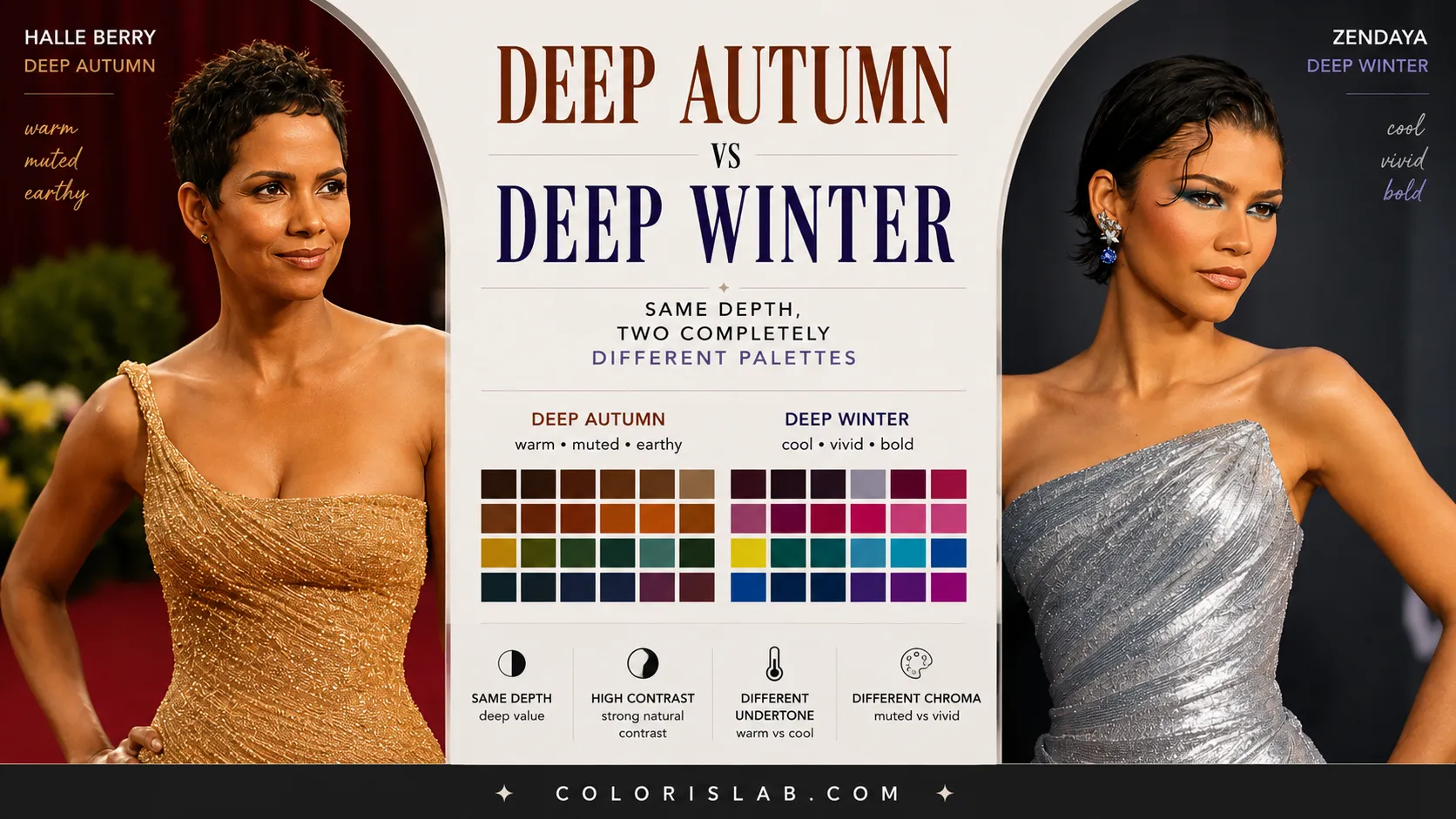
Of all the border season comparisons in color analysis, Deep Autumn and Deep Winter might be the most dramatic. Not because they are hard to tell apart, but because when you see them side by side, the difference is striking. These two seasons share the same depth. They share the same contrast level. And then they go in completely opposite directions in every other dimension.
This is also the comparison where misclassification tends to have the biggest visible impact. Getting it wrong does not just mean wearing slightly off colors. It means consistently wearing a palette that competes with some of the most powerful natural coloring in the entire spectrum. Deep seasons carry a lot of visual weight. Point that weight in the wrong direction and the result is impossible to ignore.
Understanding why these two seasons are both similar and fundamentally different is worth the time, especially if you already know you sit somewhere in the deep end of the color analysis spectrum and are trying to figure out which side of the line you fall on.
What They Actually Share
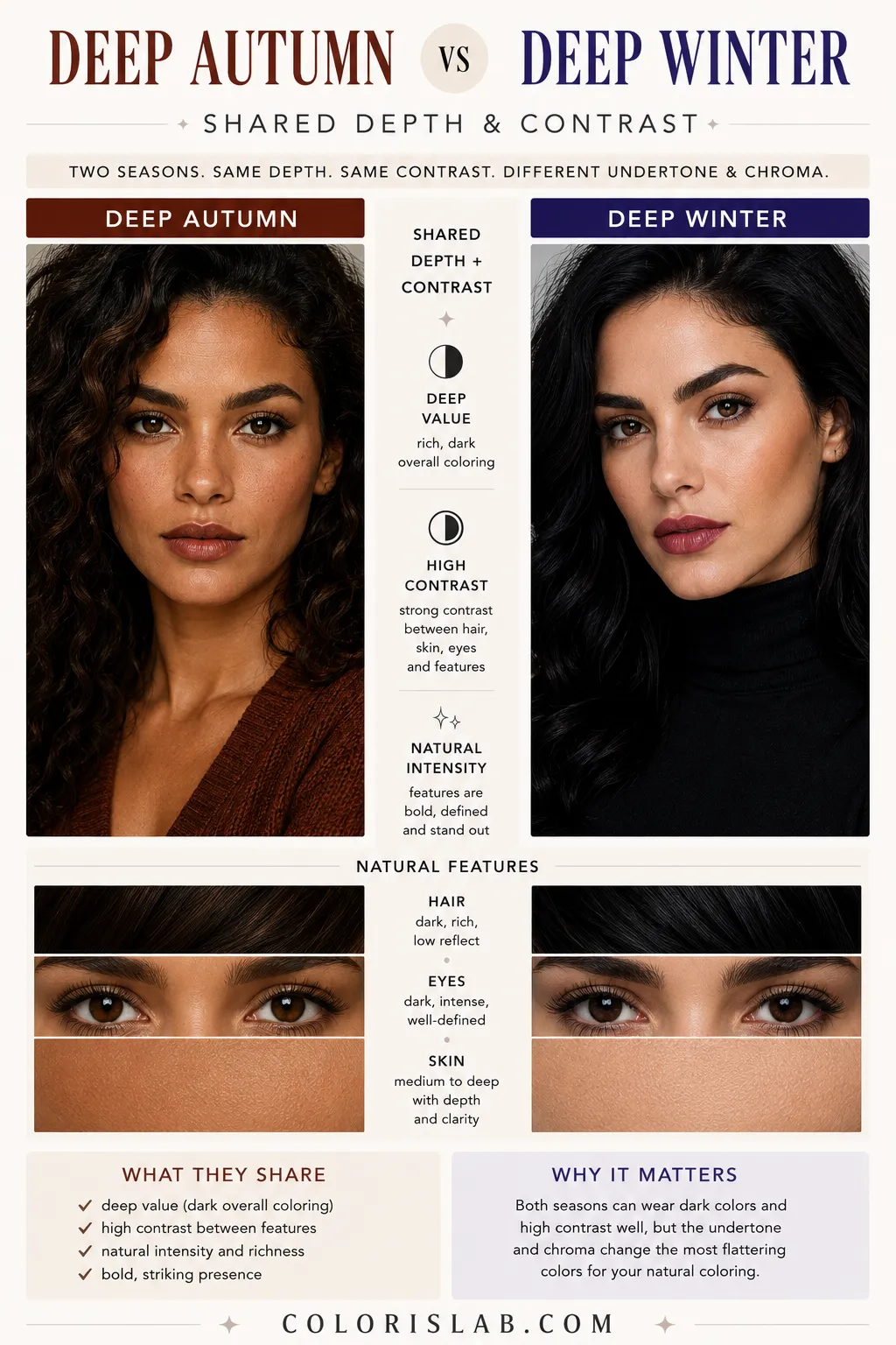
Deep Autumn and Deep Winter are the two deepest seasons in the entire 16-season system. Both require colors with significant depth and weight. Both support high contrast combinations. And both have a richness and intensity to their coloring that most other seasons cannot comfortably carry.
If you place either a Deep Autumn or a Deep Winter person in light, airy, or very low-contrast colors, the result is the same: the coloring overwhelms the palette. Light pastels look out of place. Soft, muted, low-depth combinations create a visual imbalance where the natural power of the features has nothing to match it. Both seasons are built to work with depth, and they need it.
This shared depth and contrast is also why both seasons can seem similar in initial assessments. When someone has very deep, rich coloring with strong contrast between features, people often jump quickly to Deep or Winter without analyzing the remaining parameters. Depth gets noticed first. But depth alone tells you almost nothing beyond narrowing the field to two seasons.
The Primary Difference: Chroma
The single sentence that separates them:
Deep Autumn
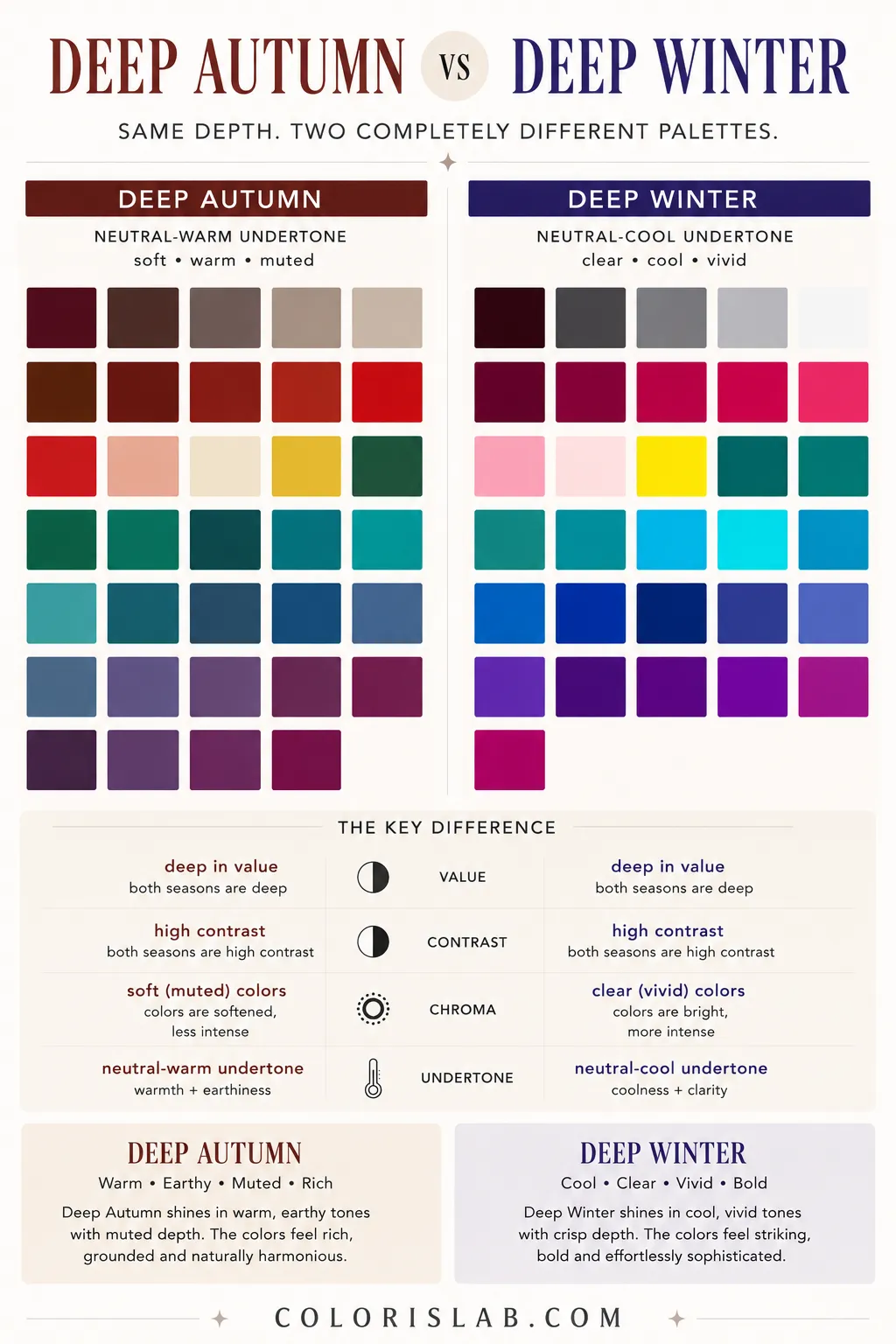
Soft in chroma. Rich terracotta, deep olive, warm burgundy, dark chocolate. Depth with warmth and earthiness inside it.
Deep Winter
Bright in chroma. True red, royal blue, emerald, black, sharp jewel tones. Depth with vivid clarity inside it.
Deep Autumn is soft in chroma. Deep Winter is bright in chroma. This is the clearest separator between the two, just as chroma was the primary separator between Light Spring and Light Summer. The pattern appears at both ends of the value spectrum.
Deep Autumn looks best in colors that carry depth but remain somewhat muted and earthen. Rich terracotta, deep olive, warm burgundy, dark chocolate brown, muted teal. These colors have weight and presence but they do not have the sharp clarity of fully saturated shades. There is warmth inside the depth, and a certain softness to how the color sits on the eye.
Deep Winter looks best in colors that are vivid, clear, and fully saturated within the deep range. True red, royal blue, emerald green, black, pure white, sharp jewel tones. These colors have the same depth as the Autumn shades but they are clear rather than muted. They have a crispness that the Autumn palette does not.
Typical Deep Autumn colors
Typical Deep Winter colors
When you test the wrong palette on the wrong person, the reaction is immediate. Muted earthy tones on a Deep Winter can make the coloring look slightly tired or underpowered, as if the natural intensity of the features has nothing to sharpen against. Vivid jewel tones on a Deep Autumn can make the face look reactive, with the colors competing against the warmth rather than supporting it.
Deep Autumn resembles a rich amber evening light filtering through autumn leaves. Deep Winter resembles the sharp clarity of a cold night sky. Both are powerful. Both are beautiful. But they are fundamentally different environments.
The Secondary Difference: Undertone
Deep Autumn has a neutral-warm undertone. Deep Winter has a neutral-cool undertone.
The word neutral matters here for both seasons. Neither Deep Autumn nor Deep Winter sits at an extreme of the warm-cool spectrum. Both have a slight tolerance for the opposite direction, more than their True or fully directional counterparts would. But the lean is real and consistent.
Deep Autumn responds best to warmth inside depth. The colors in its palette carry golden undertones, earthy warmth, and a richness that feels connected to the natural coloring. The extreme the person can tolerate is warm. Very warm, deeply golden or amber-based shades, sit comfortably within the palette. Fully icy or cool-based shades fall outside of it.
Deep Winter responds best to coolness inside depth. The colors carry a cool undertone, whether icy, blue-based, or neutral-cool. The extreme the person can tolerate is cool. Sharply cool tones, true black, blue-red, icy silver, all sit comfortably within the palette. Very warm, golden, or amber-based shades fall outside of it.
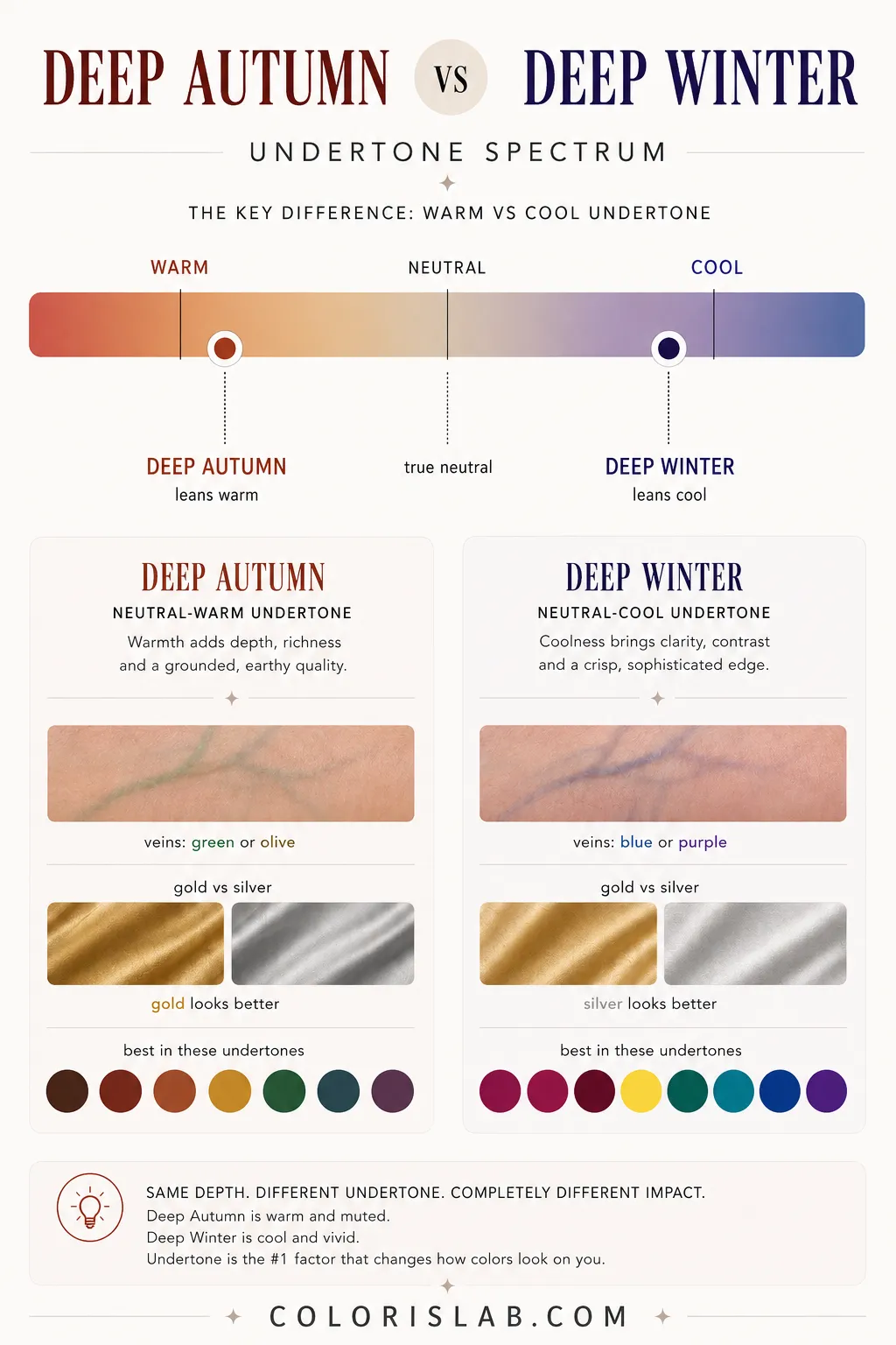
Again, these parameters describe the colors in the palette and their tolerance during draping. They are not a description of how the person looks or their skin color. They are about which direction of color produces the clearest, most harmonious skin response.
Why the Mistake Happens
The most common reason people misclassify between Deep Autumn and Deep Winter comes down to the same issue that appears in most border season comparisons: one parameter gets noticed and the rest do not get tested.
With these two seasons specifically, depth and contrast are the dominant visible characteristics. When someone has very deep coloring and strong contrast, the instinct is often to go straight to Winter. Winter is culturally associated with drama, depth, and strong features. It is the season most people think of when they see striking, high-contrast coloring.
But warm deep coloring with strong contrast does not belong to Winter. It belongs to Autumn. The difference shows up in undertone and chroma, and both of those require testing rather than visual assumption.
Another common source of error is makeup and styling. Both seasons tend to look powerful in bold, dramatic looks. A Deep Autumn person wearing deep red lipstick and strong eye makeup can look strikingly similar to a Deep Winter person in a cooler red. Without stripping back to natural coloring and testing actual palette colors against bare skin, the distinction gets buried under styling choices.
This is exactly where the double method becomes essential.
The Double Method in Practice
At ColorisLab, both Deep Autumn and Deep Winter classifications go through the same two-step process used for every season.
When both the parameter analysis and the draping point in the same direction, the classification is reliable.
Test the difference on your own photo
Drape Deep Autumn and Deep Winter palettes side by side and see exactly how your skin responds to each one.
Open Virtual Draping Studio →Celebrity Examples: Zendaya and Halle Berry
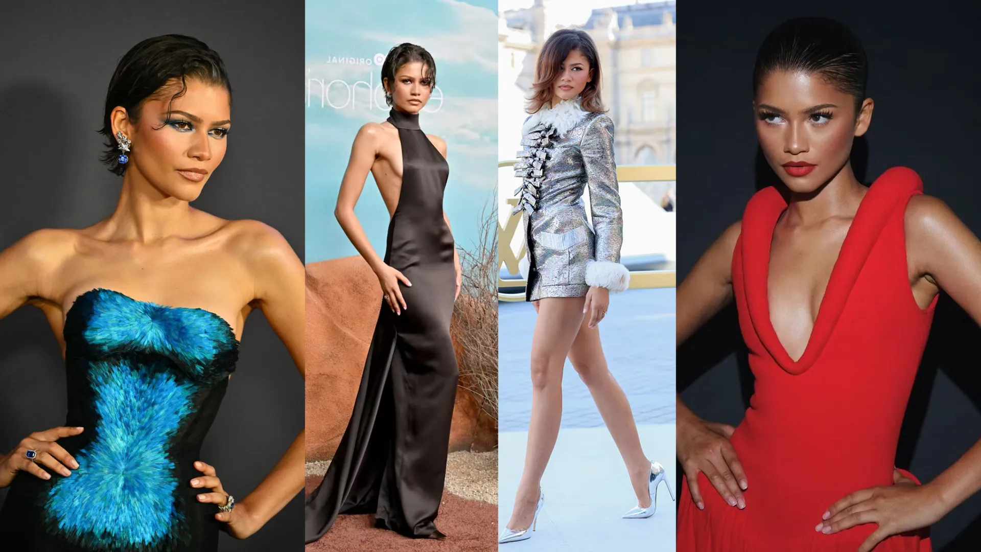
Few pairs of celebrities illustrate the Deep Autumn versus Deep Winter distinction as clearly as Zendaya and Halle Berry.
Zendaya is a Deep Winter. She has a neutral-cool undertone, deep value, high contrast between her features, and responds best to vivid, clear colors with significant depth. Her most iconic looks involve sharp jewel tones, true red, royal blue, stark black and white combinations, and highly saturated shades that match the clarity and intensity of her natural coloring. When she wears warm, earthy, or muted tones, something shifts. The colors work against her rather than with her, and the usual precision of her presence softens in a way that is not her best.
Halle Berry is a Deep Autumn. She has a neutral-warm undertone, the same deep value and high contrast as Zendaya, but her chroma is soft and her palette leans warm. Her best looks involve rich earthy colors, warm deep reds, terracotta tones, olive and forest greens, and warm chocolate neutrals. When she wears fully cool, sharply saturated shades, her warmth works against the color rather than with it, and the result is slightly disconnected from her natural richness.
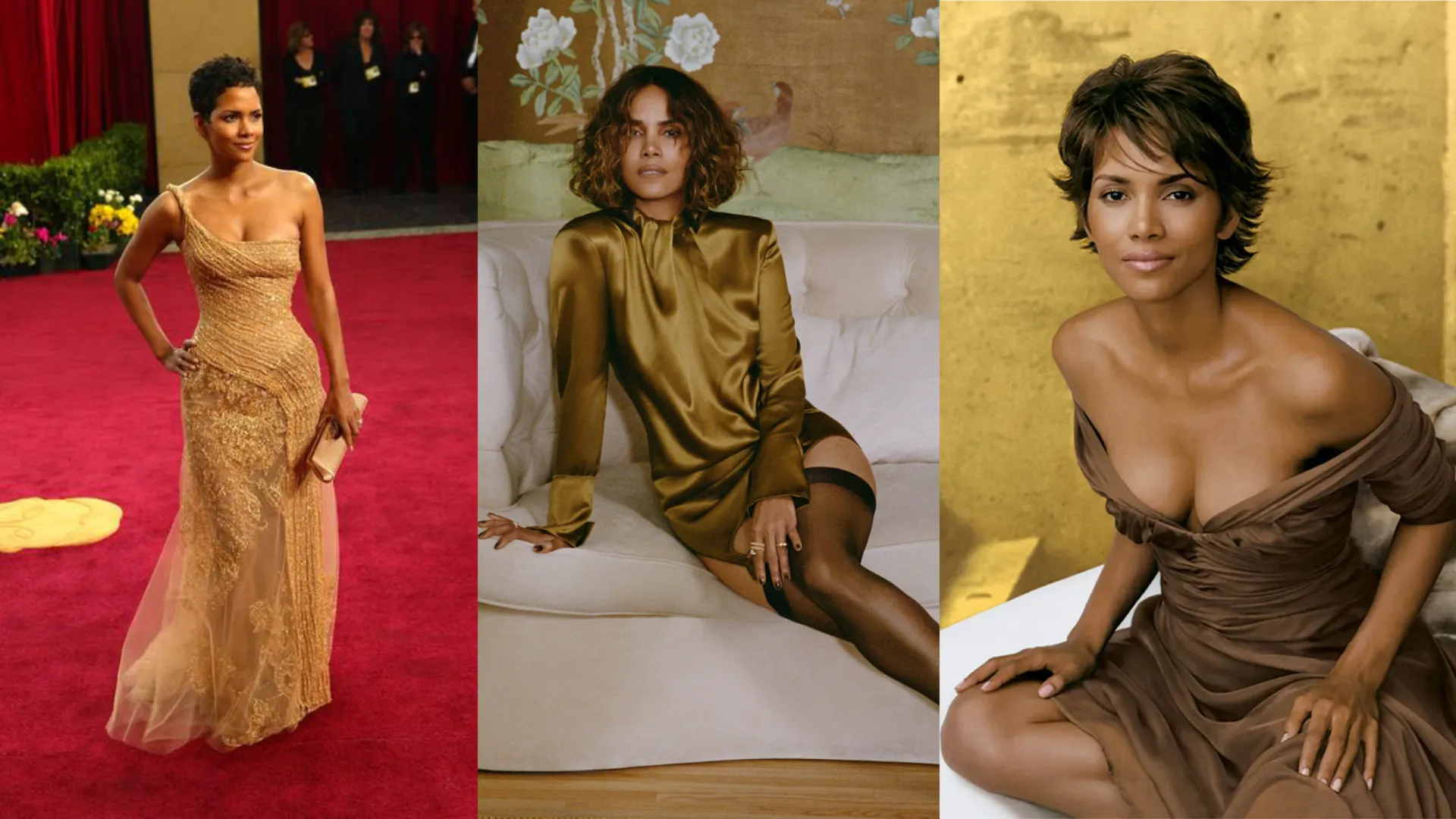
Side by side, these two women have comparable depth and comparable contrast. That similarity is exactly why the comparison matters. The difference that separates their palettes is not depth or contrast. It is undertone and chroma. And those two parameters change everything about which specific colors look extraordinary versus just fine.
Final Comparison
Deep Autumn creates warm, rich, grounded power. Deep Winter creates cool, sharp, electric presence. Both are among the most visually commanding seasons in the spectrum. But they achieve that impact through completely opposite directions.
Still unsure which deep season you are?
Our AI tool analyzes your photo for undertone, contrast and chroma and gives you a starting point before going deeper into your season.
Try the Free AI Tool →Frequently Asked Questions
What is the main difference between Deep Autumn and Deep Winter? ↓
Can Deep Autumn and Deep Winter wear the same colors? ↓
Why do people confuse Deep Autumn with Deep Winter? ↓
Is Zendaya really a Deep Winter? ↓
Is Halle Berry really a Deep Autumn? ↓
Can Deep Autumn wear black? ↓
Can Deep Winter wear warm tones? ↓
How does ColorisLab tell Deep Autumn and Deep Winter apart? ↓
ColorisLab Team
Color Analysis ExpertsWe're a team of color analysis enthusiasts dedicated to helping people discover their best colors and build confidence through personalized color advice.