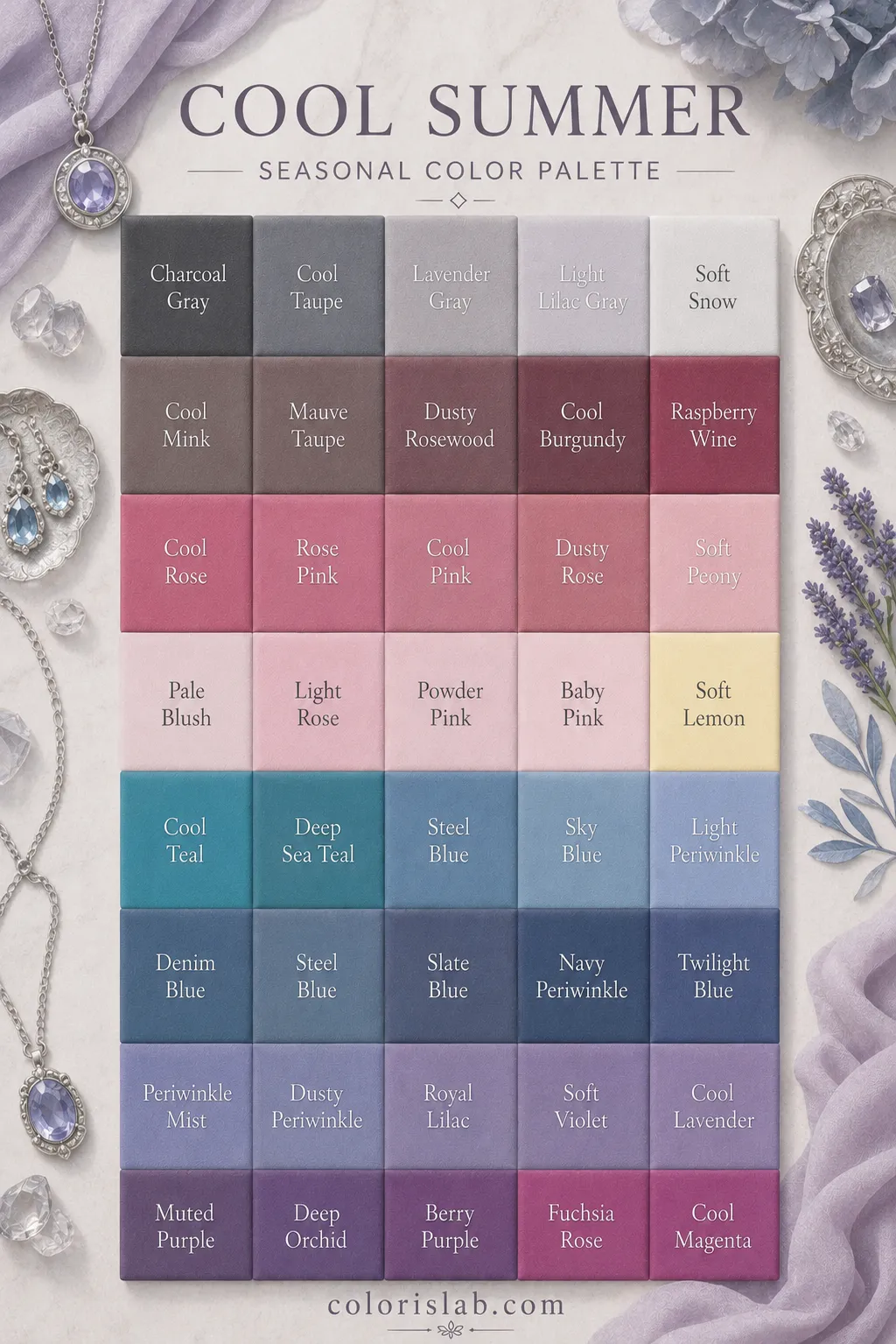
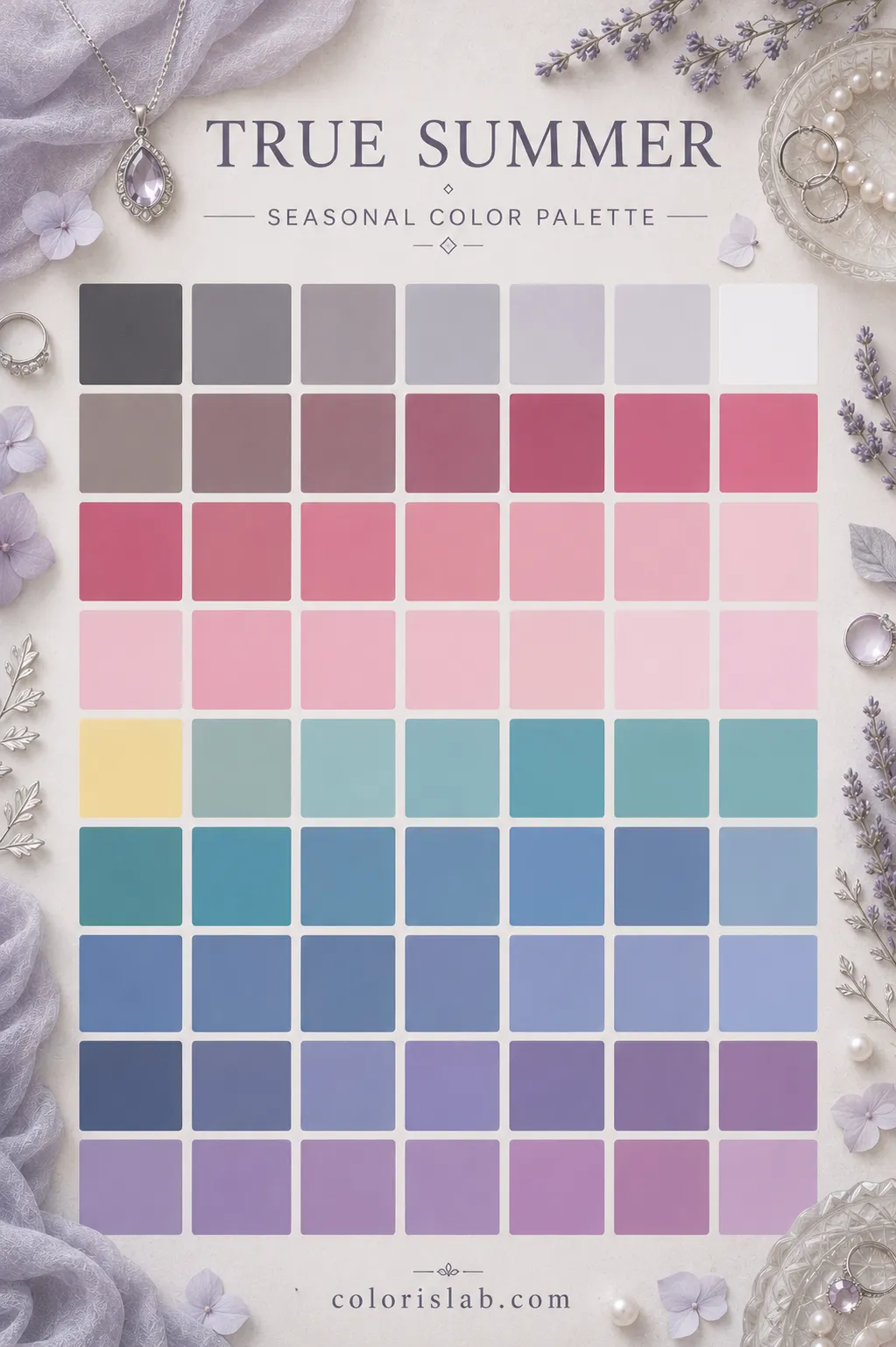
In the 12-season system, Cool Summer and True Summer are often used interchangeably. In the 16-season system, they are treated as distinct seasons.
Cool Summer
Value
Light
Contrast
Low to medium
Undertone
Cool
Chroma
Soft
Sister season
True Summer
True Summer
Value
Light to medium
Contrast
Low to medium
Undertone
Cool
Chroma
Soft
Sister season
Cool Summer
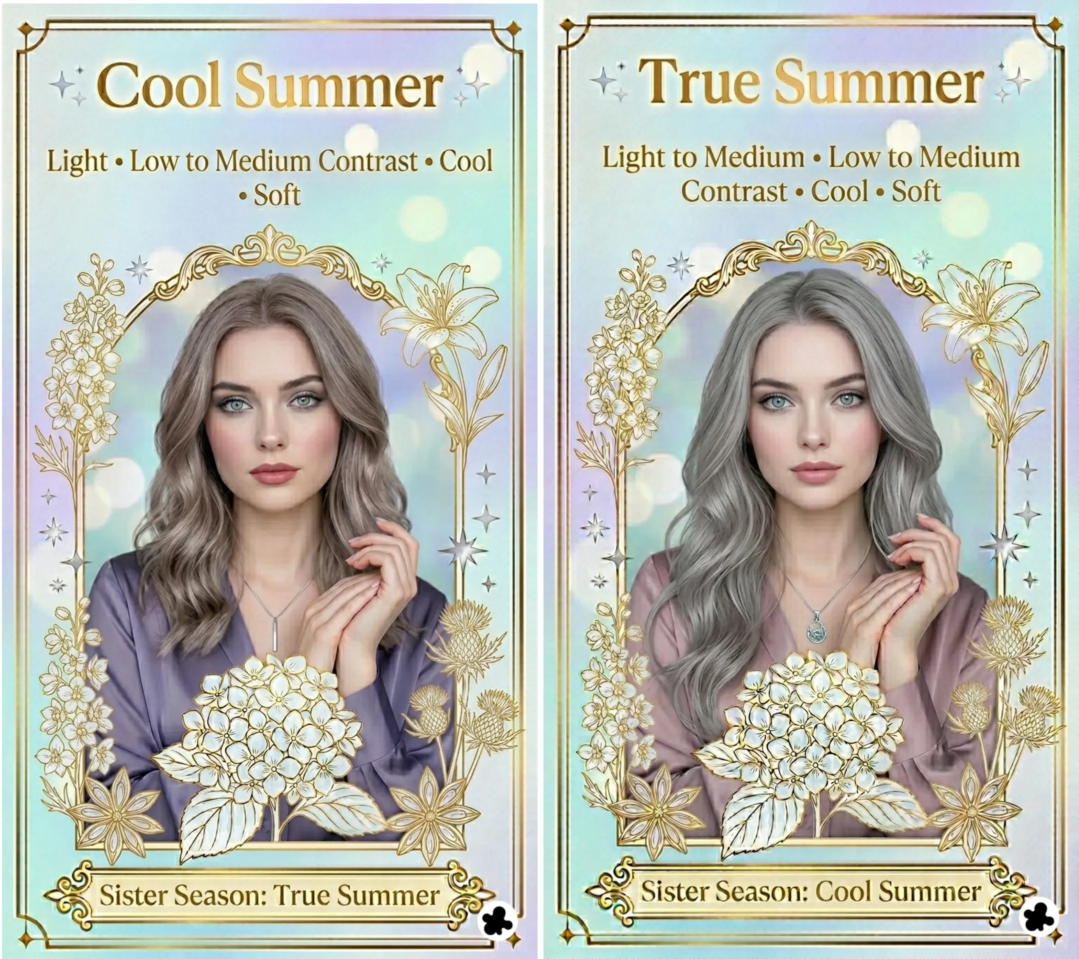
Cool Summer or True Summer is the season at the heart of the Summer family. Where Light Summer is defined by its lightness first and Soft Summer by its mutedness, Cool Summer is defined by coolness above all else. The coolness is not the sharp, high-contrast coolness of a Winter season. It is soft and refined. But it is clearly and unmistakably cool, and it shapes the entire palette.
The dominant characteristic is coolness. Before anything else, your coloring reads as cool in temperature. The secondary characteristic is softness: your coloring is muted rather than vivid, and the palette reflects that. Together they produce a season that is the purest expression of what Summer is: cool, elegant, and serene.
Cool Summer does not border another family the way Light Summer borders Spring. It sits squarely within the Summer family, which means its palette stays consistently cool and soft without borrowing from adjacent seasons. Read the 12 seasons guide if you want to understand how this fits into the full system.
Cool Summer
Summer family · True season
🌿
Cool Summer Coloring: What to Look For
The most reliable way to identify Cool Summer coloring is the immediate impression of coolness combined with a softness that stops short of being muted or dusty. Features are clearly cool in temperature but not vivid or high-contrast. The overall effect is refined and serene. When you look at someone who is a Cool Summer, the first word that comes to mind is usually elegant rather than fresh, striking, or warm.
🧴
Skin
Cool Summer skin has unmistakable cool undertones: pink, rosy, or cool beige. There is no trace of golden or peachy warmth anywhere. The range runs from fair to medium, always with that defining cool quality. The skin tends to have an even, refined quality in natural light. In the sun, Cool Summer skin burns before it tans and builds colour slowly. Freckles, when present, are cool and ashy rather than warm and golden.
Fair cool porcelain
Light rosy ivory
Medium rosy beige
Cool taupe medium
💇
Hair
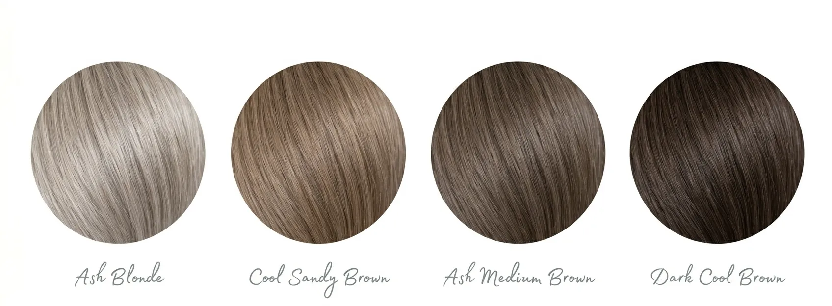
Cool Summer hair is always cool in temperature and ranges from light to medium in depth. There is no warmth to it at any lightness level: blondes are ash, not golden; browns are cool and mousy rather than chestnut or caramel. Unlike Light Summer, the hair can be somewhat darker while still fitting the season. Many Cool Summers grey to a beautiful soft silver, which is one of the most characteristic features of this season over time. Dark hair can appear here, as long as it carries a cool rather than warm quality.
Ash blonde
Cool sandy brown
Ash medium brown
Dark cool brown
👁️
Eyes
Cool Summer eyes are soft and serene. Blues are grey-blue, slate, or soft powder, never piercing or icy. Greens are muted sage or soft grey-green rather than vivid. Greys are gentle and dove-like. Hazels in this season have a cool quality, mixing grey, green, and soft taupe rather than the warm gold-and-brown of a warm season. Even darker brown eyes in Cool Summer carry a cool, refined quality rather than a warm amber one.
Slate grey-blue
Muted sage green
Soft grey
Cool soft hazel
🎨
The Cool Summer Color Palette
Cool Summer colors are cool, soft, and medium in depth. They are the colors of a misty summer morning seen through soft light: dusty rose, slate blue, muted lavender, soft sage. Nothing is vivid enough to read as electric. Nothing is so muted it reads as dusty or earthy. The palette sits at the intersection of cool temperature and medium chroma, which gives it a quality that is elegant and refined without being stark or heavy.
✓ Colors that work
Dusty rose
Slate blue
Soft lavender
Muted mauve
Soft raspberry
Soft sage
Cool periwinkle
Soft white
Cool grey
Soft navy
Cool taupe
Muted cool berry
✗ Colors that don't work
True black
Stark white
Warm peach
Coral
Golden yellow
Warm orange
Rust
Camel
Electric brights
Icy stark pastels
Warm olive
Mustard
Colors fail on Cool Summer in two clear ways. Warm colors immediately clash with the cool undertone, making the skin look sallow or slightly greenish. Vivid or electric colors overpower the natural softness of the palette and make the coloring look washed out rather than radiant. The sweet spot is always cool and medium in intensity. When in doubt, hold the color up to your face in natural light: if the skin looks refined and even and the features come forward gently, the color is right.
Silver is the most natural metal for Cool Summer, and the test is usually immediate: yellow gold sits slightly separate from the skin, while silver looks as if it belongs there. Platinum works equally well for the same reason. Rose gold is a good option too, its pink quality harmonizing with the rosy quality often present in Cool Summer skin. It is one of the more versatile sub-seasons for jewelry because the coolness is clean enough for polished silver and soft enough that rose gold does not look too warm.
Silver
Platinum
Rose gold
White gold
Champagne gold
Yellow gold
Bronze
Gunmetal
For gemstones, cool and softly luminous reads best: rose quartz, amethyst, aquamarine, cool pearl, moonstone, lavender jade, and soft blue topaz. Deep or heavily saturated gems like ruby or bright emerald have too much intensity for the softness of this season. Warm stones like citrine, amber, or coral pull the temperature in the wrong direction entirely.
Cool Summer makeup should enhance the natural refinement and coolness rather than warm it up or intensify it. The goal is skin that looks even and luminous, with colour that reads as a cool, polished version of the natural coloring. Heavy coverage, warm-toned pigments, orange-based products, and anything with a golden or bronze quality all work against this season. The best Cool Summer makeup looks effortless and slightly understated.
Look for neutral-cool or slightly pink undertoned formulas. Descriptors like cool, neutral, rosy, or ivory are reliable guides. Avoid anything with a golden, yellow, or peachy base. A satin or natural finish enhances the refined quality of Cool Summer skin better than heavy matte coverage or an overly dewy finish.
cool rosy
neutral ivory
cool beige
Dusty rose, soft pink, mauve, and cool berry in a light application. Cool Summer coloring can carry slightly more blush definition than Light Summer without it looking overdone. Avoid peach, apricot, coral, and anything with an orange or warm undertone. Terracotta and bronzer-style blushes belong to a different season entirely.
dusty rose
mauve
cool berry
Cool taupe, mauve, soft grey, and muted lavender for everyday. Slate blue or soft sage as a defined colour on the lid. Eyeliner in cool grey, soft charcoal, or dark cool brown. Jet black mascara works here more than on Light Summer, as the slightly deeper contrast of Cool Summer can carry it without it looking too sharp.
muted mauve
slate blue
soft sage
Dusty rose, soft rose, mauve, cool raspberry, and soft berry. Satin and matte finishes both work well for this season, which has the cool depth to carry a matte lip without it looking flat. Avoid coral, peach, warm brown nudes, and anything with an orange or golden base. Bright vivid reds belong to a higher-contrast season.
dusty rose
cool raspberry
soft berry
⚖️
Cool Summer vs. Neighboring Seasons
Cool Summer is most commonly confused with three seasons: Light Summer, Soft Summer, and Cool Winter. In each case a single dimension separates them cleanly.
Hue dominates. The coolness is what registers first. Medium-depth cool colours look grounded and natural. The palette can carry more saturation and depth than Light Summer without overwhelming the coloring.
Value dominates. The lightness is what registers first. Deeper or more saturated cool colours feel heavy and too much. The palette needs to stay airy and gentle to match the delicacy of the coloring.
The test: Try a medium dusty rose and a very pale shell pink side by side. If the medium dusty rose looks grounded and right, you are Cool Summer. If the pale shell pink looks fresher and the dusty rose is too deep, you are Light Summer.
Cool and soft. The palette is clearly cool in temperature. Greyed-down or earthy tones feel slightly muddy. The coolness is the defining quality rather than the mutedness.
Muted and blended. The palette has more grey in it and sits closer to Autumn. Colours need to be dusted-down to look right. The mutedness is the defining quality rather than the coolness alone.
The test: Try a clear dusty rose and a greyed-down, smoky mauve side by side. If the clear dusty rose looks right and the smoky version is slightly muddy, you are Cool Summer. If the smoky version looks more harmonious, you lean Soft Summer.
Cool and soft. The palette is muted in chroma. Vivid or stark colours overpower the natural softness. Elegance comes from the refined, understated quality of the coloring.
Cool and vivid. The palette is high in chroma and contrast. Soft or muted colours look flat and underwhelming. Elegance comes from the sharp, defined quality of the coloring.
The test: Try a vivid cool fuchsia and a dusty rose side by side. If the dusty rose looks refined and right and the fuchsia is too stark, you are Cool Summer. If the fuchsia looks alive and the dusty rose is too flat, you are Cool Winter.
👗
Building a Cool Summer Wardrobe
A Cool Summer wardrobe is built around the same three layers as the palette: a cool neutral foundation, a set of signature Cool Summer tones, and a clear understanding of contrast. The approach is about refinement and elegance rather than brightness or impact.
Soft white and cool off-white replace stark white. Charcoal grey and soft navy replace true black. Cool taupe and greige replace warm camel or beige. These neutrals harmonize with the cool undertone and create the kind of quiet, sophisticated base that defines Cool Summer dressing. A charcoal coat, soft white blouse, and cool greige trousers work together without any warmth fighting the coloring.
Soft white
Charcoal grey
Soft navy
Cool taupe
These are the colors that bring Cool Summer coloring to life. A dusty rose blouse, a slate blue coat, a soft lavender dress. These pieces look immediately and effortlessly right because they match the natural cool, soft quality of the coloring. No amount of styling with incorrect colors achieves what these do simply by existing near the face.
Dusty rose
Slate blue
Soft lavender
Cool raspberry
Soft sage
Cool Summer has low to medium natural contrast, so clothing combinations should be tonally blended rather than sharply contrasted. A dusty rose blouse with mauve trousers, or a slate blue coat over a soft grey dress, creates the kind of long, elegant line that suits this coloring well. For prints, soft watercolour effects, blurred florals, subtle stripes in palette colors, and classic patterns like houndstooth rendered in Cool Summer tones all harmonize well. Graphic, high-contrast prints or anything with warm tones in the pattern will look at odds with the natural refinement of the coloring.
🤖
Still unsure if you're a Cool Summer?
The most common confusion points are the borders with Light Summer and Soft Summer. All three are cool, and the differences come down to depth and mutedness. Our AI tool analyzes your photo for value and chroma and gives you a starting point before going further into any of the three guides.
Try the Free AI Tool →
❓
Frequently Asked Questions
Is Cool Summer the same as True Summer?
↓
In the 12-season system, yes. Cool Summer and True Summer are two names for the same sub-season: the one where coolness is the dominant characteristic within the Summer family. Some systems use True Summer to indicate the most representative expression of the season; others use Cool Summer to emphasize the temperature-driven nature of the dominant characteristic. The palette and coloring description are identical. In a 16-season system, the two names can refer to different things, as that system subdivides further and the position within the cool Summer range may shift.
Can a Cool Summer wear black?
↓
Black is too stark and too high-contrast for most Cool Summer coloring near the face. It creates a level of contrast that does not match the naturally soft quality of this season. Charcoal grey and soft navy are much better alternatives: they provide a similar sense of depth without the harshness. In clothing away from the face, like shoes or a bag, black is more acceptable, but near the face it will always pull the focus away from the features rather than toward them.
Can Cool Summers have dark hair?
↓
Yes, more so than Light Summer. Cool Summer's dominant characteristic is temperature rather than value, so the hair can be somewhat darker while still fitting the season, as long as it carries a clearly cool rather than warm quality. Dark cool brown or even very dark ash brown can appear in Cool Summer. What cannot appear is dark hair with warm, reddish, or golden tones. If the dark hair looks ashy and cool rather than warm and rich, it is consistent with this season.
Why do warm colors look so wrong on Cool Summers?
↓
Because warm colors introduce a temperature that conflicts with the cool
undertone in the skin. When a warm color sits next to a cool undertone, the contrast between the two makes the skin appear sallow or slightly greenish rather than clear and refined. The colors are not inherently bad; they simply belong to a different temperature category. This is the same reason Cool Summer coloring looks its best in cool, muted tones: those colors harmonize with the undertone rather than fighting it.
What is the difference between Cool Summer and Cool Winter?
↓
Both seasons are cool in temperature, but they differ in chroma and contrast.
Cool Winter has high
chroma and high contrast: it needs vivid, clear, defined colors to look its best. Cool Summer has low to medium chroma and low to medium contrast: it needs soft, muted, refined colors. If you put a vivid fuchsia or an icy electric blue next to your face and it looks alive, you lean Cool Winter. If it looks stark and too much, you are Cool Summer.