Light Spring vs Light Summer: And How to Finally Tell Them Apart
If Soft Summer and Soft Autumn are often described as the most confusing pair in color analysis, Light Spring and Light Summer are their closest competition. And in some ways, the argument is justified more here than anywhere else.
Both seasons are low in value. Both are low in contrast. Both sit at the lighter, airier end of the color spectrum. And both can carry a slightly neutral quality to their undertone that makes it harder to read warm or cool at a glance.
On paper, these two look nearly identical.
The difference, however, is real and measurable. And when you know what to look for, and when you have the right tools to test it, the two seasons are not difficult to separate at all. The confusion only exists because most introductions to color analysis stop before they get to chroma, and chroma is exactly where Light Spring and Light Summer part ways.
What These Two Seasons Actually Share
Before getting into the differences, it is worth being specific about what makes these two seasons genuinely similar, because the overlap is real.
Both Light Spring and Light Summer are low in value. That means both seasons look best in lighter colors. Very deep, heavy, or dark shades tend to overpower both of them. If you put someone from either season in a rich, dark outfit, the clothing becomes the focal point instead of the face. This is one of the clearest signs of lighter value, regardless of season.
Both are also low in contrast. The features, hair, skin, and eyes, sit close together in terms of lightness and darkness. There is no dramatic jump between them. As a result, both seasons tend to struggle with high contrast outfits. A stark black and white combination, a deeply colored blazer over a crisp white shirt, these kinds of combinations create more visual tension than either season can comfortably carry.
Both can also have a slightly neutral quality to their undertone. Light Spring sits at the warmer edge of the Spring family, near the boundary with Summer. Light Summer sits at the cooler edge of the Summer family, near the boundary with Spring. This proximity means neither season presents as strongly warm or strongly cool. Both can read as relatively balanced at a glance, especially to an untrained eye.
This is why the confusion exists. The two seasons share three out of four major parameters. But the fourth one, chroma, changes everything.
The Primary Difference: Chroma
The single sentence that separates them:
Light Spring
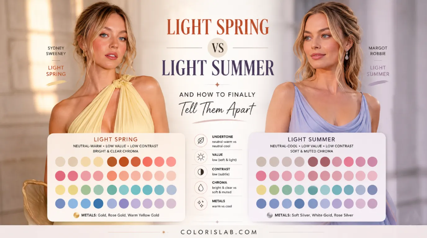
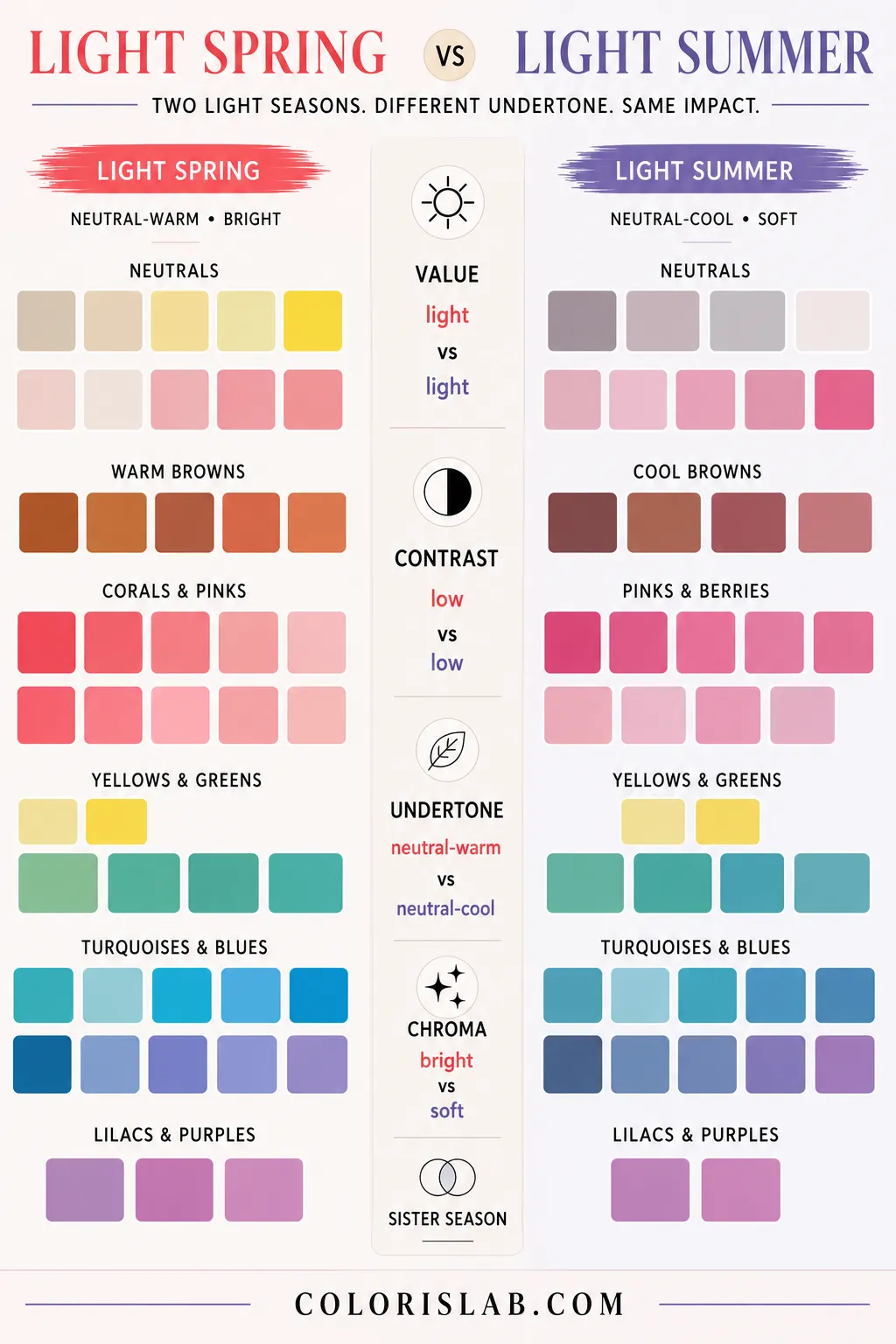
Bright in chroma. Clear warm pastels, fresh corals, warm peach, bright yellows. Colors have life and energy.
Light Summer
Soft in chroma. Dusty rose, soft lavender, muted cool pink, powder tones. Colors feel gentle and slightly washed.
That single distinction is the axis around which the entire comparison turns.
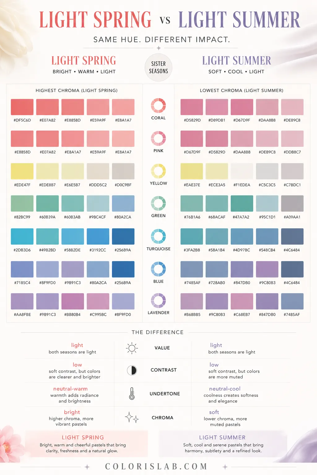
What does this mean in practice? Chroma refers to the intensity and clarity of color. High chroma colors are vivid, clear, and saturated. Low chroma colors are muted, toned-down, and slightly greyed.
Light Spring can handle colors with brightness and clarity. The palette includes clear warm pastels, fresh corals, warm peach, bright warm yellows, and light clear greens. These colors have life and energy to them. They are not deeply saturated, because the value is still light, but they are clear and unmuted.
Light Summer needs colors with softness and a slight grey quality. The palette includes dusty rose, soft lavender, muted cool pink, light greyish blue, and powder tones. These colors feel gentle and slightly washed rather than vivid.
Typical Light Spring colors
Typical Light Summer colors
Put the wrong palette on the wrong person and the reaction is immediate. A clear, bright warm peach on a Light Summer makes the face look slightly off, a little reactive, a little too much. A dusty muted lavender on a Light Spring makes the face go flat, the natural brightness of the coloring has nothing to respond to.
This is what makes chroma the primary separator here. It is not a subtle distinction. Under proper draping conditions, the difference in how the skin responds to bright versus soft colors is visible within seconds.
The Secondary Difference: Undertone Direction and Extreme Tolerance
Once chroma is understood, undertone becomes the secondary separator.
Light Spring is neutral-warm. That means the palette leans warm, but not as strongly as True Spring or Warm Spring. The person can tolerate a slight amount of coolness in their colors without losing harmony entirely. However, the extreme end of what they can tolerate is warm. Very warm, golden, peachy, and coral-based shades sit comfortably within their range. Extremely cool shades, sharp icy blues, cool lavenders, stark cool pinks, fall outside of it.
Light Summer is neutral-cool. The exact opposite applies. The palette leans cool, but not as strongly as True Summer or Cool Summer. The person can tolerate a slight amount of warmth without completely losing harmony. But the extreme end of what they can tolerate is cool. Very cool, icy, and lavender-based shades sit within their range. Extremely warm shades, deep golden hues, warm oranges, peachy corals, fall outside of it.
This is important to understand because of how draping works. The tolerances described here are not qualities of the person's appearance. They are qualities of the colors in the palette that produce the best skin response during draping. It is a description of what works, not what the person looks like.
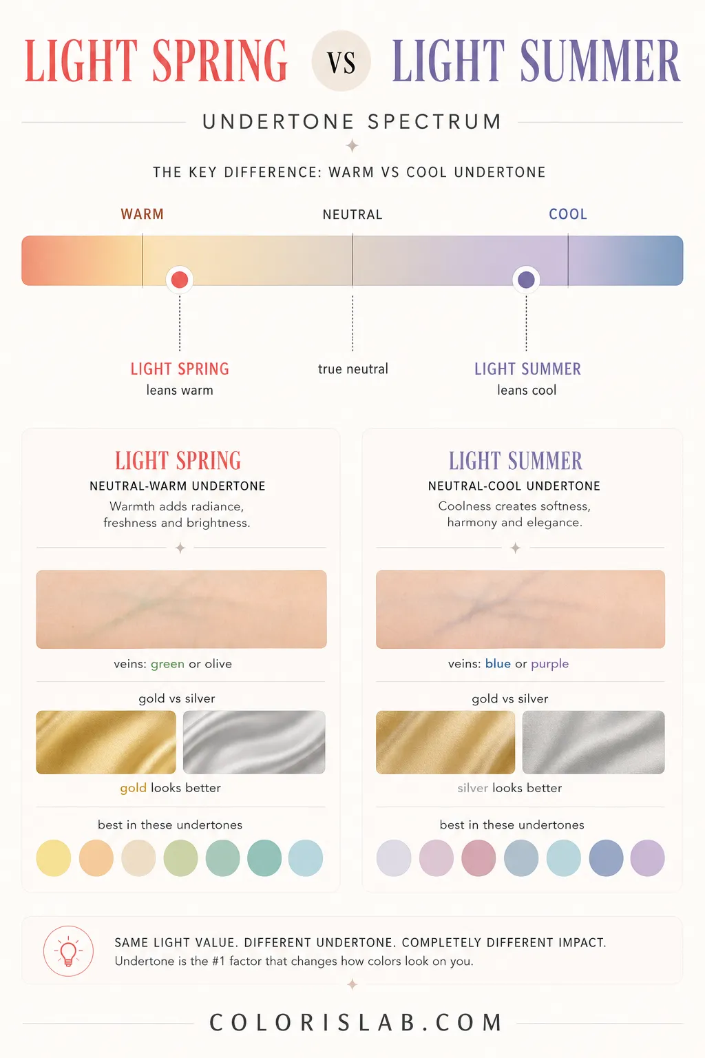
A Light Spring person is not necessarily visibly warm in their features. They may appear quite neutral. But when you test their skin against extremely warm colors versus extremely cool ones, the warm end produces a consistently better result.
For Light Summer, the same logic applies in reverse. They may look quite neutral at a glance, but the cool end of the spectrum consistently produces more clarity and harmony in the skin during draping.
Why Misclassification Between These Two Can Happen
The overlap in value and contrast means that anyone relying only on those two parameters to type themselves, or someone else, will hit a wall quickly. You can confirm that someone is light and low contrast with relative ease. But that tells you nothing about whether they belong to Light Spring or Light Summer.
The vein test and jewelry test, which are common starting points for undertone identification, are also less reliable here than they are for seasons with stronger warm or cool leanings. Because both seasons are neutral in undertone, someone from either season might not get a clear result from those tests. Their veins may appear in between, and both gold and silver jewelry may look reasonably good on them.
This is exactly where the double method that ColorisLab uses becomes critical.
Light Spring draping uses clear, warm-leaning bright pastels. Light Summer draping uses soft, cool-leaning muted tones. The skin's reaction to each set confirms or adjusts the parameter analysis.
Test the difference on your own photo
Drape Light Spring and Light Summer palettes side by side and see exactly how your skin responds to each one.
Open Virtual Draping Studio →In Practice: What This Looks Like on Real People
Both seasons tend to look effortless and light in their best colors. When a Light Spring wears clear warm pastels, there is a fresh, almost glowing quality to the face. Everything looks bright without looking overdone. When a Light Summer wears soft cool pastels, there is a similarly delicate quality, gentle, even, and refined.
The difference shows most clearly when the palette is wrong. A Light Spring in muted, greyed-out tones can look flat. The natural brightness of the coloring has nothing to amplify it, and the result is that the face slightly disappears. A Light Summer in clear, vivid pastels can look slightly overwhelmed. The brightness reads as too much against a coloring that is built around softness.
Neither effect is dramatic in the way that, say, placing a Light Summer in deep black is dramatic. But it is consistent and reproducible across multiple tests, which is what makes draping the most reliable confirmation method for this particular comparison.

Celebrity Examples: Margot Robbie and Sydney Sweeney
Few comparisons illustrate the Light Summer and Light Spring distinction as naturally as Margot Robbie and Sydney Sweeney.
Margot Robbie is a Light Summer. She has a neutral-cool undertone, low contrast between her features, and a soft, delicate quality to her overall coloring. Her best looks consistently involve soft cool tones: dusty rose, powder blue, cool off-white, and muted lavender. These shades create an effortless, polished harmony with her natural coloring. When she wears very warm tones or highly saturated colors, the color tends to compete with her face rather than enhance it.

Sydney Sweeney is a Light Spring. She has a neutral-warm undertone, similarly low contrast, and a fresh, bright quality to her coloring that responds well to clarity and warmth. Her best looks involve clear warm tones: warm peach, fresh coral, golden beige, and light warm aqua. These shades amplify the natural luminosity in her complexion. When she wears very muted, greyed-out, or cool shades, her coloring can look slightly flat, as if the brightness has been pulled out of it.
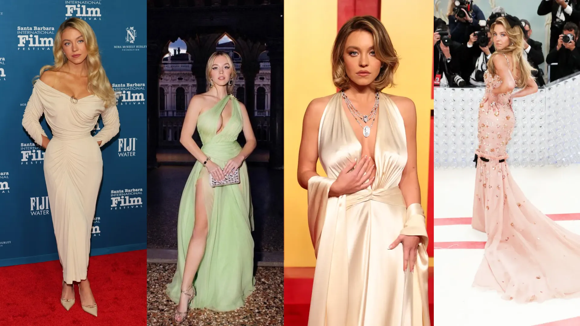
Both women are blonde, light-featured, and low in contrast. On the surface, they look remarkably similar in terms of coloring. But their seasons point in opposite directions on the chroma and undertone axis. This is exactly what makes them such a useful real-world example. Two people who look almost interchangeable at a glance, but whose best colors are built on completely different principles.
Final Comparison
Light Spring creates fresh, clear, warm brightness. Light Summer creates soft, cool, gentle harmony. That difference may look small on a color chart. In draping, it is immediately visible.
Still unsure which season you are?
Our AI tool analyzes your photo for undertone, contrast and chroma and gives you a starting point before going deeper into your season.
Try the Free AI Tool →Frequently Asked Questions
What is the main difference between Light Spring and Light Summer? ↓
Can Light Spring and Light Summer wear the same colors? ↓
Why are Light Spring and Light Summer so easy to confuse? ↓
Is the undertone difference between Light Spring and Light Summer visible at a glance? ↓
What colors should Light Spring avoid? ↓
What colors should Light Summer avoid? ↓
Can someone with neutral undertone be both Light Spring and Light Summer? ↓
How does ColorisLab distinguish between Light Spring and Light Summer? ↓
Is Light Summer related to Light Spring? ↓
Is Margot Robbie a Light Summer? ↓
Is Sydney Sweeney a Light Spring? ↓
ColorisLab Team
Color Analysis ExpertsWe're a team of color analysis enthusiasts dedicated to helping people discover their best colors and build confidence through personalized color advice.