Bright Winter vs Bright Spring: Two Seasons That Look Identical Until You Test Them
Every now and then in color analysis, two seasons come along that feel like they were designed to confuse people. Bright Winter and Bright Spring are exactly that pair, and the story behind them is more interesting than most.
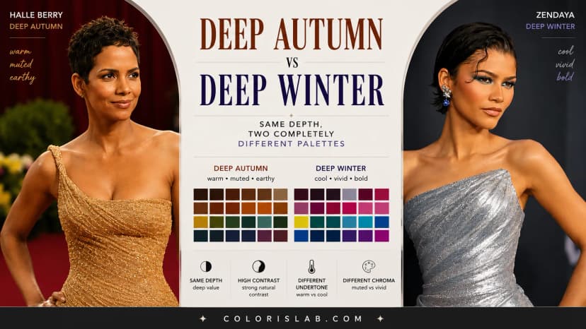
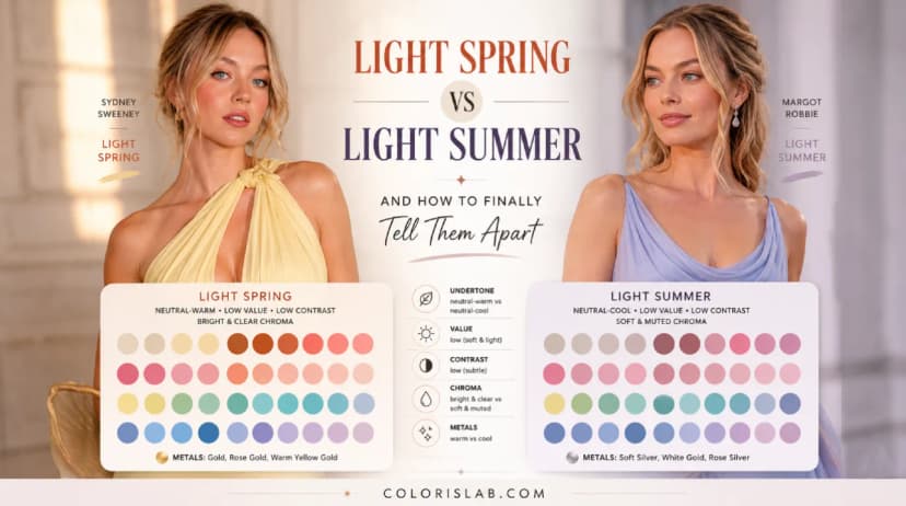
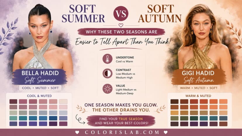
These two seasons are sister seasons. They border each other on the color analysis spectrum. They share the same chroma and the same contrast range. And they are the only two seasons in the entire system built around brightness as their dominant characteristic. Everything in both palettes is vivid, clear, and saturated. There is no softness here, no muting, no greying down of color.
And yet, despite all of that, these two seasons belong to completely different families and wear almost entirely different palettes. The brightness is real in both cases. The direction of that brightness is not the same at all.
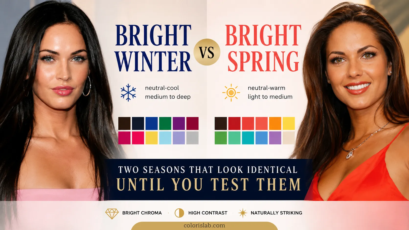
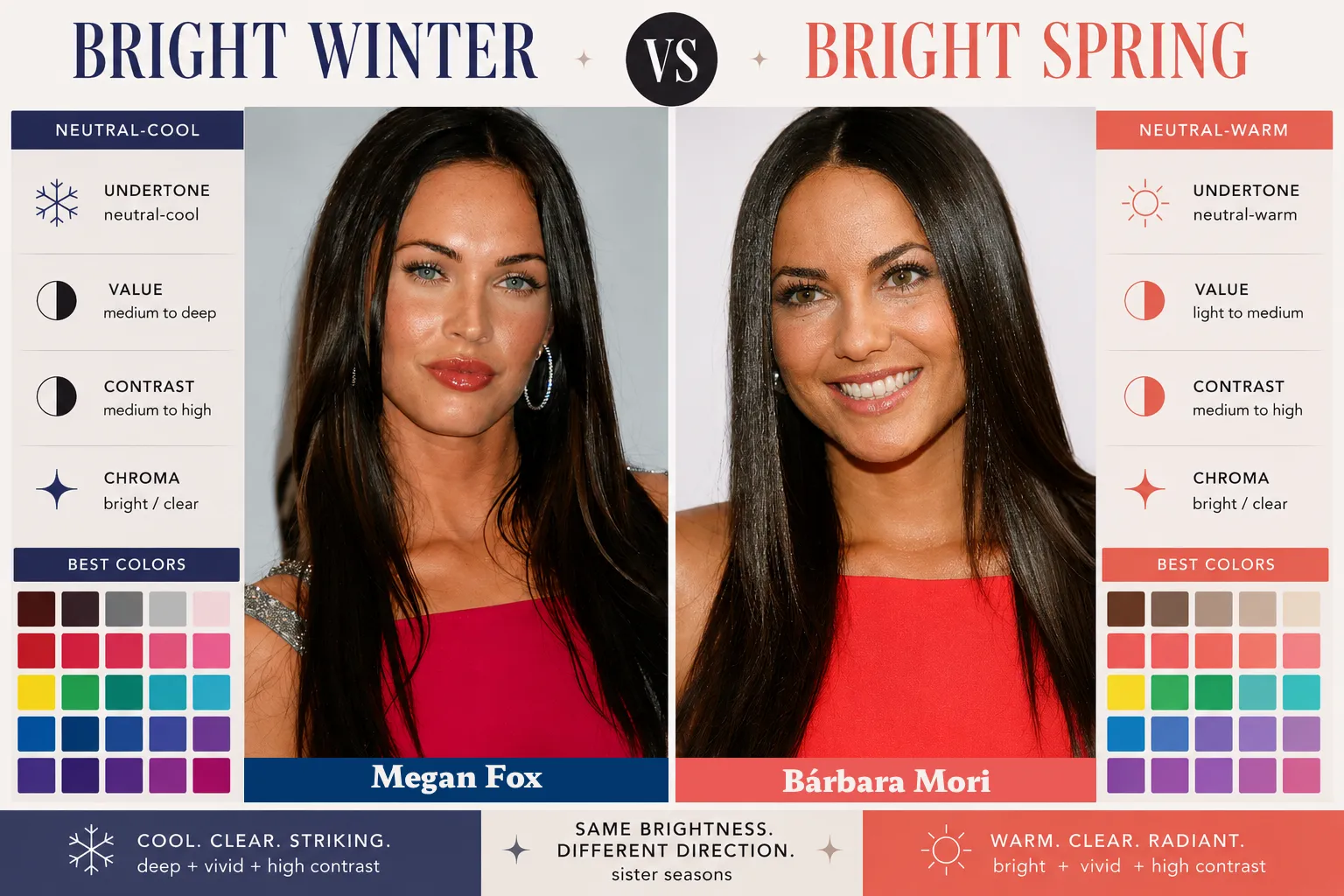
There is also a genuinely interesting real-world example that makes this comparison easier to understand than almost any abstract explanation could. Megan Fox and Bárbara Mori not only belong to these two sister seasons, they have been compared to each other for years because of how visually similar they appear. Bárbara Mori has been called the Latin American Megan Fox more times than either of them would probably care to count. They carry the same striking quality, the same kind of dramatic, high-contrast presence. And they are a perfect illustration of how two people can look remarkably similar and still belong to different seasons with different palettes.
What Bright Winter and Bright Spring Actually Share
The shared characteristics between these two seasons are real and significant.
Both are bright in chroma. This is the defining quality of both seasons and the thing that separates them from every other season in the system. No other season is built around the same level of color intensity. Soft seasons need muted tones. Light seasons need airy, gentle colors. Deep seasons need depth and richness. Only Bright Winter and Bright Spring are genuinely built for vivid, saturated, clear colors at their full intensity.
Both also sit in a medium to high contrast range. Neither season has the blended, soft contrast of a Summer or a Light season. Both have a natural sharpness and definition between features that allows them to carry contrast in clothing. A stark color combination that would overwhelm a lighter or softer season reads as completely natural on both of these.
This shared brightness and contrast is what gives both seasons their striking quality. People who belong to either Bright Winter or Bright Spring tend to have a natural intensity to their appearance. Features stand out. There is definition and drama that does not require much effort to produce.
The Primary Difference: Value
The single sentence that separates them:
Bright Winter
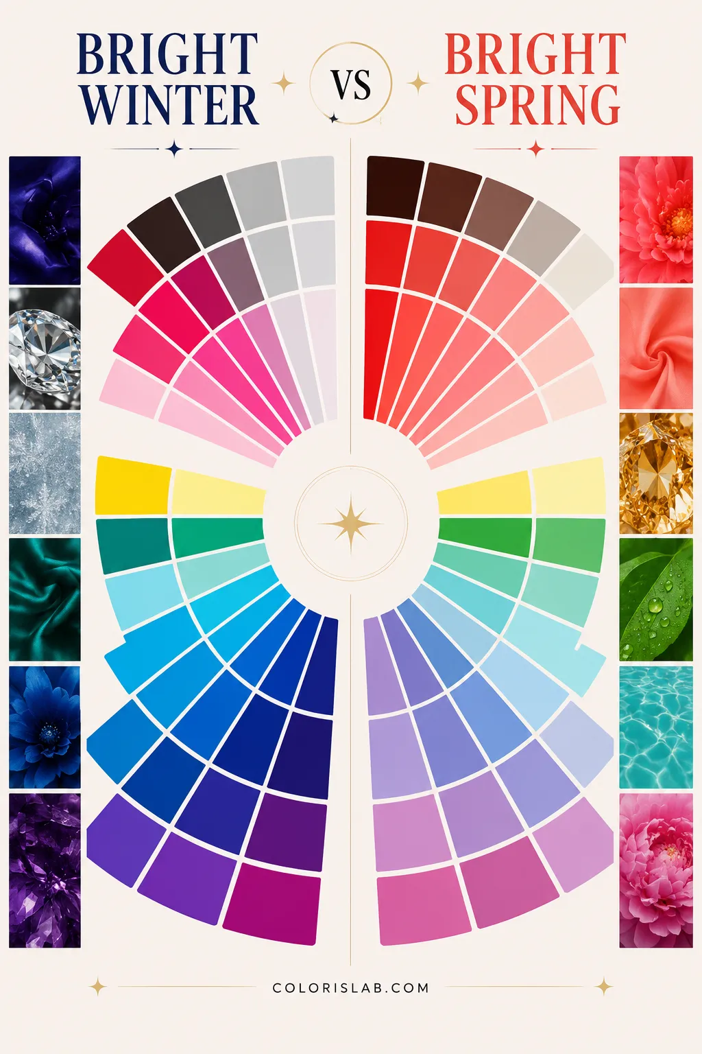
Medium to deep in value. Carries true black, deep jewel tones, rich saturated navy, vivid emerald, sharp fuchsia.
Bright Spring
Light to medium in value. Carries vivid coral, bright warm yellow, clear peach, warm vivid pink, fresh bright greens.
Bright Winter can carry depth. The palette includes true black, deep jewel tones, rich saturated navy, vivid emerald, and sharp fuchsia. These are colors with significant weight and presence. The depth does not soften the brightness, it intensifies it. Bright Winter coloring has enough natural weight and contrast to match that depth and remain the focal point.
Bright Spring sits lighter. The palette includes vivid coral, bright warm yellow, clear peach, warm vivid pink, and fresh bright greens. These are colors that carry the same chroma level as the Winter palette, the same clarity and saturation, but they are lighter in overall value. They have energy and vividness without the depth.
Typical Bright Winter colors
Typical Bright Spring colors
The Secondary Difference: Undertone
Bright Winter is neutral-cool. Bright Spring is neutral-warm.
Both seasons are neutral rather than fully directional in their undertone, which reflects their position as sister seasons bordering each other. Neither sits at an extreme. But the lean is consistent and it changes which specific shades within the bright, high-contrast range actually work.
Bright Winter responds best to cool brightness. The vivid colors in the palette have a cool or neutral base. True red rather than orange-red. Royal blue rather than warm teal. Sharp fuchsia rather than coral pink. The coolness inside the brightness is what connects the colors to the natural coloring and allows the skin to remain the focal point.
Bright Spring responds best to warm brightness. The vivid colors in the palette have a warm or neutral base. Warm coral rather than cool red. Fresh clear yellow rather than icy lemon. Vivid warm green rather than cool emerald. The warmth inside the brightness is what creates the connection to the natural coloring.
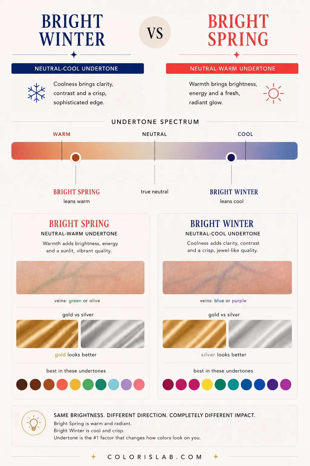
When the wrong direction is used, the skin responds. Cool brightness on a Bright Spring can make the face look slightly reactive or flat. Warm brightness on a Bright Winter can make the warmth in the colors compete with the natural cool undertone, creating a slight visual noise rather than harmony.
These parameters describe the colors in the palettes and how they perform during draping. They are about which direction of brightness produces the clearest skin response, not about how the person looks in isolation.
The Double Method for These Two Seasons
At Colorislab, Bright Winter and Bright Spring are distinguished using the same double method applied to every classification.
Test the difference on your own photo
Drape Bright Winter and Bright Spring palettes side by side and see exactly how your skin responds to each one.
Open Virtual Draping Studio →Celebrity Examples: Megan Fox and Bárbara Mori
Megan Fox is a Bright Winter. She has a neutral-cool undertone, medium to deep value, high contrast between her features, and responds best to vivid, cool-based colors with real depth behind them. Her most iconic looks involve true red, deep jewel tones, rich emerald, sharp fuchsia, and black and white combinations. The crispness and intensity of these colors matches the crispness and intensity of her coloring. When she wears warmer or lighter shades, the precision that defines her appearance softens in a way that reads as slightly less than her best.

Bárbara Mori is a Bright Spring. She has a neutral-warm undertone, light to medium value, the same high contrast as Megan Fox, and responds best to vivid, warm-based colors in a lighter to medium depth range. Her best looks involve vivid coral, warm bright red, clear warm pink, fresh bright green, and warm vivid orange. The energy and brightness of these colors connects with her natural warmth in a way that deeper, cooler shades do not.
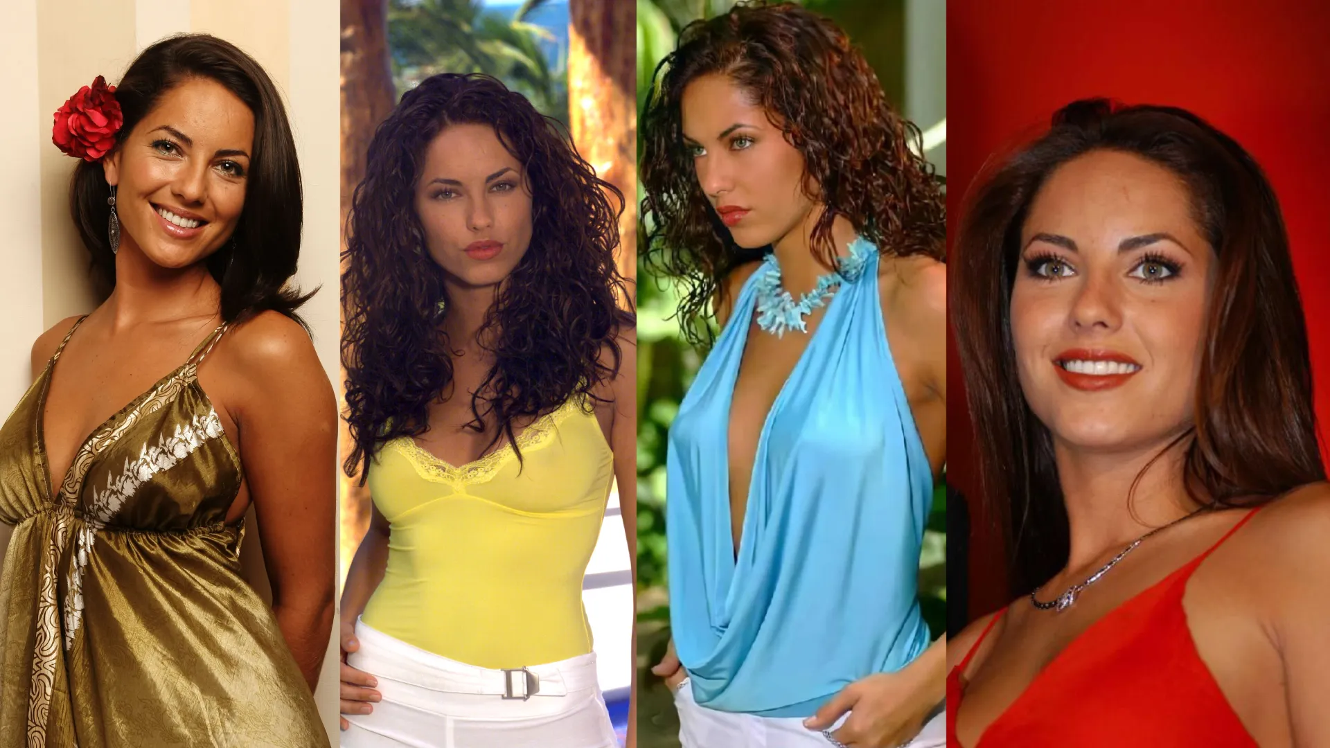
The fun fact that makes this comparison particularly useful is that Bárbara Mori has been called the Latin American Megan Fox throughout her career. The resemblance is real and noticeable. Both women have a striking, high-contrast quality that immediately reads as dramatic and vivid. They both carry the same level of visual intensity.
And yet their palettes diverge significantly. What makes Megan Fox look precise and powerful, the deep cool jewel tones, the sharp icy crispness, would sit differently on Bárbara Mori, where the warmth of her undertone needs a warmer direction inside the same level of brightness. And what makes Bárbara Mori look radiant, the vivid warm corals and fresh energetic tones, would read as slightly lighter and warmer than what Megan Fox's coloring is built to match.
This is one of the clearest real-world demonstrations of why sister seasons are not the same season. Proximity on the spectrum does not mean identical palettes. It means shared characteristics with a meaningful directional difference.
Why This Distinction Is Worth Understanding
Beyond the celebrity comparison, the Bright Winter versus Bright Spring distinction matters because both are relatively rare seasons that are often misidentified in two different ways.
Some bright, high-contrast people get placed into Winter simply because of the contrast and depth, without testing whether the undertone and value actually align with the Winter end. If the person is lighter and warmer in their natural coloring, Bright Spring is the more accurate result.
Others get placed into Spring because of energy and vibrancy, without recognizing that the value is deep enough and the undertone cool enough to point toward Winter. The brightness gets attributed to Spring by default, when Winter is actually the correct home.
Final Comparison
Bright Winter creates cool, precise, electric drama. Bright Spring creates warm, energetic, vivid radiance. Both are among the most visually striking seasons in the entire system. They just achieve that impact through completely different directions of brightness.
Still unsure which bright season you are?
Our AI tool analyzes your photo for undertone, contrast and chroma and gives you a starting point before going deeper into your season.
Try the Free AI Tool →Frequently Asked Questions
What is the main difference between Bright Winter and Bright Spring? ↓
Are Bright Winter and Bright Spring really sister seasons? ↓
Can Bright Winter and Bright Spring wear the same colors? ↓
Is Megan Fox really a Bright Winter? ↓
Is Bárbara Mori really a Bright Spring? ↓
Can Bright Spring wear black? ↓
Can Bright Winter wear warm tones? ↓
How does Colorislab distinguish between Bright Winter and Bright Spring? ↓
ColorisLab Team
Color Analysis ExpertsWe're a team of color analysis enthusiasts dedicated to helping people discover their best colors and build confidence through personalized color advice.