Soft Autumn Overview
Value
Medium to deep
Contrast
Medium to high
Undertone
Neutral-warm
Chroma
Soft
Sister season
Soft Summer
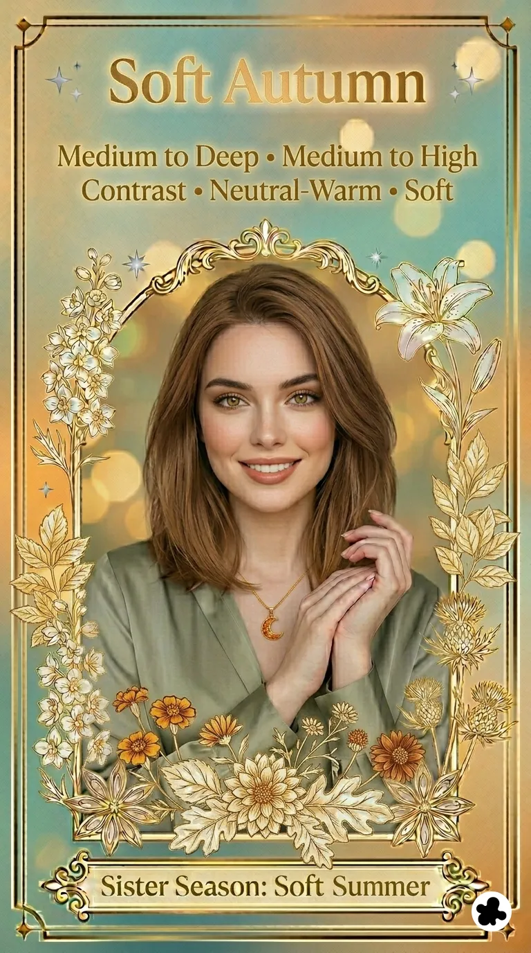
Soft Autumn is the sub-season that sits at the furthest edge of the Autumn family from its warm, vivid center. The warmth is still there and still real, but it has been filtered through a softness and mutedness that belong to the neighboring Summer family. The result is a season that is uniquely blended and understated.
The dominant characteristic is softness in chroma. Before anything else, Soft Autumn coloring reads as muted and harmonious. The secondary characteristic is warmth, which keeps the palette on the warm side of neutral and separates it cleanly from its closest neighbor, Soft Summer. Together they produce the lowest-chroma palette in the entire Autumn family.
The border with Soft Summer is the source of the most difficult identification challenge this season presents. Both are muted. Both have low contrast. Both have features that blend rather than contrast. The single dimension that separates them is temperature, and it is only reliably visible in draping rather than feature analysis. Read the 12 seasons guide if you want to understand how border seasons work before going further.
⚠️
One of the hardest seasons to self-identify
Most seasons have at least one feature that reads clearly: an obvious pink undertone, a golden glow, a strong contrast between hair and skin. Soft Autumn often has none of these. The coloring is defined by harmonious blending rather than any single notable quality. Draping rather than feature analysis is the most reliable path to identification for this season.
Soft Autumn
Autumn family · Borders Summer
Secondary
Neutral Warm (Temperature)
Metals
Brushed gold, bronze
🌿
Soft Autumn Coloring: What to Look For
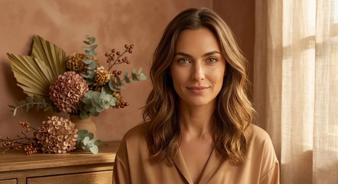
The overall impression of Soft Autumn coloring is blended, harmonious, and quietly warm. Skin, hair, and eyes read as similar in depth and do not contrast sharply with each other. There is low to medium contrast between features, giving the appearance a soft, balanced quality. The beauty is quiet and requires looking rather than announcing itself. When you look at someone who is a Soft Autumn, the first word that comes to mind is usually understated, natural, or serene rather than vibrant or striking.
🧴
Skin
Soft Autumn skin is the most complex of the Autumn family to describe because it is the least obviously warm. The undertone is neutral-warm rather than distinctly golden or peachy. It can read as beige, soft sand, or warm tan, and in some cases has a slightly ashy or muted quality that causes it to be misread as cool. The range extends from fair to tan, always with that soft, warm quality. The complexion often appears muted or softly sun-kissed, never bold or vibrant. Unlike other Autumn types, Soft Autumn skin lacks strong golden or coppery warmth: subtle hints of beige, soft peach, and gentle golden undertones create harmony without announcing themselves.
Light warm beige
Soft sand ivory
Medium warm tan
Golden caramel beige
Freckles are common in this season and, when present, are soft and warm in tone rather than ashy or cool — a useful distinguishing detail from Soft Summer, where freckles have a cooler quality.
💇
Hair
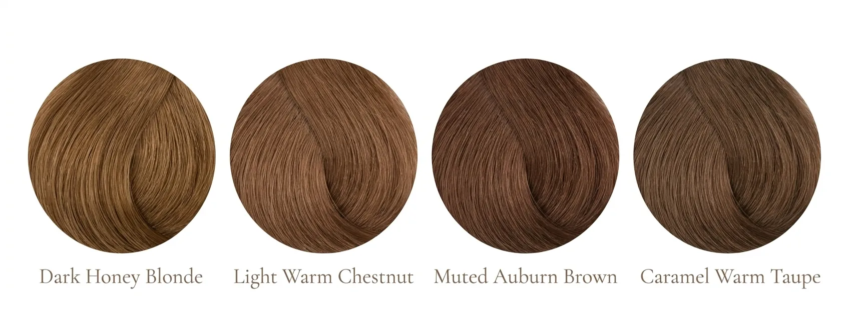
Soft Autumn hair is light to medium-dark in depth with soft golden, honey, or warm brown qualities. The overall appearance is gentle, blended, and subtly warm, often with a slightly sun-faded or matte quality in the light. Compared to other Autumn seasons, Soft Autumn hair is slightly ashier and more subdued, enhancing the season's low-contrast, harmonious look. Bold copper, vivid auburn, or deep bronze are less characteristic: this season leans toward subtle, blended warmth rather than strong vibrancy. Many Soft Autumns feel their hair colour is the most unremarkable thing about them. That quality is itself one of the most characteristic features of the season.
Dark honey blonde
Light warm chestnut
Muted auburn brown
Caramel warm taupe
👁️
Eyes
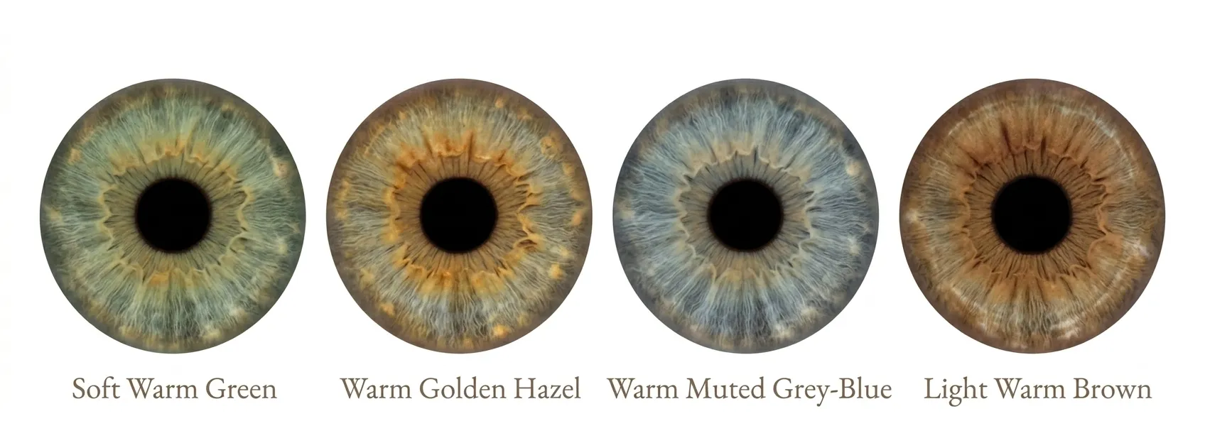
Soft Autumn eyes are warm, muted, and have a gentle, earthy quality. They do not read as a clear, defined colour. Blues have grey and warmth in them. Greens have grey and gold in them. Browns are soft and warm rather than dark and rich. Many Soft Autumns notice their eye colour appears to shift slightly depending on the light, with gentle hints of gold, olive, or taupe adding depth. This changeable quality is itself a useful identification signal: if muted warm tones consistently make your eyes look richer and cool or bright tones consistently make them look flat, that pattern is characteristic of Soft Autumn.
Soft warm green
Warm golden hazel
Warm muted grey-blue
Light warm brown
🎨
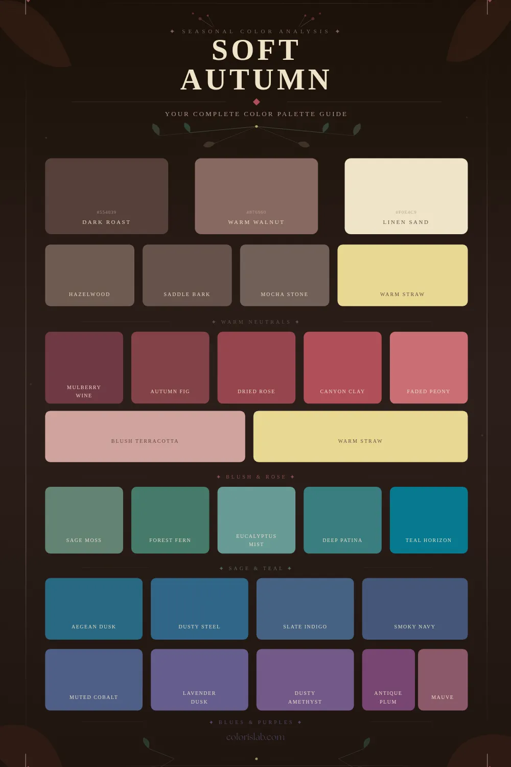
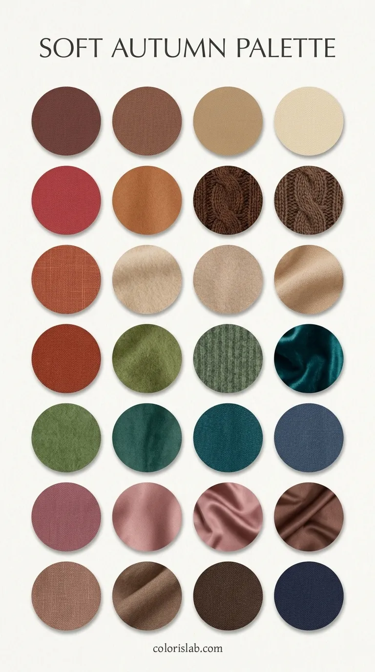
The Soft Autumn Color Palette
Soft Autumn colors share one quality above all others: they are greyed down with warmth. Every color in the palette has been softened with grey or warm smoke, reducing its saturation and creating a blended, diffused quality. Think of colors seen through a golden mist or reflected in still water at sunset. This is the lowest-chroma palette in the Autumn family, more muted than Warm Autumn and Deep Autumn. The warmth is what keeps it in Autumn; the softness is what makes it unique.
The palette is medium in value, meaning colors are neither too light nor too dark. Both extremes feel wrong: very light, airy tones feel too delicate and detached from the coloring, while very dark, rich tones feel too heavy and intense. The sweet spot is always warm, muted, and medium in depth.
✓ Colors that work
Dusty peach
Soft terracotta
Sage green
Moss green
Warm camel
Muted olive
Rose-brown
Cream and ecru
Warm taupe
Soft coral
Golden beige
Muted marigold
✗ Colors that don't work
True black
Bright white
Icy pastels
Cool grey
Cool blue
Bright purple
Electric blue
Fuchsia
Cool lavender
Silver grey
Bright coral
Vivid teal
Colors fail on Soft Autumn in three distinct ways. Cool colors conflict immediately with the warm undertone, making the skin look grey or flat. Bright or vivid colors overpower the low chroma of the coloring, making the skin look washed out and the colour look unrelated to the person wearing it. High-contrast combinations, regardless of temperature, break the natural blended quality of the coloring and create a jarring impression. The palette is always warm, always soft, and always part of a whole.
A note on neutrals
Black and stark white are the two neutrals that work least well for this season. Instead of black, the best dark neutrals are dark warm brown and very dark olive green. Instead of stark white, the best light neutrals are cream, ecru, warm off-white, and light warm beige. These substitutions are not minor adjustments; for Soft Autumn coloring, they make a visible and immediate difference to how the skin looks.
Soft Autumn is one of the seasons where finish matters as much as metal color. Gold, rose gold, bronze, and pewter are the right temperature choices, but high-polish, bright-finish versions can be too stark for the low chroma of this season. A brushed, antiqued, or matte finish suits Soft Autumn coloring better than a mirror-polished version. This distinction is important: high-polish yellow gold can look slightly garish against Soft Autumn skin, while the same color in a brushed finish looks harmonious and warm.
Brushed gold
Antique gold
Rose gold (matte)
Bronze
Pewter
Soft silver (matte)
Warm champagne
High-polish gold
Bright silver
Platinum
For gemstones, look for soft, warm, and lightly luminous options: smoky quartz, moss agate, jasper, tiger's eye, amber, citrine, carnelian, and warm pearls. Stones with subtle veining or translucency suit the muted, blended quality of this season well. Brilliant-cut, highly reflective stones that sparkle intensely are too vivid for the low chroma of Soft Autumn. Cool stones like sapphire, amethyst, and aquamarine are the wrong temperature entirely. Natural materials, including wood, leather, and woven textures, also work beautifully alongside jewelry for this season.
Soft Autumn makeup has a different brief than most seasons. The goal is not to create a defined look or a polished finish. It is to enhance the natural blending of the coloring by using muted, warm, and harmonious pigments that feel like an extension of the features rather than a layer placed over them. Bold definition, cool tones, bright colors, and high-contrast combinations all work against this season. The best Soft Autumn makeup looks as if it might not be there at all, while the skin reads as slightly more even, the eyes slightly deeper, and the lips slightly richer.
Neutral-warm undertoned formulas with a satin or natural finish. Because Soft Autumn skin is not distinctly golden the way Warm Autumn skin is, formulas that are too yellow can be as wrong as those that are too pink. The aim is as close to the natural skin tone as possible in undertone. Avoid dewy or radiant finishes, which can introduce a high-shine quality that conflicts with the muted coloring.
warm beige
golden ivory
neutral-warm sand
Peachy pinks, muted apricot, rosewood, and soft coral, applied very softly and blended thoroughly. The goal is a suggestion of warmth rather than a defined flush. Anything too pink, too cool, or too bright will look separate from the face rather than part of it. Rosewood and muted apricot are the most characteristic Soft Autumn blush tones.
soft peach
rosewood
terracotta blush
Warm muted neutrals: taupe, khaki, warm brown, soft bronze, and muted copper for everyday. A soft smoky eye using muted bronze and warm greyed brown adds depth without harsh definition. Liner in soft brown, warm taupe, muted green, or bronze rather than black. Jet black creates too sharp a contrast with the low-chroma coloring. Brown-black or warm grey mascara integrates better than pure black.
warm taupe
soft bronze
moss green
Peachy browns, soft corals, dusty rose, terracotta, warm nude, and muted brick red. Satin or creamy finishes work best; gloss in warm peach or rose is also a good option. Avoid cool pinks, blue-based reds, and bright fuchsias. Also avoid overly glossy or bright colors, which feel too stark against the naturally muted coloring.
peachy brown
terracotta
muted brick red
⚖️
Soft Autumn vs. Neighboring Seasons
Soft Autumn is most commonly confused with three seasons: Soft Summer, Warm Autumn, and occasionally Deep Autumn. The Soft Summer confusion is the most consequential because the two seasons share their dominant characteristic and differ only in temperature.
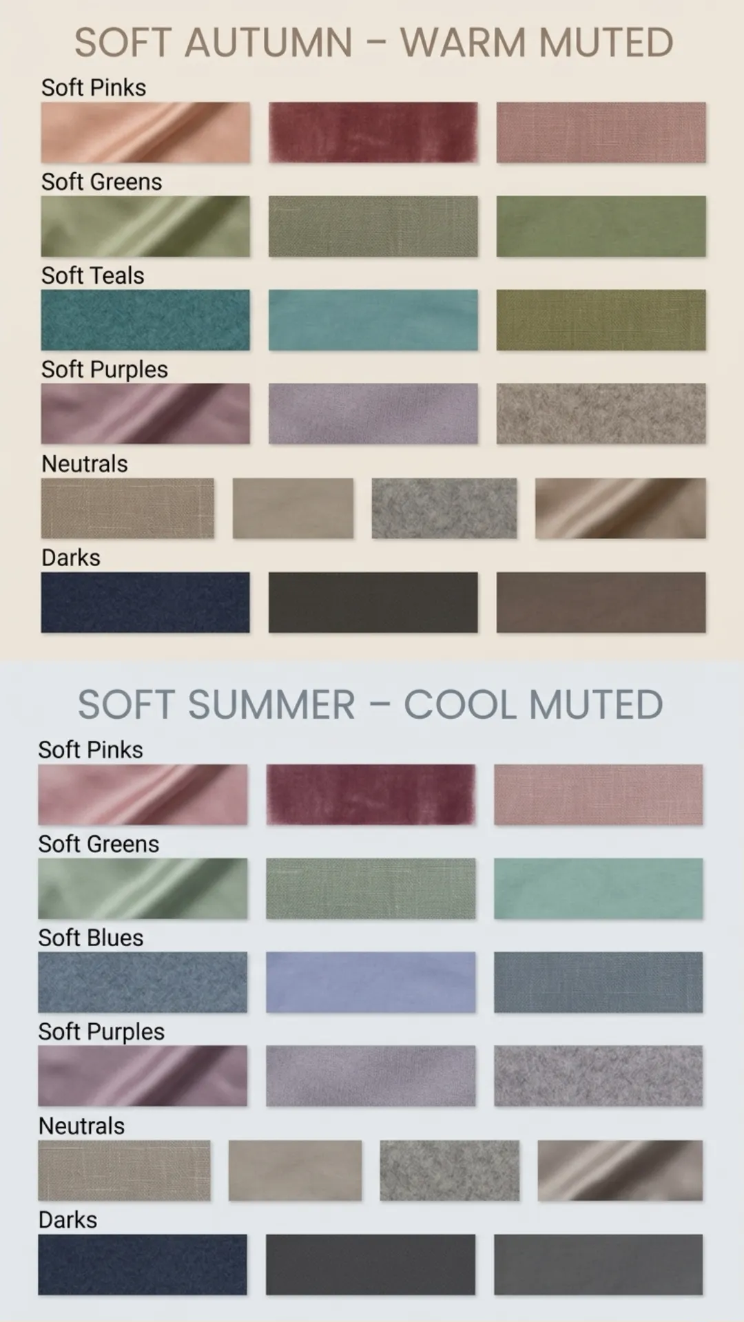
Muted and warm. Brushed gold harmonizes with the skin. Warm muted tones like dusty peach, moss green, and soft terracotta look right. Cool tones, even muted ones, produce a slight greyness or flatness in the skin. The mutedness is about warm dust rather than cool smoke.
Muted and cool. Silver harmonizes with the skin. Cool muted tones like dusty rose, grey-blue, and soft mauve look right. Warm tones, even muted ones, produce a slight sallowness. The mutedness is about cool smoke rather than warm dust.
The test: Hold a soft olive fabric (warm muted) and a soft grey-blue fabric (cool muted) up in turn. Whichever makes the skin look clearer and more alive tells you which season you are. Olive works for Soft Autumn; grey-blue works for Soft Summer. This single test, done in natural light, resolves most cases where feature analysis has been inconclusive.
Softness dominates. Everything is greyed-down and muted. A clear terracotta looks slightly too vibrant and defined. Higher saturation in any color makes the coloring look flat by comparison. The palette needs to stay greyed and blended throughout.
Warmth dominates. The warmth is defined enough to carry medium-saturation colors without looking flat. A clear terracotta looks grounded and natural. The palette carries more vibrancy without overwhelming the coloring.
The test: Try a clear terracotta and a heavily greyed, muted terracotta side by side. If the clear version looks right, you lean Warm Autumn. If the greyed version is more harmonious and the clear version feels slightly too intense, you are Soft Autumn.
Medium in depth with low chroma. Dark, rich colors feel too heavy and intense. The palette needs a grounded, blended quality without extreme depth. Very light, airy tones are also too delicate.
Deep in value with rich chroma. Medium-depth colors can feel slightly washed out. The palette needs the depth and richness of dark, warm tones to come alive.
The test: Try a deep chocolate brown and a medium warm brown side by side. If the deep brown looks rich and the medium brown feels flat, you lean Deep Autumn. If the medium warm brown is more harmonious and the deep brown seems too heavy, you are Soft Autumn.
👗
Building a Soft Autumn Wardrobe
A Soft Autumn wardrobe is built around the principle of tonal harmony. Every piece should feel as if it belongs to the same world: warm, muted, and blended. The result may look understated when viewed in isolation but becomes quietly sophisticated when worn by the right person. The opposite experience, where the clothes wear the person rather than the person wearing the clothes, is what happens when Soft Autumn coloring meets bright, cool, or high-contrast clothing.
Cream and warm off-white replace stark white. Warm camel, taupe, and beige replace cool grey. Soft brown and dark olive green replace black. Muted soft navy can work as a deeper neutral, but true black should be avoided near the face. These neutrals carry an entire wardrobe with minimal signature color additions and read as a unified, harmonious whole.
Cream
Warm camel
Warm taupe
Dark olive
Warm brown
These are the colors that make Soft Autumn coloring come to life. A dusty peach blouse, a moss green coat, a soft terracotta dress. These pieces do something visible when worn near Soft Autumn coloring: the skin looks clearer, the eyes look deeper, and the overall impression becomes quietly luminous rather than flat. They do not work this way for other seasons, which is the clearest confirmation that the season identification is correct.
Dusty peach
Soft terracotta
Sage green
Moss green
Rose-brown
3
Contrast, Prints, and Texture
Soft Autumn has low to medium natural contrast, and outfit combinations should reflect this consistently. Tonal dressing is the approach that works best: layers of dusty peach and warm camel, or sage green with soft olive and cream. Any single element that stands out too sharply from the rest disrupts the blended harmony that makes Soft Autumn dressing look sophisticated rather than plain. For prints, choose soft, natural patterns: watercolor florals, subtle plaids, leaves, woodgrain, and earthy textures in small to medium scale, rendered in Soft Autumn colors. High-contrast geometrics, sharp black-and-white patterns, and dense structured prints work against the season's natural blending. Fabrics with soft texture and matte or semi-matte finishes complement the natural softness: brushed cotton, linen blends, soft knits, fine wool, cashmere, suede, and matte silk all suit this season well.
🤖
Still unsure if you're a Soft Autumn?
The hardest part of Soft Autumn identification is the border with Soft Summer. Both seasons read as muted and low-contrast, and the difference is in temperature alone. Our AI tool analyzes your photo for undertone direction and gives you a starting point to guide your draping tests.
Try the Free AI Tool →
❓
Frequently Asked Questions
Why is Soft Autumn so hard to identify?
↓
Because the season's defining characteristics are the absence of things rather than the presence of them. There is no obvious strong warmth, no obvious coolness, no high contrast, no pronounced depth, no strong chroma. Features blend together harmoniously without any single element standing out. Most identification methods rely on identifying something notable. Soft Autumn often does not give that. Draping, where the difference between what works and what does not is visible in real time on the skin, is the method that works most reliably for this season.
Can a Soft Autumn wear black?
↓
Black is the most difficult neutral for Soft Autumn near the face. It creates a contrast level that does not match the natural low contrast of the coloring, and it lacks the warm, muted quality this season needs. The skin tends to look flat, greyish, or slightly yellowish next to black rather than alive and clear. Dark warm brown, very dark olive green, and deep charcoal-brown are much better alternatives for dark neutral needs. In clothing away from the face the impact is lower, but even there, very dark tonal dressing in brown or olive tends to produce a more harmonious result than pure black.
I have cool-looking features but I test warm in draping. Can I be a Soft Autumn?
↓
Yes. Soft Autumn is one of the seasons most likely to produce this experience. The
undertone is neutral-warm rather than clearly warm. The neutral element means some Soft Autumns have coloring that reads as cool or neutral under casual observation. Ashy brown hair can look cool in some lighting. Grey-green eyes can read as cool. But when gold versus silver draping is done in consistent natural light near the face, the warm undertone becomes visible because silver consistently introduces a slightly grey or flat quality that gold does not. Trust the draping result over the feature reading.
Can a Soft Autumn wear silver jewelry?
↓
Soft, matte silver can work for Soft Autumn, particularly if it has a warm patina or antique finish. However, bright, high-polish silver is generally too stark and cool. If you prefer silver, look for oxidized, brushed, or antique-finish silver. But overall, gold, rose gold, bronze, and pewter will harmonize more naturally with the warm undertone and produce a more effortless result.
Does Soft Autumn coloring age well?
↓
Yes. The natural greying pattern for this season tends toward warm grey or soft silver with a slightly yellow tint rather than stark white or cool white, and it harmonizes beautifully with the season's muted warmth. The muted, blended quality of the coloring also means there is less obvious change as depth decreases with age than in seasons that start with stronger contrast. Many Soft Autumns find their coloring becomes more balanced and harmonious over time, and the palette remains essentially the same throughout.