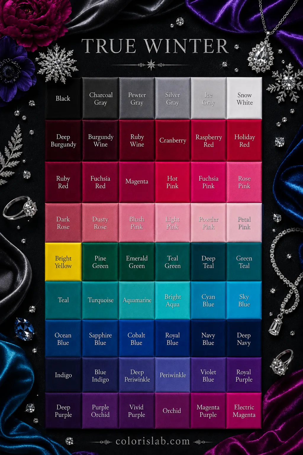
In the 12-season system, True Winter and Cool Winter are often used interchangeably. In the 16-season system, they are treated as distinct seasons.
True Winter
Value
Medium to deep
Contrast
Medium to high
Undertone
Cool
Chroma
Bright
Sister season
Cool Winter
Cool Winter
Value
Deep
Contrast
Medium to high
Undertone
Cool
Chroma
Bright
Sister season
True Winter
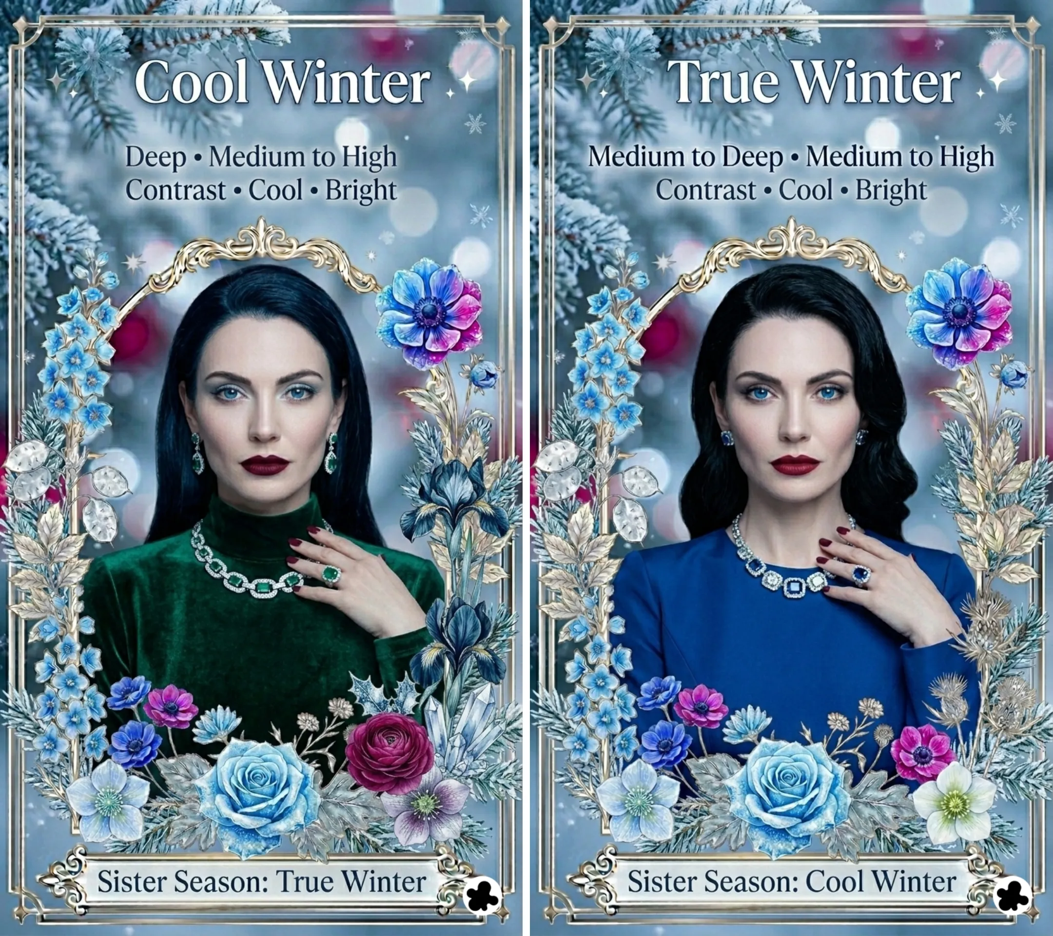
Cool Winter or True Winter is the season at the center of the Winter family. Where Deep Winter is defined by its depth first and Clear Winter by its brightness, Cool Winter is defined by coolness above all else. The coolness is not the icy, airy coolness of a Summer season. It is clear and saturated. But it is unmistakably, definitively cool, and it shapes the entire palette.
The dominant characteristic is coolness in hue. Before anything else, your coloring reads as cool and clear. The secondary characteristic is brightness: the palette is vivid and saturated rather than muted or dusty. Together they produce a season that is the purest expression of what Winter is: cool, clear, and striking in precisely the way that makes other seasons look slightly mismatched in the same colors.
Cool Winter does not border another family in the way Deep Winter borders Autumn. It sits at the center of the Winter family, which means its palette stays consistently cool and clear throughout without the warmth-of-depth complication. Read the 12 seasons guide if you want to understand how this fits into the full system.
Cool Winter
Winter family · True season
Dominant
Cool (Temperature)
🌿
Cool Winter Coloring: What to Look For
The most reliable way to identify Cool Winter coloring is the immediate impression of coolness combined with a clarity that stops short of being electric or overwhelming. Features are clearly cool in temperature and clear in quality. The overall effect is striking and polished. When you look at someone who is a Cool Winter, the first words that come to mind are usually cool, clear, or dramatic rather than warm, soft, or earthy.
🧴
Skin
Cool Winter skin has unmistakable cool undertones: pink, rosy, or cool beige. There is no trace of golden, peachy, or warm quality. The range runs from fair to deep, always with that defining cool clarity. Fair skin in this season often has a porcelain or translucent quality with visible pink or rosy tones. In sun, Cool Winter skin burns before it tans and maintains its cool quality even when tanned. The skin has a clear, even surface quality that is one of the most characteristic features of this season.
Fair cool pink
Medium cool beige
Cool olive grey
Deep cool ebony
💇
Hair
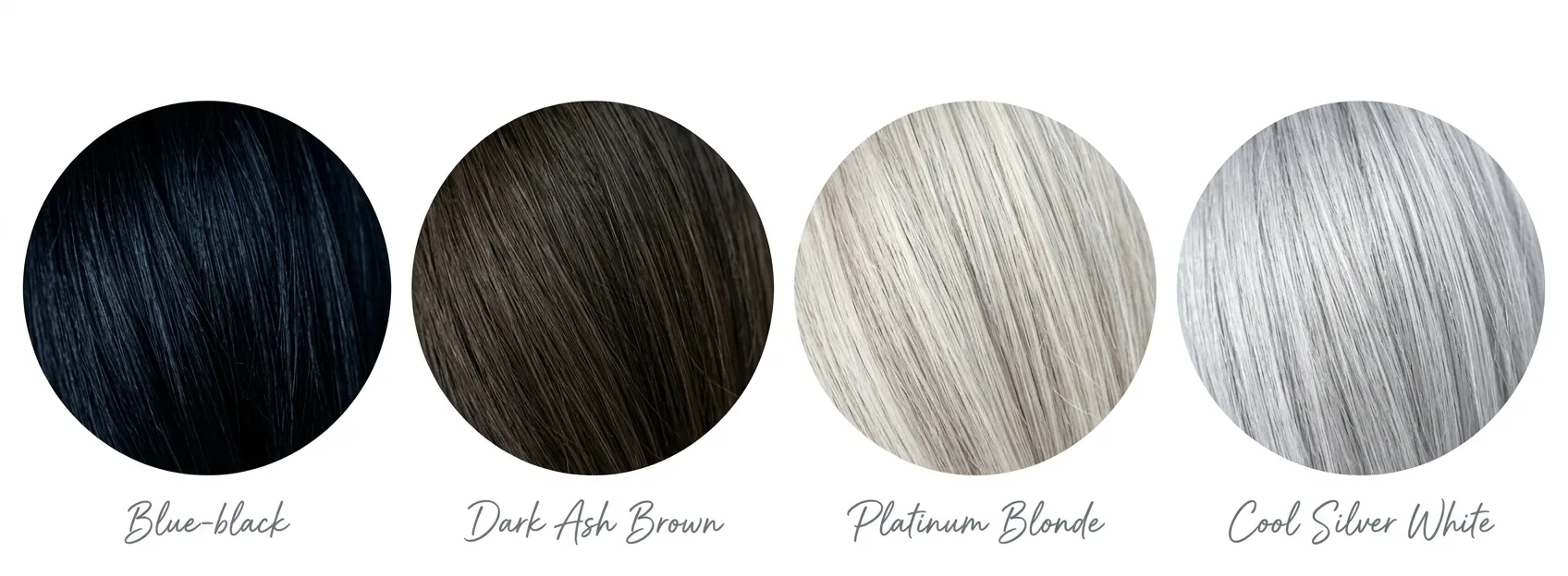
Cool Winter hair is cool at every depth level. Black hair has a blue-black or neutral-black quality with no brown or golden cast. Dark brown hair is ash-toned and cool. Blonde hair in this season is platinum or silver-blonde, never golden or warm. In sunlight there are no copper or warm highlights, only a cool, sometimes blue-tinged sheen. When Cool Winter hair lightens with age, it tends toward cool silver or pure white rather than warm grey or yellow-tinged white.
Blue-black
Dark ash brown
Platinum blonde
Cool silver white
👁️
Eyes
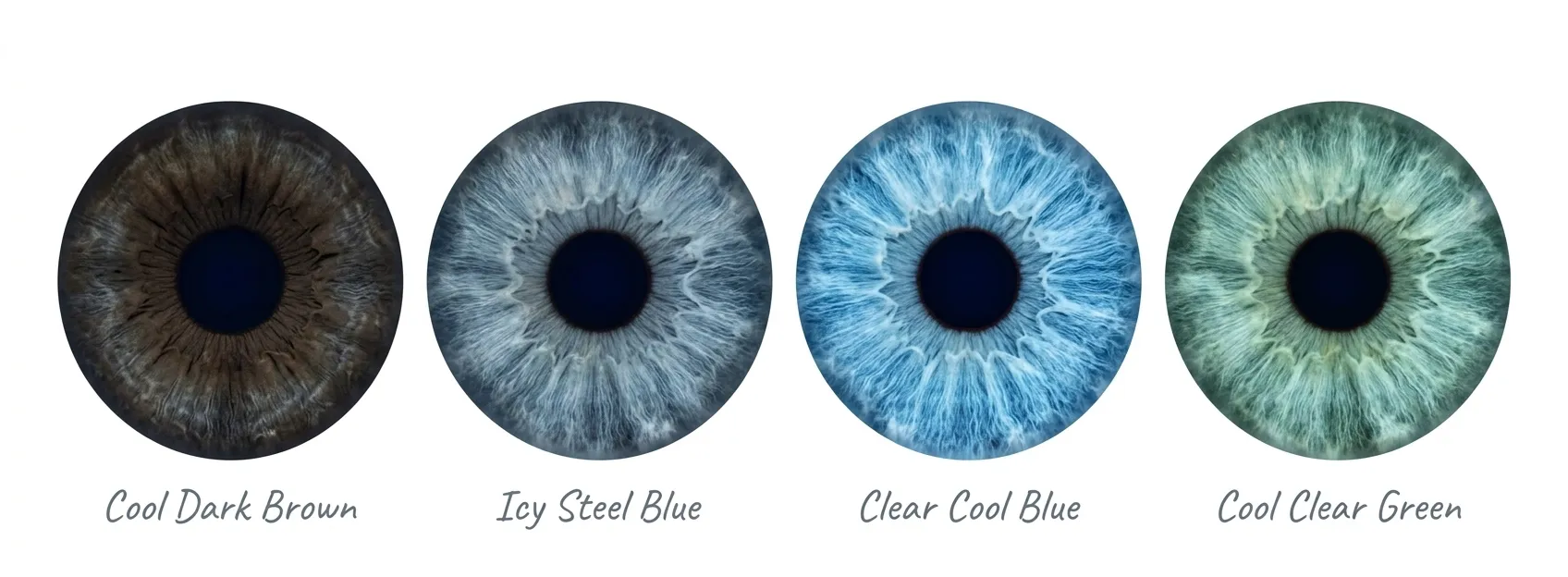
Cool Winter eyes are clear, cool, and often have a piercing quality. Dark brown eyes are deep and cool with no visible warmth. Blue eyes in this season are one of the clearest and most striking expressions of the season: icy blue, steel blue, or clear cool blue with defined contrast at the iris edge. Cool green eyes are clear and sharp rather than warm or olive-toned. Grey eyes are clear and cool rather than warm or hazel-influenced. The eyes have a defined, precise quality against the white of the eye that is one of the most characteristic visual features of this season.
Cool dark brown
Icy steel blue
Clear cool blue
Cool clear green
🎨
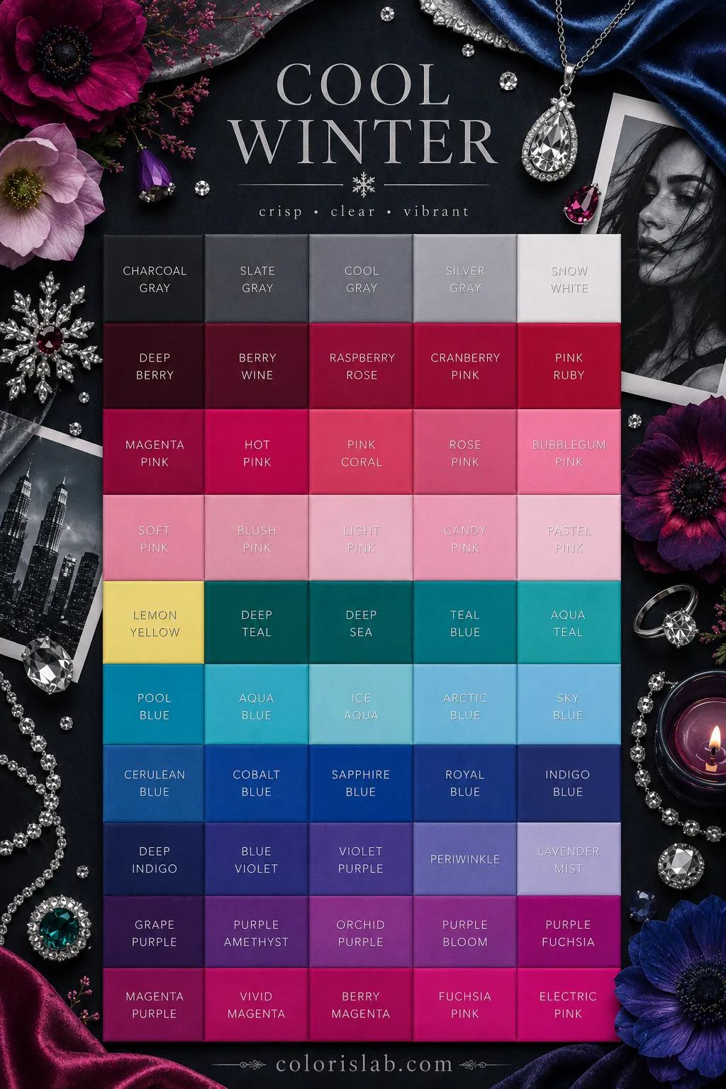
The Cool Winter Color Palette
Cool Winter colors share two qualities above all others: they are cool and clear. Every color in the palette has a blue-based quality that gives it coolness, and a saturation that gives it clarity. Think of the clearest winter sky, the most brilliant cool gemstones, the sharpest contrasts of a snowy landscape lit by cold sun. This is the purest cool palette in the entire 12 seasons system, cooler than Deep Winter and sitting at the heart of the Winter family.
The palette runs from light to dark, but every color shares the same cool, clear quality. Icy pastels sit alongside deep jewel tones, unified by their cool undertone and saturation. Chroma is medium to high. What the palette does not include is anything muted, greyed, dusty, or warm. Those qualities belong to Summer, which is the cool season on the other side of the spectrum.
✓ Colors that work
True black
Pure white
True red (cool)
Royal blue
Fuchsia
Emerald green
Cool navy
Charcoal
Icy pink
Icy blue
Cool purple
Raspberry
✗ Colors that don't work
Warm brown
Camel or tan
Rust or terracotta
Mustard or olive
Peach or coral
Warm orange
Dusty rose
Muted mauve
Warm red
Golden yellow
Cream or ecru
Soft muted tones
Colors fail on Cool Winter in two distinct ways. Warm colors conflict with the cool undertone immediately, making the skin look sallow, grey, or simply at odds with the clothing. Muted, dusty, or greyed colors lack the saturation that the coloring needs and produce a washed-out impression, as if the face has faded against what it is wearing. The palette always needs both coolness and clarity simultaneously. A color that is cool but muted, such as dusty lavender or greyed blue, belongs to Summer rather than Winter. When in doubt, hold the fabric up to your face in natural light: if the skin looks clear and the eyes brighten, the color is right.
A note on icy pastels
Icy pastels, such as icy pink, icy blue, and icy lavender, are a genuine part of the Cool Winter palette. They differ from the soft, muted pastels of Summer in one important way: they are clear and cool rather than greyed or dusty. An icy pink is not a warm blush pink or a dusty mauve. It is a very light, very cool, saturated-in-quality pink that provides high contrast against the dark features of this season. They work because the clarity is intact, not because the color is particularly light.
Silver is the natural metal for Cool Winter, and the result is immediate: silver integrates with the cool undertone of the skin so completely that it looks as if it belongs there. Gold sits visibly warm and separate. Platinum and white gold work equally well. Unlike Deep Winter, where darker and heavier metals like gunmetal and pewter also work because of the depth of the coloring, Cool Winter is most naturally suited to bright, polished, high-shine silver and platinum. The clarity of the coloring resonates with the brilliance of these metals.
Silver
Platinum
White gold
Diamonds
Polished steel
Pewter (light)
Yellow gold
Rose gold
Bronze
For gemstones, cool and clear options suit this season best: diamonds, sapphires, emeralds, rubies (in their blue-red rather than orange-red form), amethysts, clear quartz, and black onyx. The clearer and more brilliant the stone, the more naturally it resonates with Cool Winter coloring. Warm stones like amber, citrine, tiger's eye, and carnelian introduce the wrong temperature and will always look slightly off regardless of how beautiful they are on their own. Sparkling, faceted stones set in silver or platinum are the most natural choice for this season.
Cool Winter makeup should enhance the natural coolness and clarity of the coloring. The goal is a polished, striking look that is cool in temperature and clear in quality. Warm pigments, golden or bronze products, and earthy tones work against this season. Muted or dusty versions of cool colors also fail here for the same reason they fail in clothing: they reduce the saturation the coloring needs. The best Cool Winter makeup looks precisely cool, precisely defined, and effortlessly striking.
Cool or neutral-cool undertoned formulas that match the skin precisely. Descriptors like cool, neutral, pink, porcelain, ivory, or rosy are reliable guides. Avoid anything with a golden, yellow, or peachy undertone. A satin or natural finish works best, giving the skin a clear, polished quality. Matte finishes work for a more editorial look but should not veer into dull or flat territory.
cool porcelain
rosy ivory
neutral sand
Cool pink, fuchsia, raspberry, magenta, and cool rose. The key distinction from Summer is clarity: the blush must be a clear, cool pink rather than a muted, dusty, or greyed pink. For deeper skin tones, deep cool berry and cool wine work well. Avoid peach, coral, apricot, warm pink, and any blush with an orange or brown quality. A clearly defined flush rather than a diffused, natural-looking warmth is the goal.
fuchsia pink
raspberry
cool rose
Cool and clear: charcoal, silver, cool grey, navy, cool taupe, cool purple, emerald, and royal blue. A charcoal or silver smoky eye is one of the most naturally powerful looks for this season. For color, cool purple, royal blue, or emerald on the lid creates a jewel-toned effect that resonates with the season's character. Liner in cool black or charcoal. Silver shimmer as a highlight adds cool clarity and brightness at the inner corner or lid.
charcoal
royal blue
emerald
True red with a blue base, fuchsia, magenta, raspberry, cool deep berry, and cool wine. A true red lip is one of the most naturally powerful looks for Cool Winter, looking definitive rather than costume-like. For a more everyday option, a clear cool pink or raspberry works well. Avoid warm reds with orange undertones, brick tones, terracotta, caramel, and any nude with a warm or brown quality. Matte and satin finishes are most characteristic; gloss in clear or icy pink works for casual looks.
true red
fuchsia
raspberry
⚖️
Cool Winter vs. Neighboring Seasons
Cool Winter is most commonly confused with three seasons: Deep Winter, Clear Winter, and Cool Summer. The Deep Winter confusion is about depth. The Clear Winter confusion is about brightness. The Cool Summer confusion is about temperature and chroma: both are cool, but the coloring demands are very different.
Coolness dominates. Colors are cool and clear across the full value range. The palette moves comfortably from icy pastels to deep jewel tones, united by their cool clarity. Very dark, heavy tones can feel slightly overpowering when worn alone.
Depth dominates. Colors need to be dark and rich to look most natural. Medium or lighter cool tones can feel slightly airy or washed out against the intensity of the coloring. The palette needs depth to truly come alive.
The test: Try a royal blue and a deep charcoal navy side by side. If the royal blue looks natural and the deep navy feels slightly heavy or intense, you are Cool Winter. If the deep charcoal navy looks rich and alive and the brighter blue feels slightly too light, you are Deep Winter.
Coolness is dominant, brightness secondary. Colors are cool and clear, but not electric or neon. Very bright, almost-neon colors can feel slightly too intense. The palette is cool first; the brightness follows from the coolness.
Brightness is dominant, with coolness secondary. Colors need to be high-intensity and vivid. The palette can include some warmer brights that Cool Winter cannot carry. The coloring needs the electric quality of maximum chroma to look truly alive.
The test: Try a clear true blue and an electric, almost-neon royal blue side by side. If the true blue looks natural and harmonious and the electric version feels slightly too intense, you are Cool Winter. If the electric blue looks alive and energizing and the true blue feels slightly understated, you are Clear Winter.
Cool and clear. Saturated, vivid colors look natural and alive. Muted or dusty versions of cool colors look flat and washed out. High contrast within the cool palette is not only acceptable but flattering.
Cool and soft. Muted, dusty, or greyed versions of cool colors look most natural. Saturated, vivid colors look slightly too intense and sharp. Low to medium contrast within the cool palette is most flattering.
The test: Try a clear, saturated fuchsia and a muted, dusty rose side by side. If the clear fuchsia looks natural and the dusty rose looks flat or washed out, you are Cool Winter. If the dusty rose looks harmonious and the clear fuchsia feels slightly too sharp or intense, you are Cool Summer.
👗
Building a Cool Winter Wardrobe
A Cool Winter wardrobe is built around cool, clear, striking harmony. Every piece should feel as if it belongs to the same world: cool in temperature, clear in quality, and confident in contrast. The result is a wardrobe that looks polished and effortlessly powerful in a way that warm, muted, or earthy palettes cannot replicate for this coloring.
True black and pure white are both genuine neutrals for Cool Winter, which places this season among very few that can carry the full black-and-white contrast naturally. Charcoal, cool dark navy, and cool grey complete the range. Unlike Autumn seasons whose wardrobe is built around warm dark neutrals and cream, Cool Winter's foundation is built around the cool end of the value spectrum, from stark white to true black, with cool greys and navies in between. This is not a limitation but a strength: these neutrals are versatile, elegant, and completely at home with the coloring.
True black
Pure white
Charcoal
Cool navy
Cool grey
The clearest, coolest expressions of saturated color: true red, royal blue, emerald green, fuchsia, cool purple, and raspberry. These colors do something immediate and visible when worn near Cool Winter coloring: the skin takes on a clear, luminous quality, the eyes sharpen and brighten, and the overall impression becomes striking and authoritative. True red and royal blue are arguably the most powerful single signature colors for this season. A true red worn by a Cool Winter looks genuinely definitive in a way that it will not on any warmer or more muted season.
True red
Royal blue
Emerald green
Fuchsia
Cool purple
3
Contrast, Prints, and Texture
Cool Winter has medium to high natural contrast, which means bold combinations within the cool palette look natural rather than overdone. Black and white, true red and black, royal blue and pure white: these high-contrast pairings are among the most powerful options available to this season and look genuinely at home with the coloring in a way they do not on lower-contrast or warmer seasons. For prints, graphic and bold patterns work best: houndstooth, sharp stripes, bold geometrics, high-contrast florals, and clean abstract designs. Delicate, soft, or warm-toned prints tend to disappear against the clarity of the coloring. Fabrics can range from crisp and matte to high-shine: silk, satin, polished cotton, fine wool, and cashmere all work, as do patent leather for accessories. The overall quality of the fabric matters: crisp, clean, and well-finished resonates with the clarity of the season in a way that relaxed or rough textures do not.
🤖
Still unsure if you're a Cool Winter?
The most common confusion is the border with Cool Summer, where both seasons are cool but the chroma demand is completely different. Our AI tool analyzes your photo for undertone and chroma direction and gives you a starting point before you test clear fuchsia versus dusty rose in person.
Try the Free AI Tool →
❓
Frequently Asked Questions
Is Cool Winter the same as True Winter?
↓
Yes. Cool Winter and True Winter are two names for the same sub-season. Cool Winter is the more descriptive name used in many 12-season frameworks, emphasizing that coolness is the dominant characteristic. True Winter is used in some systems to indicate the most representative, central expression of the Winter family. The palette, dominant characteristic (coolness), and secondary characteristic (brightness) are identical under both names.
Can a Cool Winter wear brown?
↓
Warm brown is not a natural color for Cool Winter. The temperature conflict is immediate and visible. The closest acceptable option is a very cool taupe or greige, which has more grey in it than brown and sits at the cool end of a neutral range. But black, charcoal, and cool navy are far more natural and harmonious dark neutrals for this season, and they will produce a noticeably better result near the face.
Can a Cool Winter wear pastels?
↓
Yes, but specifically icy pastels rather than soft or muted pastels. Icy pink, icy blue, and icy lavender are genuine Cool Winter palette colors. The distinction from Summer pastels is clarity: these colors are very light but cool and clear rather than greyed or dusty. They provide high contrast against dark Cool Winter features and look striking rather than faded. Soft, muted, or warm pastels belong to Summer and will look washed out or mismatched for this season.
I think I'm cool, but saturated colors sometimes feel too much. Could I be a Cool Summer?
↓
This is worth testing carefully.
Cool Summer and Cool Winter are both cool, but the chroma requirement is opposite. Cool Summer needs muted, greyed, dusty colors. Cool Winter needs clear, saturated colors. The best test is to drape a clear fuchsia and a muted dusty rose in natural light near your face. If the clear fuchsia makes the skin look clear and the eyes brighten, you are Cool Winter. If the dusty rose looks more natural and the fuchsia introduces a slightly harsh or too-defined quality, you are Cool Summer. The difference in the skin's response is visible and decisive.
Does Cool Winter age well?
↓
Yes. Cool Winter ages with considerable distinction. As hair naturally lightens to cool silver or pure white, the contrast between hair and skin often becomes more striking rather than less, and the clear, cool palette continues to provide the same flattering response from the skin at every age. The jewel tones and clear cool colors that suit this season are not dependent on youthful coloring; they respond to the undertone rather than the saturation of individual features, which means they remain consistently effective throughout life.