
Winter Color Analysis: The Complete Guide to Your Cool and Dramatic Palette

Winter is cool and deep. Of the four seasons, it is the one that reads most clearly as striking, clear and high in contrast. If you are a Winter, your coloring has a particular intensity to it, a coolness and clarity that responds immediately to bold, clear colors and just as immediately rejects anything warm, dusty or muted. This guide covers everything: your features, your palette, how to build a wardrobe, and how to approach makeup and jewelry from a Winter starting point.
If you are still working out whether Winter is your season, the guides on undertone, contrast and chroma will help you get there. The four seasons overview is also a good place to start if you want the broader picture before going deeper into Winter specifically.
Who is a Winter?
Winter is defined by two qualities above everything else: coolness and clarity. The undertone is cool, meaning the skin has a blue, pink or rosy quality rather than a golden or peachy one. The chroma is clear rather than muted, meaning the coloring reads as sharp and vivid rather than soft and blended. These two qualities together produce a look that is distinctly striking, high in contrast and intensely clear.
Winter sits in the cool and deep quadrant of the four season system. It shares coolness with Summer but differs significantly in depth and chroma. Where Summer is lighter, softer and more muted, Winter is deeper, clearer and more dramatic. The dusty rose that works for Summer reads as flat and underpowered on Winter. The jewel tones and stark black and white that define Winter overwhelm the softness of Summer entirely.
Undertone
Cool: blue, pink or rosy
Value
Deep and high contrast between features
Chroma
Clear and vivid, not muted or dusty
Winter Features: What to Look For
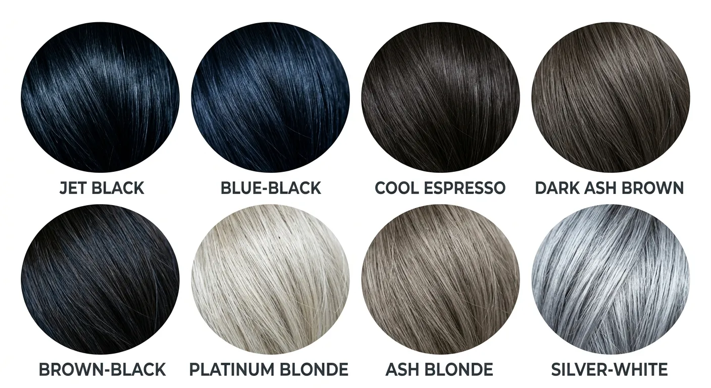
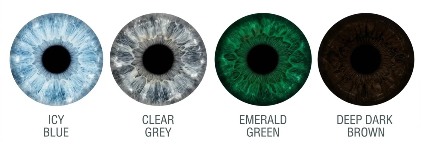
Not sure if you are a Winter?
Our free AI tool analyzes your photo and identifies your most likely season, undertone, contrast and chroma in minutes. No quiz, no guesswork.
Try the Free AI Tool →The Winter Palette
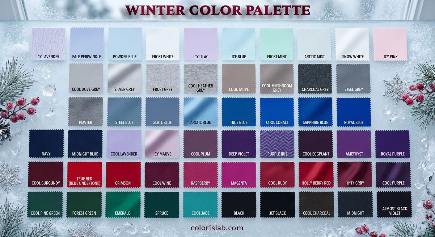
Winter colors are cool, clear and bold. They draw from the same visual world as Winter coloring: the colors of gemstones, icicles, a clear night sky and the stark contrast of fresh snow against dark evergreens. Nothing is warm, dusty or earth-toned. Everything has that characteristic coolness and clarity that makes Winter palettes immediately recognizable as dramatic and powerful.

Winter Palette
Pure white, jet black, sapphire blue, emerald green, ruby red, amethyst purple, royal purple, fuchsia, hot pink, true red, crimson, electric blue, icy blue, cool true green, charcoal, cool navy
Warm earth tones like mustard, rust, olive and camel, muted dusty shades, warm pastels like peach and coral, golden yellows and anything with a warm or grey-brown quality
Pure white and jet black deserve special mention as Winter neutrals. For most seasons they create problems: too stark for Spring, too harsh for Summer, too cool for Autumn. For Winter they are simply correct. The contrast between true white and jet black mirrors the natural contrast of Winter coloring and sits there completely at home. These are the only season where both truly belong.
Building a Winter Wardrobe
Winter coloring is high in contrast. The most harmonious outfits are ones that lean into that contrast rather than softening it. High-contrast combinations like pure white with jet black, or a jewel-toned top with dark navy, mirror the natural contrast of Winter features in a way that feels completely integrated rather than forced.
Bold, graphic prints are a Winter strength: sharp stripes, geometric patterns and high-contrast polka dots all work because they have the same clarity and visual sharpness as Winter coloring itself. Soft, blurred or organic prints have the wrong energy entirely. Clean lines and polished silhouettes suit Winter best. The goal is clothing that looks sharp and intentional.
- Pure white blouse with jet black trousers
- Sapphire blue dress with charcoal coat
- Fuchsia top with cool navy trousers
- Emerald green with black accessories
- True red with pure white and silver
- Mustard with warm brown
- Dusty rose with soft grey
- Camel with olive green
- Peach with warm beige
- Terracotta with golden accessories
For fabrics, the best choices for Winter are those with a sleek, polished or crisp quality: silk, satin, velvet, crisp cotton, wool crepe, cashmere and anything with a sheen or gloss. The goal is clothing that looks sharp and intentional, which mirrors the quality of the coloring itself.
Jewelry for Winter
Jewelry is one of the fastest ways to confirm whether your coloring is warm or cool. Hold a piece of silver against your face in natural light, then hold a piece of yellow gold. For Winter, the silver looks completely natural and integrated. The gold sits on the skin rather than merging with it, creating a visible disconnection.
Best metals
Silver, platinum and white gold are the strongest choices for Winter. They harmonize with the cool undertone and create a crisp, polished effect that suits the natural intensity of Winter coloring. Clear, brilliant diamonds are also a perfect match.
Metals to avoid
Yellow gold and bronze introduce warmth that conflicts with the cool undertone. Against Winter skin they tend to look disconnected and dull, diminishing the natural radiance of the complexion rather than enhancing it.
For gemstones, the best choices are cool and brilliant: diamonds, sapphires, emeralds, rubies, amethysts and black onyx. The clearer and more brilliant the stone, the better it suits Winter coloring. Warm stones like citrine, amber and tiger's eye have the wrong quality entirely.
Winter Makeup
Winter makeup should enhance the natural clarity and intensity of the coloring rather than softening it. The goal is a polished, often bold result that embraces the drama rather than working against it. Every product choice follows the same principle as the wardrobe: cool, clear and confident in its intensity.
Foundation
Look for foundations with a cool, neutral or slightly pink undertone. Shade descriptors like cool, neutral, porcelain or ivory are reliable indicators. Avoid anything with a golden or yellow base, which will sit on top of cool skin rather than integrating with it and make the complexion look sallow.
Blush
Cool pink, fuchsia, raspberry and true red applied sparingly all work well. The goal is a healthy flush rather than a warm glow. Peach, coral and terracotta conflict with the cool undertone and tend to introduce a warmth that sits against rather than with Winter skin.
Eyeshadow
Cool neutrals form the base: charcoal, silver, grey, cool taupe and icy white. For color, jewel tones like sapphire blue, emerald green and amethyst purple on the lid suit Winter eyes exceptionally well and enhance their natural clarity and intensity. Black eyeliner defines Winter eyes powerfully.
Lips
This is where Winter truly shines. True red with a blue base, fuchsia, raspberry, deep berry, plum and black cherry are all stunning. A matte or satin finish suits the sharp, polished quality of Winter coloring particularly well. Warm browns, coral, peach and muted nudes all work against the undertone and tend to flatten Winter coloring rather than enhancing it.
Common Winter Misconceptions
All Winters have dark hair
Winter coloring includes platinum blondes, ash blondes and silver-whites. The defining quality is the coolness of the hair, not its darkness. A Winter with platinum blonde hair and icy blue eyes is just as much a Winter as someone with jet black hair and porcelain skin. The cool, ashy quality is what matters.
Winters can only wear black and white
Black and white are Winter's strongest neutrals but the palette is far richer than that. All jewel tones, cool reds, fuchsia, icy pastels and cool navy are all strong Winter colors. The palette is one of the most versatile across all seasons when worn correctly.
Winter looks harsh or severe
The wrong colors make Winter look harsh. The right ones produce a striking, vivid and powerful result. Warm, muted shades sit against Winter coloring rather than with it and create a visual tension that reads as harsh. Clear, cool colors harmonize with it and allow the natural intensity to read as elegance and drama rather than severity.
Summer and Winter are the same because both are cool
Both seasons share a cool undertone but differ significantly in depth and chroma. Summer is lighter, softer and more muted. Winter is deeper, clearer and higher in contrast. Dusty rose works for Summer but reads as flat and underpowered on Winter. Jewel tones work for Winter but overwhelm Summer entirely.
See your Winter palette in action
Cycle through cool and clear palettes on your own photo and watch how your skin responds to each one. The same method a professional uses, free for everyone.
Open Virtual Draping Studio →Frequently Asked Questions About Winter
What makes someone a Winter in color analysis? ↓
Can a Winter wear warm colors? ↓
What is the difference between Winter and Summer? ↓
Can a Winter have fair skin? ↓
What are the Winter subtypes in the 12 season system? ↓
Why do muted colors make Winter look washed out? ↓
The Winter Subtypes
In the 12 season system, Winter divides into three subtypes. All three are cool and clear, but they differ in which secondary quality shapes the palette most. If the Winter palette above feels broadly right but something is slightly off in one direction, one of the subtypes is likely a closer fit.
ColorisLab Team
Color Analysis ExpertsWe're a team of color analysis enthusiasts dedicated to helping people discover their best colors and build confidence through personalized color advice.