Catherine, Princess of Wales: Color Analysis Case Study - True Spring
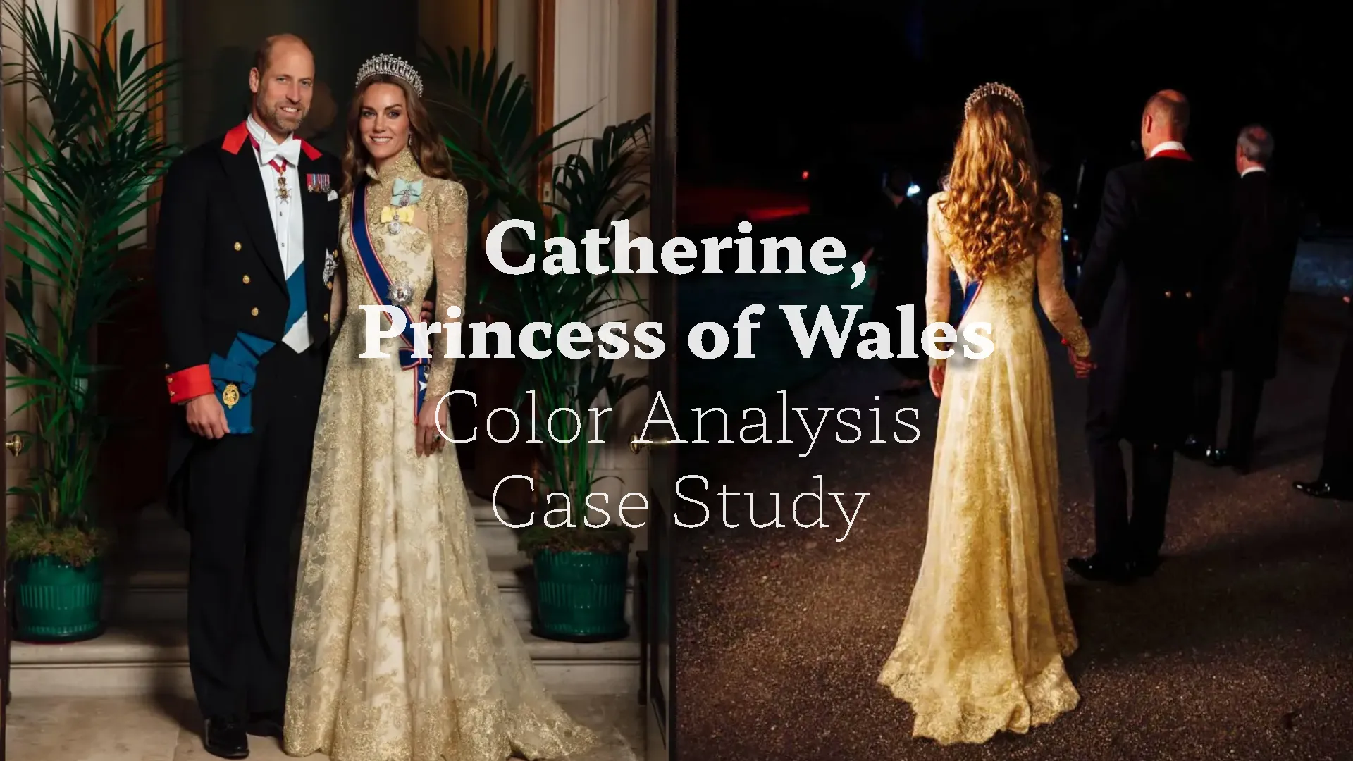
Catherine, Princess of Wales, is one of the most frequently misanalyzed public figures. That is why we will go step by step, analyze her natural features, and present a case study of her outfits for both education and entertainment, in a way that closely reflects how draping works in professional color analysis.
We have noticed that many celebrities are placed into the wrong categories and assigned incorrect seasons. That is exactly why we created this Celebrities and Influencers color analysis category. Not to judge the people we analyze, but to help everyday people understand how to recognize their best colors while still enjoying fashion.
If you do not believe in color analysis, that is completely your personal choice. We are not a fashion police, but an educational platform for people who are interested in this topic and want to understand it better. So take this analysis with a light heart.
Our Method
We always use double testing. The first method is our own system, developed internally, which focuses purely on the person's natural parameters like contrast, value, undertone, and chroma. In specific cases we also consider skin tone as a secondary factor. The second method is virtual draping, done by trained analysts using our own tools, following the same principles used across the industry. We require all parameters to align before making a conclusion. We do not rely only on lighting, personal preference, or a single tool.
Step One: Undertone
To begin, we will analyze undertone. We will compare two images of the Princess of Wales wearing a gold and a silver dress.
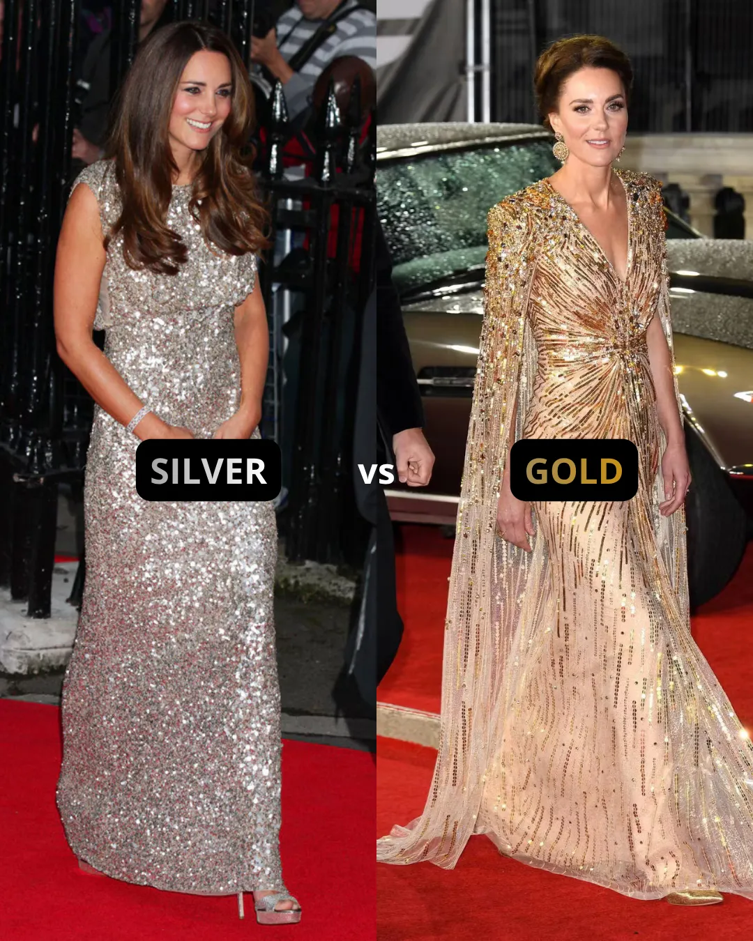
She is often placed into a Cool or True Summer category. However, for someone to be Summer, they need to have a fully cool undertone, not neutral leaning cool, but clearly cool. In addition, they need to be soft, meaning they look best in muted tones rather than bright and vivid Spring colors.
One of the simplest undertone tests is metals. Silver is associated with Summer, while gold is ideal for Spring. Looking at this image, Catherine looks good in both, which is important to note. The goal is not just to avoid looking bad, but to avoid situations where the color wears the person instead of the person wearing the color.
Silver dress
Her face visually recedes. The eye is constantly pulled toward the dress. The color competes with her features rather than enhancing them.
Gold dress
The overall look feels more harmonious. Her face comes forward, her eyes stand out, her skin looks fresher, and there is a slight lifting effect.
This is a strong indication in favor of warmth. However, in draping it is important not to jump to conclusions too quickly. We need to test across multiple colors.
Testing Cool vs Warm
Let's look at another example, a blue dress versus an orange-red one.
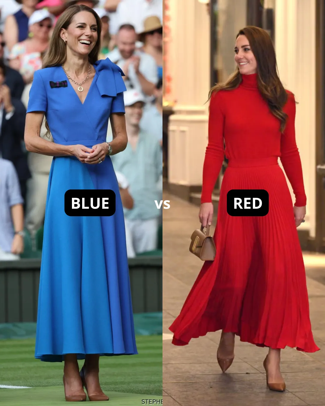
The blue she is wearing is clearly cool and quite intense, something that would align with a Cool Summer palette. But again, the same issue appears. The dress dominates her face. It is too strong relative to her natural coloring.
On the other hand, the red, even though it is deeper, allows her to remain the focal point. It does not compete with her features or pull attention to the jawline, under eyes, or any imperfections. Instead, it enhances what is already there.
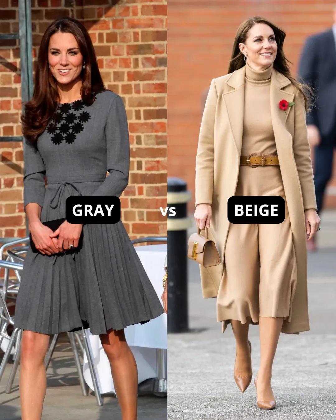
We can see a similar effect here. On the left she is wearing a cooler grey, and on the right a warmer tone. The difference in how her face responds is consistent with what we have already observed.
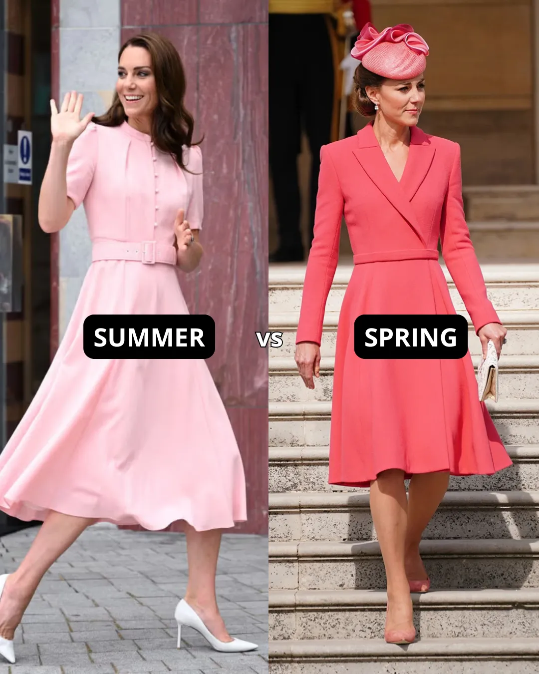
At this point it becomes clear that intense cool tones are not part of her palette. That allows us to eliminate both Winter and Summer. Below is another example with a cool pink versus a warm coral to confirm this.
Depth and Contrast
The next parameter is depth, meaning value and contrast. We need to observe whether she looks harmonious in darker shades or even black. If we see the same pattern, where the color overpowers her, we can safely conclude that she does not belong to the Deep categories and does not benefit from high contrast.
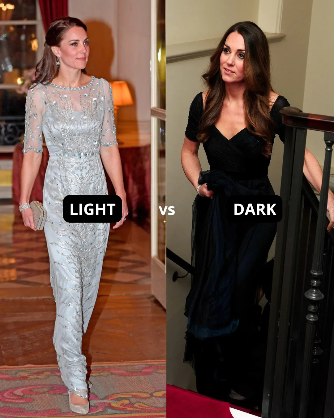
Here we can see that the lighter shade enhances her face and hair, while the darker one feels too heavy for her softer features.
The Conclusion: True Spring
From all the previous examples, the conclusion becomes quite clear. She is not deep, not cool, and not muted. That leaves us with one family — Spring.
Since she is not extremely light with very low contrast, and not high contrast with strong intensity, we can already exclude Light Spring and Bright Spring. In the 12-season system, this leaves us with True or Warm Spring.
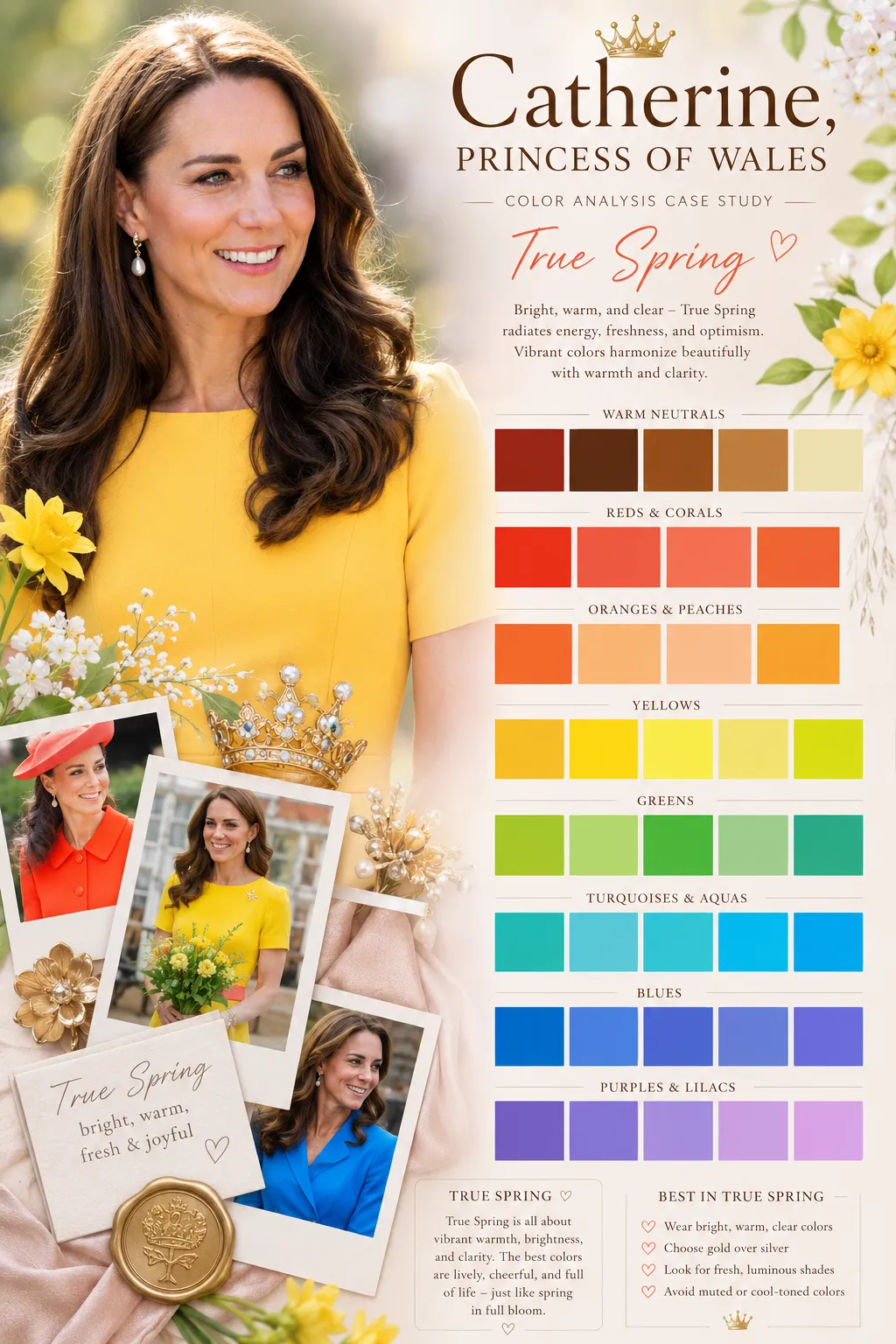
Warm Spring vs True Spring
Warm Spring is closer to Light Spring. It requires a lighter overall appearance, lower to medium contrast, strong warmth, and brightness. True Spring can move into light to medium depth. Since undertone alone does not help us distinguish between them, both share a fully warm undertone, the key difference is value. Catherine's value is light to medium, her contrast is low to medium, her undertone is clearly warm, and she responds well to brightness. That places her in True Spring.
Now you might be wondering why so many people place her in True Summer. The truth is that True Summer and True Spring share similar depth and contrast levels. Undertone is the hardest parameter for most people to judge. From our experience, this often comes down to personal preference. Many people simply prefer cooler tones, and because of that bias, they assume those colors look better on others.
Another common mistake is confusing overtone with undertone. People see a pink surface and assume the person is cool. But overtone is not what determines your season. Skin can appear pink due to flushing, makeup, lighting, and many other factors.
That is why chroma is often the most reliable way to distinguish between Spring and Summer. In this case, it is quite clear that the Princess looks better in bright, clear colors rather than muted ones.
Her best colors
- Clear warm greens
- Fresh corals and peach tones
- Warm blues
- Bright balanced shades
- Gold and rose gold metals
What overpowers her
- Intense cool tones
- Muted, greyed shades
- Very dark or black
- High contrast combinations
- Silver metals
Want to be analyzed the same way?
If you want to know your own season, our professional analysts use the same double-method approach, internal parameter analysis combined with virtual draping, to give you a result you can rely on.
Order Your Professional Analysis →Frequently Asked Questions
What is Kate Middleton's color analysis result? ↓
Is Kate Middleton cool or warm toned? ↓
Is Kate Middleton a Cool Winter? ↓
Is Kate Middleton a Summer season? ↓
What are the best colors for Kate Middleton? ↓
ColorisLab Team
Color Analysis ExpertsWe're a team of color analysis enthusiasts dedicated to helping people discover their best colors and build confidence through personalized color advice.