Contrast in Color Analysis: How to Find Your Level and Dress for It
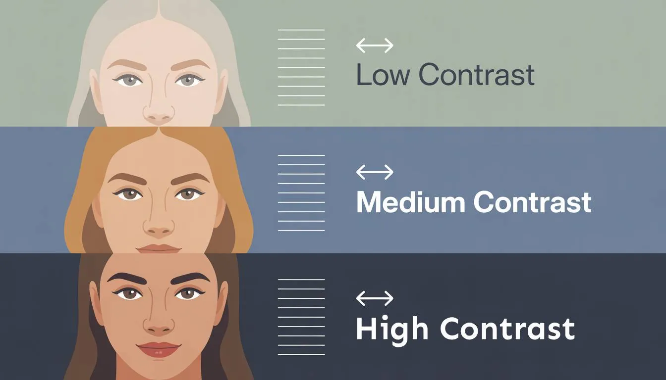
Have you ever wondered what people actually mean when they say someone is deep, light, or has high contrast? Maybe you have even heard someone described as having high visual weight. What does that actually mean, and does it really matter in everyday life? More importantly, how can understanding this improve your appearance, help you work with your natural features, stay authentic to yourself, and look your best with minimal effort?
To begin with, it is important to understand the terms value and contrast. In color analysis, whether you are familiar with it or not, this is one of the most important parameters. These terms are often used interchangeably because they lead to very similar conclusions.
If you have already explored your undertone, you have completed the most important step in color analysis. However, undertone is only one dimension. It tells you whether your colors should lean warm or cool, but it does not tell you how bold, how soft, or how visually impactful those colors should be.
This is where contrast comes in.
Contrast is the relationship between the lightness and darkness of your hair, skin, and eyes. It reflects how much these features differ when viewed together. It is also one of the main reasons why two people with the same undertone can wear completely different color palettes. In some cases, contrast between features is not the only factor. What matters is how much contrast a person can carry around the face. For example, some people of color may not have a strong contrast between their features, but they can still carry deep, heavy shades extremely well. Black, for instance, can be one of the best colors in their palette, which often places them within Winter categories.
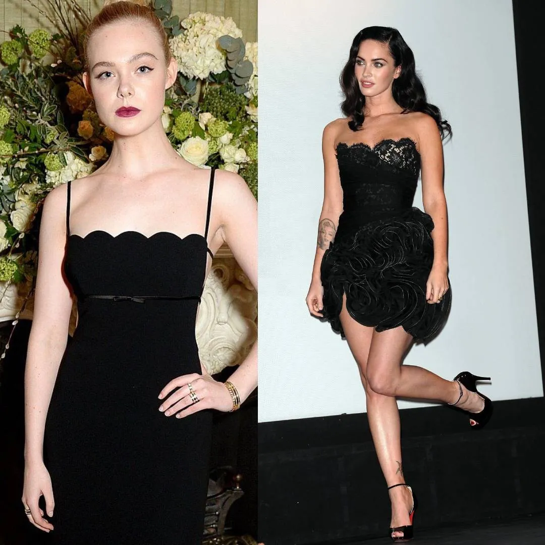
Before moving into practical ways to determine whether your contrast is low or high, it helps to see it clearly. A visual example says more than theory ever can.
On the left is Elle Fanning as a classic example of a Light Spring with low contrast between hair, skin, and eyes. On the right is Megan Fox, one of the most recognizable examples of a Bright Winter palette, with strong, high contrast between her features.
Both are wearing a black dress, but as you can see, Elle appears more washed out and the dress tends to dominate her presence, slightly overshadowing her natural features and softness. On the other hand, Megan remains visually dominant in relation to the black dress and appears fully harmonious, with her features standing strong against the intensity of the color.
What Contrast Actually Means
In color analysis, contrast refers to value, which is the scale from light to dark. When your hair, skin, and eyes are close in value, your contrast is low. When there is a strong difference between them, your contrast is high. Everything in between is considered medium contrast.
This matters because the colors you wear create a new contrast relationship with your face. When that relationship aligns with your natural contrast level, your features appear clear and defined. When it does not, the colors either overpower you or fade into the background.
A common real-life example can be seen in Spring and Summer palettes. Light Spring and Light Summer individuals are often overwhelmed by dark colors, especially black. This is the moment when the clothing becomes more noticeable than the person. You try to focus on the face, but the outfit takes all the attention. When someone says "black is not my neutral," this is often a sign of lower contrast.
Low Contrast
Features blend softly with minimal difference. Common in Light Spring, Warm Spring, and Light Summer.
Medium Contrast
Features are distinct but not dramatically separated. Common in Cool Summer, Soft Summer, Soft Autumn, and Warm Autumn.
High Contrast
Strong difference between features. Typical for Deep Autumn, all Winter subseasons, and Bright Spring.
Low Contrast
Low contrast coloring has a natural softness and harmony. The features blend rather than stand apart. No single element dominates, and the overall impression is cohesive and gentle.
This often appears as fair or light skin paired with similarly light hair, such as blonde or light brown, and eyes in soft tones like grey, blue, or light hazel. It can also appear in deeper coloring when all features are equally dark without a strong difference between them.
The Common Mistake
Reaching for high contrast combinations in an attempt to look more polished. A black and white outfit on a low contrast person does not look elegant. It looks like the outfit is wearing the person.
What works instead is staying within a narrow value range. Tonal dressing, where all pieces are similar in depth, reflects the natural harmony of the features. Medium-depth, slightly muted colors such as dusty rose, muted sage, soft camel, or medium denim blue work particularly well.
Colors that work well
High Contrast
High contrast coloring creates immediate visual impact. There is a clear difference between features, which naturally draws attention and creates a striking appearance.
This is often seen in combinations like very dark hair against light skin, especially when paired with bright or very dark eyes. The difference between features is strong, giving the face a defined and dramatic quality.
The Common Mistake
Softening the palette too much in an attempt to look subtle. Muted or overly blended outfits can make high contrast individuals look washed out, because their natural features require more intensity.
What works is embracing that contrast. Pairing light with dark, choosing rich and saturated colors, and maintaining clear visual separation allows the natural features to stand out. Combinations like crisp white with deep navy, or strong jewel tones like emerald or deep violet, are particularly effective.
Colors that work well
Medium Contrast
Medium contrast is the most common and the most flexible. Features are clearly defined but not extremely different.
This often includes medium brown hair with light to medium skin, or darker hair with medium skin and eyes in shades like hazel, green, or warm brown. The features are balanced, neither too blended nor too sharp.
This flexibility allows for a wider range of styling options. Lower contrast outfits can appear soft and elegant, while slightly higher contrast combinations can look polished and refined. The key is avoiding extremes. Very high contrast can overwhelm, while very low contrast can make the overall look appear flat.
Why This Changes Everything
Understanding your contrast level explains many common wardrobe frustrations. It is the reason a color can technically match your undertone and still not look right. The undertone may be correct, but the contrast is not.
Color analysis works as a system, not a single rule. Undertone, value, and chroma all interact. Contrast exists within the value dimension and determines which specific shades and combinations truly complement you.
When contrast matches
- Your face becomes the focal point
- Colors enhance rather than compete
- The overall look feels effortless
When it doesn't
- High contrast individuals look washed out in muted tones
- Low contrast individuals are overwhelmed by strong combinations
- Something feels off even when undertone is correct
Not sure about your contrast level?
Our free AI tool analyzes your photo and gives you a read on your contrast level, undertone, and most likely season in minutes.
Try the Free AI Tool →Frequently Asked Questions About Contrast
What is contrast in color analysis? ↓
Is value the same as contrast? ↓
How do I know if I am high or low contrast? ↓
Can two people with the same undertone have different contrast levels? ↓
What happens if I wear the wrong contrast level? ↓
Does contrast change over time? ↓
Is contrast the same as chroma? ↓
ColorisLab Team
Color Analysis ExpertsWe're a team of color analysis enthusiasts dedicated to helping people discover their best colors and build confidence through personalized color advice.