Color Analysis: The Complete Guide to Finding Your Season
Have you ever noticed how a color that looks incredible on someone else doesn't always have the same effect on you? Someone glows in bright fuchsia, while you feel your best in a soft, dusty blue. That "universally flattering" red lipstick everyone swears by? Sometimes it just isn't your red.
Or people compliment the clothes you're wearing but overlook you entirely, saying how beautiful the color of your top is, but not you.
And then there are those other days. The days when people pause and say you look fresh, radiant, or simply really good today. They don't even mention the clothes. Somehow, the attention lands on you and not on the outfit. That subtle difference says a lot. It's the difference between wearing the clothes and the clothes wearing you.
So why does this happen? Is it luck? The right light on the right day? Or is there actually something you can understand and control, so that when you want to shine, the attention naturally falls on your face rather than on what you're wearing?
The answer lies in how colors interact with your natural coloring. Your undertone, your contrast level, how soft or saturated your features are. These are exactly the elements that color analysis takes into account.
A Short History of Color Analysis
Color analysis became widely popular in the 1970s and 80s. One of the key figures was Carole Jackson, whose book Color Me Beautiful introduced the idea to a broad audience. The original system used four seasons: Spring, Summer, Autumn, and Winter, each based on undertone (warm or cool) and overall depth (light or dark).
Simple, useful, but not precise enough. People are more complex than four categories. That's why the system evolved into the 12-season model, which is now the professional standard. Each original season is divided into three subtypes, producing results that are far more accurate and personal.
Some systems go even further, into 16 or even 32 seasons, each with increasingly specific subtypes. On this site we work primarily with the 16 season tonal system, which you can explore in more detail as you go deeper into your analysis.
What Is Color Analysis?
Color analysis is the process of identifying which colors work best with your natural features, without makeup, extra styling, or buying a hundred different products.
Your coloring comes from two pigments. Melanin affects your skin, hair, and eyes. Carotene adds yellow and orange tones. Everyone has a unique combination of these, creating a specific color profile.
When you place a color near your face, one of two things happens:
✓ Harmony
The color harmonizes with your undertone and your face stands out. Your skin looks clear, your eyes steal the attention.
✗ Clash
The color clashes with your undertone. The fabric becomes more noticeable than you. Skin can look dull, reddish, or grey.
This isn't about personal taste. It's about how light reflects onto your skin. The right color acts like a natural facelift. The wrong one pulls focus to the chin and highlights imperfections, making you look more tired than you are.
How Color Analysis Works
A professional analysis follows a specific logic to narrow down your palette. It moves through four steps.
You compare warm and cool versions of similar colors, like a warm coral versus a cool pink. One makes your skin look clearer; the other highlights shadows or unevenness. Undertone is the single most important factor and the foundation every season is built on.
Value (Light vs Dark)
You test how light or deep your coloring is. If dark colors overpower you, you're likely a Light season. If light colors wash you out, you need more depth.
This is about intensity. Some people look better in soft, muted tones like dusty sage. Others need strong, vibrant colors like cobalt blue to look balanced.
Confirming the Season
At this point, a full palette is tested. When it's correct, your skin looks even, your eyes stand out, and everything feels natural.
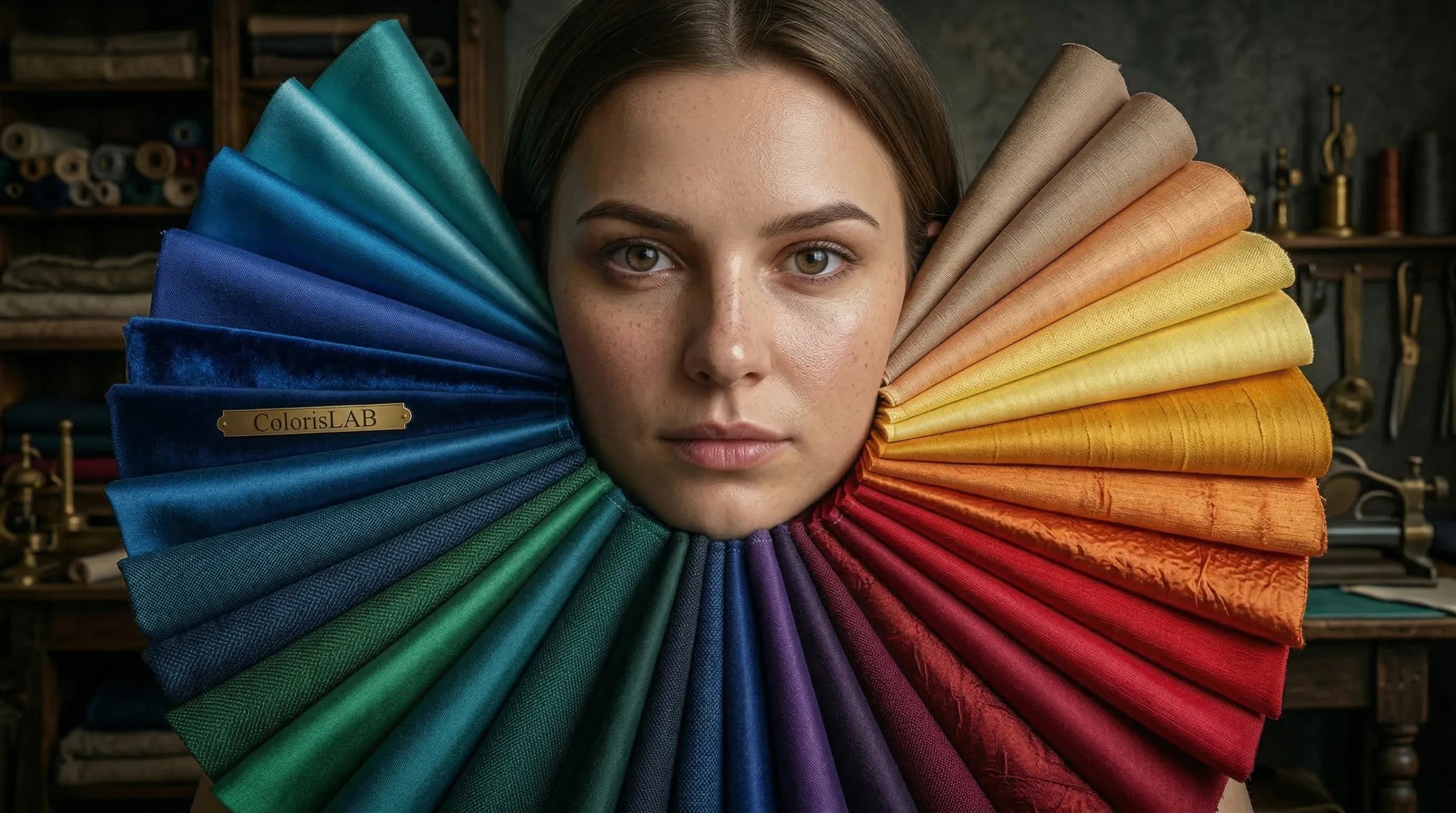
Traditionally, this is done through draping: placing different colored fabrics around the face so the analyst can see exactly how each color interacts with your skin, eyes, and hair. Hair is sometimes covered with a white cloth, particularly if it's grey or dyed, since color analysis works with your natural adult coloring. Many people say "I was a natural blonde as a child," but very few people remain natural blondes past their twenties, and adult hair is what matters here.
After a professional session, you leave with physical color swatches from your palette, written guidance on how to use them, and a clear understanding of not just your season but why. It's something you can take shopping, share with a stylist, or come back to years later.
Want a definitive result?
A trained analyst works through your coloring in detail, accounts for everything an untrained eye, and any tool, can easily overlook, and gives you a result you can rely on for years.
Learn about Professional Analysis →Virtual Draping: The Modern Approach
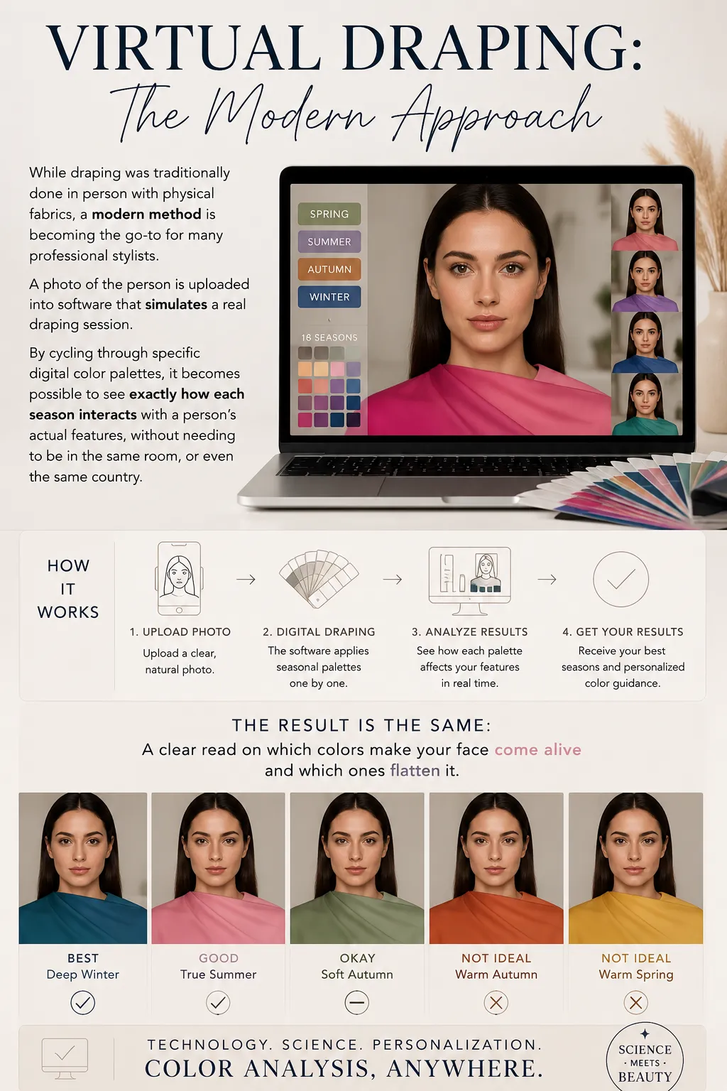
While draping was traditionally done in person with physical fabrics, a modern method is becoming the go-to for many professional stylists. A photo of the person is uploaded into software that simulates a real draping session. By cycling through specific digital color palettes, it becomes possible to see exactly how each season interacts with a person's actual features, without needing to be in the same room, or even the same country.
The result is the same: a clear read on which colors make your face come alive and which ones flatten it.
Try it yourself
Cycle through full color palettes on your own photo, the same way a professional would in a live session. Free for everyone.
Open Virtual Draping Studio →It's About You, Not the Rules
Color analysis doesn't put you in a box or make you look like everyone else. It works entirely with who you already are, your specific eyes, skin, and hair. Instead of you serving fashion trends, it makes the colors serve you.
And it works regardless of your personal style. If you lean toward a capsule wardrobe and repeat outfits often, it's not just about finding the right neutrals — though that matters too. Every season has its own ideal neutrals, the ones that don't clash with anything else in your wardrobe. But knowing your palette also means finding your statement colors, the ones that are bold enough to stand out and still work cohesively with everything else you own. If you're on the other end of the spectrum and love experimenting with clothes, makeup, and accessories, there's plenty of room for that here too. You can absolutely wear colors outside your season. But you need to know the rules before you can break them well.
There's also an interesting flip side to all of this. When you wear your colors, the attention naturally lands on your face. The clothes support you rather than compete with you. You've probably noticed the opposite effect on fashion websites, where models almost disappear behind the garments. That's intentional. In product photography, the model is meant to fade into the background so the clothing reads clearly. In real life, most of us want the opposite. We want to be the thing people notice, not the outfit.
Think of it as a filter. It doesn't limit your style; it gives you a clear direction so you can stop guessing and start wearing colors that feel like home.
When it works
- Your skin looks clearer
- Your eyes stand out
- Everything feels put together
When it doesn't
- You look tired or washed out
- Your skin tone looks uneven
- The color draws attention instead of supporting you
Where to Start
If you're curious about your own season, there are a few ways to find out.
Free AI Tool
Analyzes your photo and gives you your most likely season from the main four, along with a read on your undertone, contrast level, and chroma. It takes a few minutes and gives you a real starting point, not a quiz based on whether you prefer gold or silver jewelry.
Try the AI Tool →Virtual Draping Studio
Cycle through full color palettes on your own photo, the same way a professional would in a live session. Free and built for both beginners and people who already know their season but want to explore their palette more precisely.
Open Draping Studio →Professional Analysis
The most thorough option. A trained analyst works through your coloring in detail, accounts for everything an untrained eye, and any tool, can easily overlook, and gives you a result you can rely on for years.
Learn about Professional Analysis →There's no wrong place to start. The AI tool is a good first step, and the professional session is there when you're ready to go all the way.
Frequently Asked Questions
What is color analysis? ↓
What are the color analysis seasons? ↓
How do I find my color season? ↓
What is undertone and why does it matter? ↓
What is draping in color analysis? ↓
What do you get from a professional color analysis? ↓
Is color analysis accurate? ↓
Can color analysis change over time? ↓
ColorisLab Team
Color Analysis ExpertsWe're a team of color analysis enthusiasts dedicated to helping people discover their best colors and build confidence through personalized color advice.