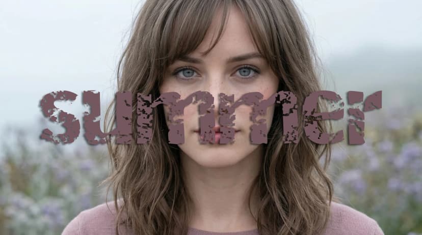
The Four Color Analysis Seasons: Spring, Summer, Autumn and Winter Explained

Most people encounter color analysis through the seasons framework. It is the oldest and most widely recognized version of the system, and it remains the foundation that every more detailed model builds on. Before there were 12 seasons or 16 seasons, there were four: Spring, Summer, Autumn and Winter. And while the expanded systems offer more precision, the four seasons are still where the logic begins.
This guide explains what each season actually is, what distinguishes one from another, and why the system works the way it does. If you have already read the guides on undertone, skin tone, contrast, and chroma, this is where those pieces come together. If you are starting here, this is still a complete place to begin.
How the Four Seasons Work
The four seasons are built on two dimensions that you have likely encountered already if you have spent any time with color analysis: hue and value.
Hue refers to the warm or cool direction of your coloring. Warm coloring has yellow, golden, or peachy undertones. Cool coloring has pink, blue, or rosy undertones. This is the single most important dimension in color analysis, and it is the first thing that any professional analysis establishes.
Value refers to how light or deep your overall coloring is. Some people have fair skin, light hair and soft eyes that sit toward the lighter end of the scale. Others have deep skin, dark hair and rich eyes that sit toward the deeper end. Most people fall somewhere in the middle.
When you combine these two dimensions, you get the four seasons. Each season has its own palette of colors that harmonize with that specific combination of hue and value. Wearing colors from your season creates a relationship between your face and your clothing where your features stand forward and your skin looks clear. Wearing colors from a conflicting season creates the opposite: the clothing becomes the focal point and your complexion can read as grey, ruddy, or flat.
The third dimension, chroma, which is the intensity and clarity of color, sits within each season and helps define the subtypes in expanded systems. But at the four season level, the primary difference between seasons is hue and value.
Spring
Spring is warm and light. It is the combination that reads as golden, fresh and clear, with a natural radiance that comes from having a warm undertone without heavy depth weighing it down.
Spring coloring typically presents as fair to medium skin with a warm, peachy or golden quality to it. The skin often has a natural flush to it, and some Spring types have visible freckles that are golden or warm brown rather than ashy. Hair tends to fall in the golden range: strawberry blonde, golden blonde, warm copper, light warm brown. The eyes are often the most striking feature in Spring coloring, with a particular brightness and clarity. Clear blue, bright turquoise, warm green, golden hazel, and light topaz brown are all common. There is often a sparkle or luminosity to them that reads clearly even in photographs.
Spring Palette
Warm sunny yellows, coral, peach, clear warm reds, bright golden oranges, fresh grass greens, turquoise, camel, warm ivory
Stark black, cool icy tones, dusty muted shades, deep heavy colors that overwhelm the natural lightness
One of the most common misreadings for Spring is the pink or reddish overtone that many Spring types have on the surface. A flushed complexion reads as cool, which sends many Spring types toward Summer or Winter palettes. As covered in the undertone guide, this is an overtone, not an undertone. Warm colors calm the redness. Cool colors intensify it.
Spring is also frequently confused with Autumn, which is the other warm season. The distinction is value and chroma. Autumn is deeper and more muted. Spring is lighter and clearer. A warm yellow that works for Spring would be bright and sunny. The equivalent for Autumn would be more golden and toned down, like mustard or ochre. Both are warm. The depth and saturation differ.
In the 12-season system, Spring divides into Light Spring, Warm Spring, and Clear Spring.
Summer
Summer is cool and light. It is the combination that reads as soft, refined and gentle, with a coolness that runs through every feature without the depth or drama of Winter.
Summer coloring typically presents as fair to medium skin with a cool, pink or rosy quality. The skin is often delicate and can have a slightly translucent quality in fairer types. It burns before tanning and has a softness to it that does not carry heavy, saturated color well. Freckles, when present, are ashy rather than golden. Hair is cool-toned and usually on the ashy side: platinum blonde, ash blonde, mousy or cool-toned brown. There is no golden or red quality to it. Eyes are soft and blended rather than vivid or piercing, sitting in cool ranges like soft blue, grey-blue, dove grey, soft green and cool hazel.
Summer Palette
Dusty rose, soft lavender, powder blue, mauve, greyed greens, muted plum, all ranges of grey, soft burgundy, off-white
Warm vibrant oranges, bright golden yellows, earthy rust, electric shades, stark black which can look too harsh
Summer is frequently confused with Winter because both are cool. The distinction is value and chroma. Winter is darker, clearer and higher in contrast. Summer is lighter, softer and more muted. A cool pink that works for Summer would be dusty and toned down. The equivalent for Winter would be icy and clear, or a bright fuchsia at full saturation. The undertone is the same. The depth and intensity are not.
Summer is also sometimes confused with Soft Autumn types because both have a blended, gentle quality to their features. The distinction is undertone. Summer pulls cool. Autumn pulls warm. Wearing warm colors on a Summer type tends to make the skin look slightly yellow or sallow. Wearing cool colors on a Soft Autumn type tends to make it look grey or flat.
In the 12-season system, Summer divides into Light Summer, Cool Summer, and Soft Summer.
Autumn
Autumn is warm and deep. It is the combination that reads as rich, earthy and golden, with a warmth that goes deeper and richer than Spring and a palette that draws from the colors of turning leaves, spices and earth.
Autumn coloring typically presents as medium to deep skin with a warm, golden, olive or honey quality. The skin tans easily and has a natural richness to it. Freckles are common and are a warm, golden brown. Hair tends to be warm and rich: auburn, copper, chestnut, warm brown, dark warm brown and occasionally a very warm dark shade that reads almost black but has red or golden undertones in sunlight. Eyes are deep and warm: dark brown, amber, golden hazel, olive green and topaz are all common. There is often a depth and intensity to them, sometimes with visible golden flecks.
Autumn Palette
Mustard yellow, olive green, moss, terracotta, rust, pumpkin, warm brown, chocolate, cinnamon, camel, warm cream, deep warm reds
Cool icy pastels, stark black and white, bright neon shades that conflict with the earthy warm depth
Autumn is the season that most benefits from understanding chroma, because Autumn itself contains a wide range. Soft Autumn sits at the muted, blended end and needs colors that are toned down even within the warm family. True Autumn and Deep Autumn can carry more richness and depth. All of them are warm, but the degree to which they lean saturated versus muted varies considerably, which is exactly why the expanded 12 and 16 season systems exist.
In the 12-season system, Autumn divides into Soft Autumn, Warm Autumn, and Deep Autumn.
Winter
Winter is cool and deep. It is the combination that reads as stark, clear and high contrast, with a coolness that runs deep and a natural drama that does not need much help from clothing to be present.
Winter coloring typically presents as skin with cool undertones across a wide range of depths. Fair Winters have a porcelain, almost translucent quality. Medium Winters often have a cool olive or neutral beige tone. Deep Winters have rich, clear depth. What all of them share is the cool undertone and, usually, a notable contrast between features, particularly between hair and skin. Hair is typically dark and cool: jet black, dark ash brown, cool espresso. Eyes are clear and often striking: icy blue, clear grey, piercing green and very deep dark brown that reads as almost black. The whites of the eyes in Winter coloring tend to be particularly clear, which adds to the overall impression of contrast and intensity.
Winter Palette
True white, jet black, jewel tones including sapphire blue, emerald green, ruby red and amethyst purple, icy pastels, fuchsia, cool true red, cool berry
Warm earthy tones like mustard, rust and olive, soft muted pastels that sit flatly against the natural intensity of Winter features
Winter is the season where contrast matters most. The depth and clarity of Winter coloring calls for colors that can hold their own, which is why the palette skews toward extremes rather than middle ranges. A medium-depth, muted color that would look elegant on a Summer type will often look flat and underpowered on a Winter type.
In the 12-season system, Winter divides into Deep Winter, Cool Winter, and Clear Winter.
What the Four Seasons Cannot Tell You
The four season system is a starting point, not a complete answer. It tells you the broad direction of your coloring: warm or cool, light or deep. It gives you a general palette to work with. But it does not account for the full range of variation within each season.
Two people can both be Summer and wear noticeably different palettes. One might be a Light Summer, closer to Spring in some ways, needing the softest, lightest version of cool tones. Another might be a Cool Summer, sitting squarely in cool and muted territory. Another might be a Soft Summer, with a neutral lean that brings it closer to Soft Autumn in feel if not in direction. All three are Summer. All three need cool and relatively soft tones. But the specifics differ enough that dressing them from the same exact palette would not produce the same results.
This is why the 12 season system exists, and why the 16 season tonal system adds further precision. The four seasons give you the foundation. The expanded systems give you the detail. If you are new to color analysis, the four seasons are the right place to start. They will immediately tell you whether you are warm or cool and give you a working palette to test. Once that feels clear, going deeper into your subseason will sharpen the results significantly.
How to Find Your Season
There are several ways to approach this depending on how much certainty you need and how much time you want to invest.
Free AI Tool
Analyzes your photo and gives you your most likely season from the four main categories, along with a read on your undertone, contrast and chroma. It takes a few minutes and gives you a real starting point based on your actual features rather than a quiz about jewelry preferences.
Try the Free AI Tool →Virtual Draping Studio
Cycle through full color palettes on your own photo, the same way a professional analyst would in a live session. You can see how warm versus cool and muted versus bright palettes interact with your specific skin in real time.
Open Virtual Draping Studio →Professional Analysis
A trained analyst works through your coloring in detail, accounts for everything an untrained eye and any automated tool can miss, and gives you a result and a physical palette you can use for years.
Learn about Professional Analysis →There is no wrong place to start. The AI tool is a fast and genuinely useful entry point. The professional session is there when you want the complete picture.
Frequently Asked Questions About the Four Seasons
What are the four color analysis seasons? ↓
How do I know which season I am? ↓
What is the difference between Spring and Autumn? ↓
What is the difference between Summer and Winter? ↓
What is the difference between the four season and twelve season systems? ↓
Can your season change over time? ↓
Is the four season system accurate enough to use? ↓
What if I feel like I am between two seasons? ↓
ColorisLab Team
Color Analysis ExpertsWe're a team of color analysis enthusiasts dedicated to helping people discover their best colors and build confidence through personalized color advice.