Soft Summer vs Soft Autumn: Why These Two Seasons Are Easier to Tell Apart Than You Think
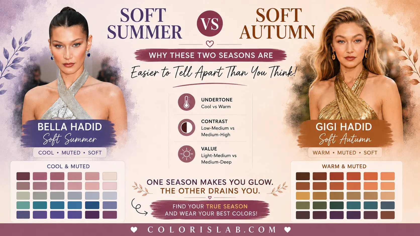
There is a widespread belief in color analysis communities that Soft Summer and Soft Autumn are the most confusing pair of seasons to distinguish. At first glance, that makes sense. Both are soft. Both sit in a muted, low-chroma territory. Both produce a gentle, blended quality in the person's coloring that feels more understated than sharp. And both can borrow very slightly from neighboring palettes without completely losing harmony.
But when you look at the actual parameters behind each season, the picture changes quickly. These two seasons are not nearly as close as they appear. They share exactly one characteristic. Everything else points in opposite directions. And if the analysis is done correctly, with the right tools and a proper draping protocol, the two are essentially impossible to confuse.
This article breaks down why.
The One Thing They Have in Common
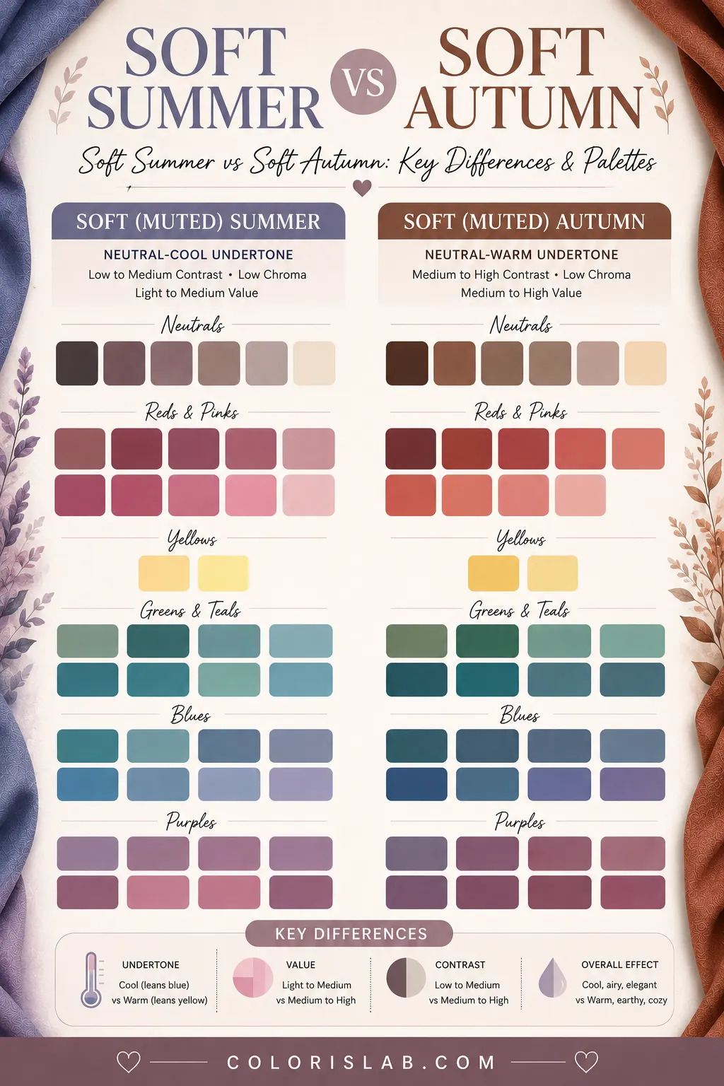
Soft Summer and Soft Autumn share a low chroma level. That means neither season does well with highly saturated, intense, or vivid colors. Both look best in toned-down, somewhat muted shades that do not overpower the face.
This is the only thing that genuinely overlaps between them.
A saturated hot pink overwhelms Soft Summer. An electric cobalt blue overwhelms Soft Autumn. In that narrow sense, both seasons benefit from restraint when it comes to color intensity. That shared softness is also the reason people assume the two are harder to separate than they actually are.
Where They Diverge: Undertone
The most fundamental difference is undertone.
The easiest way to understand the distinction:
Soft Summer
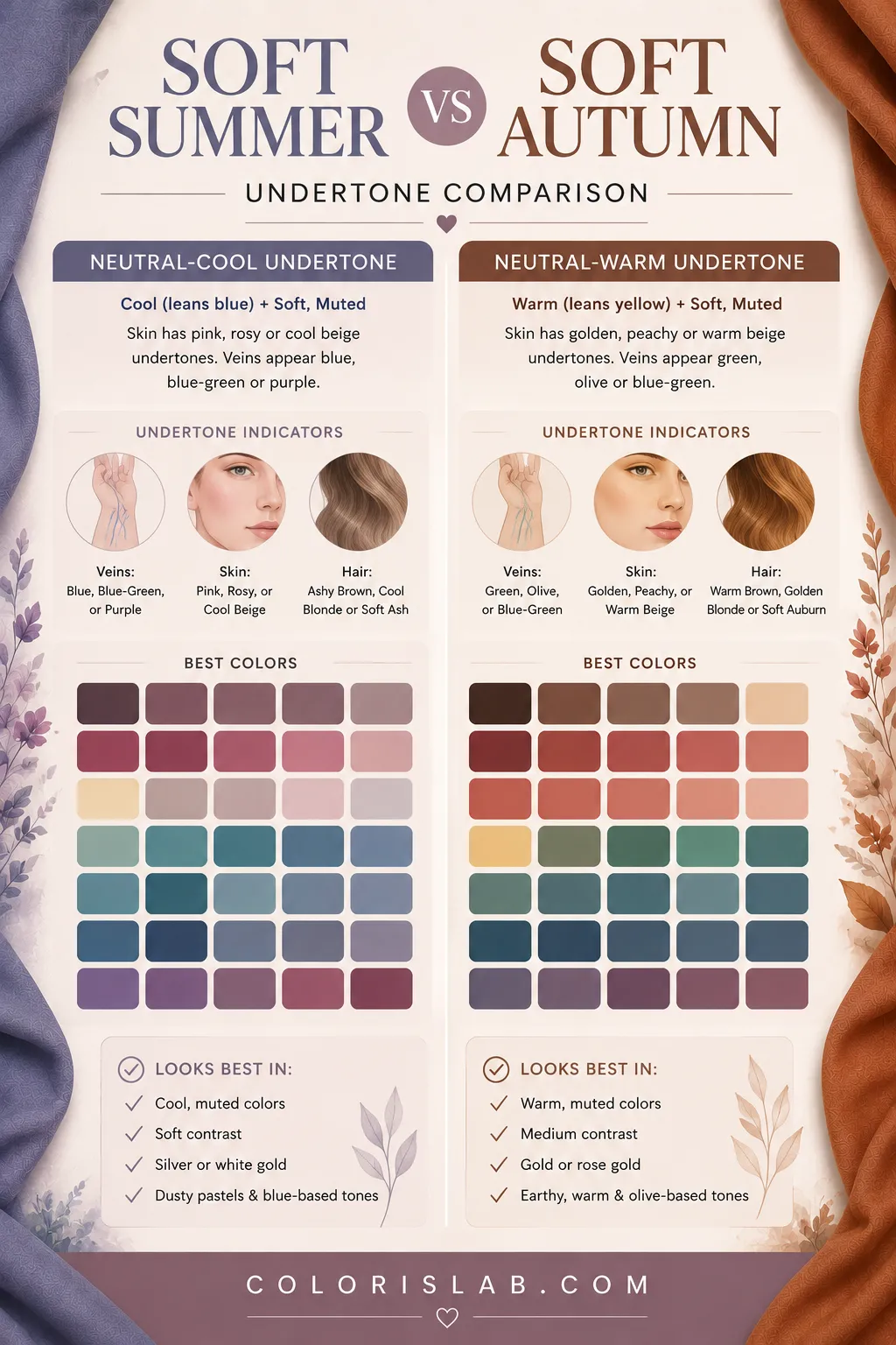
Has a neutral-cool undertone. Colors that flatter are greyish blues, soft rose, lavender, dusty mauve, and cool taupe.
Soft Autumn
Has a neutral-warm undertone. Colors that flatter are muted terracotta, warm camel, olive, dusty gold, and earthy rust.
Put simply: what flatters one actively diminishes the other.
A warm caramel shade that makes a Soft Autumn look radiant will make a Soft Summer look sallow and off. A cool greyish pink that makes a Soft Summer look clear and fresh will make a Soft Autumn look flat and slightly washed out.
This is the core of the distinction.
Where They Diverge: Value and Depth
Beyond undertone, the two seasons also differ in value — which is how light or deep the person's overall coloring is, and how deep the colors they can carry tend to be.
Soft Summer sits in a low to medium value range. The colors that work best for Soft Summer are not the darkest shades within the cool spectrum. Very deep or heavy tones tend to overpower the natural softness and lightness of the coloring. Soft Summer tends to look best in medium-depth ranges, lighter dusty tones, and nothing that creates a stark visual weight against the face.
Soft Autumn sits in a medium to high value range. The person naturally carries more depth, and that depth is supported by deeper, richer tones. A Soft Autumn can wear earthy chocolate brown, deep olive, or warm burgundy without those colors overwhelming the face. In fact, going too light often does the opposite of what you might expect: it can make Soft Autumn coloring look washed out rather than fresh.
This difference in value tolerance is significant in practice. It means the two palettes occupy very different depth ranges even within their shared softness.
Where They Diverge: Contrast
The contrast dimension follows the same logic as value but describes the relationship between individual features rather than overall depth.
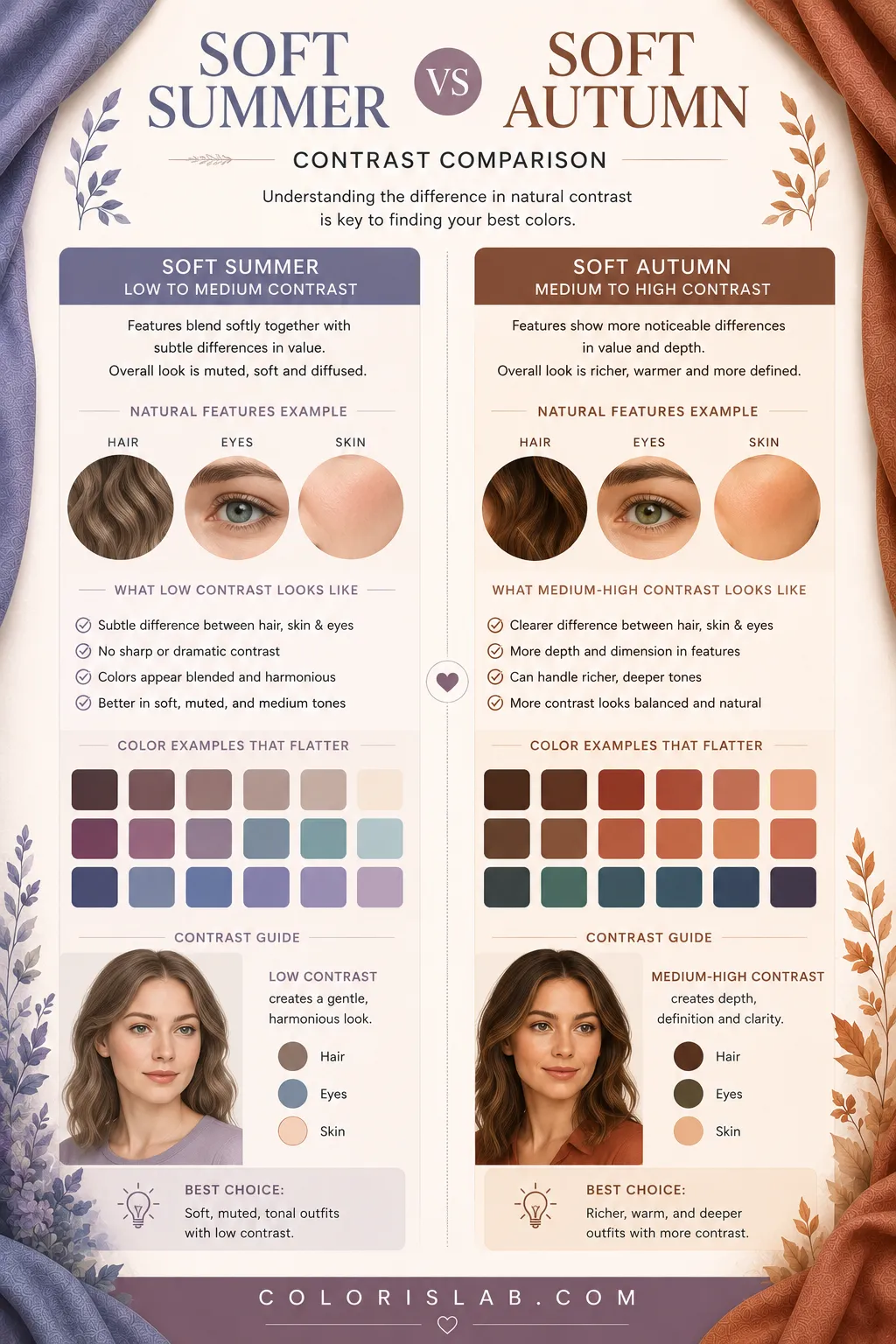
Soft Summer has low to medium contrast. The features — hair, skin, and eyes — tend to blend softly with each other. There is not a dramatic jump between them. This means outfits with strong contrast, a sharp dark jacket over a white shirt, for example, often feel too heavy. They create more visual tension than the natural coloring can comfortably support.
Soft Autumn has medium to high contrast. The features are more distinctly separated. There is more visual difference between the hair, skin, and eyes. Soft Autumn can carry more contrast in an outfit without it feeling overwhelming, because the natural coloring already has more definition built into it.
This is another area where the draping process makes the distinction clear very quickly.
How Draping Confirms the Difference
At Colorislab, every classification uses a double method. The first is a parameter measurement system that evaluates value, contrast, undertone, and chroma from the person's natural coloring. The second is virtual draping, where trained analysts observe how the skin responds to specific colors placed around the face.
The wrong set of colors creates visual noise, pulls attention to imperfections, or makes the skin read as dull or uneven. This is why both methods together make misclassification between these two seasons essentially impossible. The parameters already point in different directions. The draping confirms it physically.
Test the difference on your own photo
Drape Soft Summer and Soft Autumn palettes side by side and see exactly how your skin responds to each one.
Open Virtual Draping Studio →Celebrity Examples: The Hadid Sisters
Perhaps no two people illustrate this distinction more naturally than Bella Hadid and Gigi Hadid.
Bella Hadid is a Soft Summer. She has a neutral-cool undertone, lower overall contrast between her features, and a delicate, slightly cooler quality to her coloring. Her best looks tend to involve cool-toned muted shades, dusty pinks, soft blues, cool nudes, and greyed tones. When she wears warm or very saturated colors, the result is often slightly disconnected, the color competes with her face rather than supporting it.
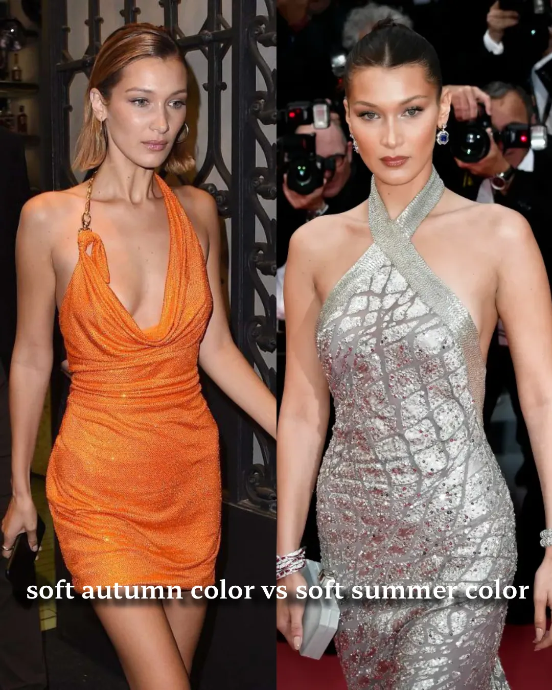
Gigi Hadid is a Soft Autumn. She has a neutral-warm undertone, more depth and contrast than her sister, and a warmer quality to her overall coloring. Her best looks involve warm muted tones: camel, warm beige, terracotta, dusty gold, and earthy naturals. When she wears cool or highly saturated colors, her skin can look flat or slightly off.
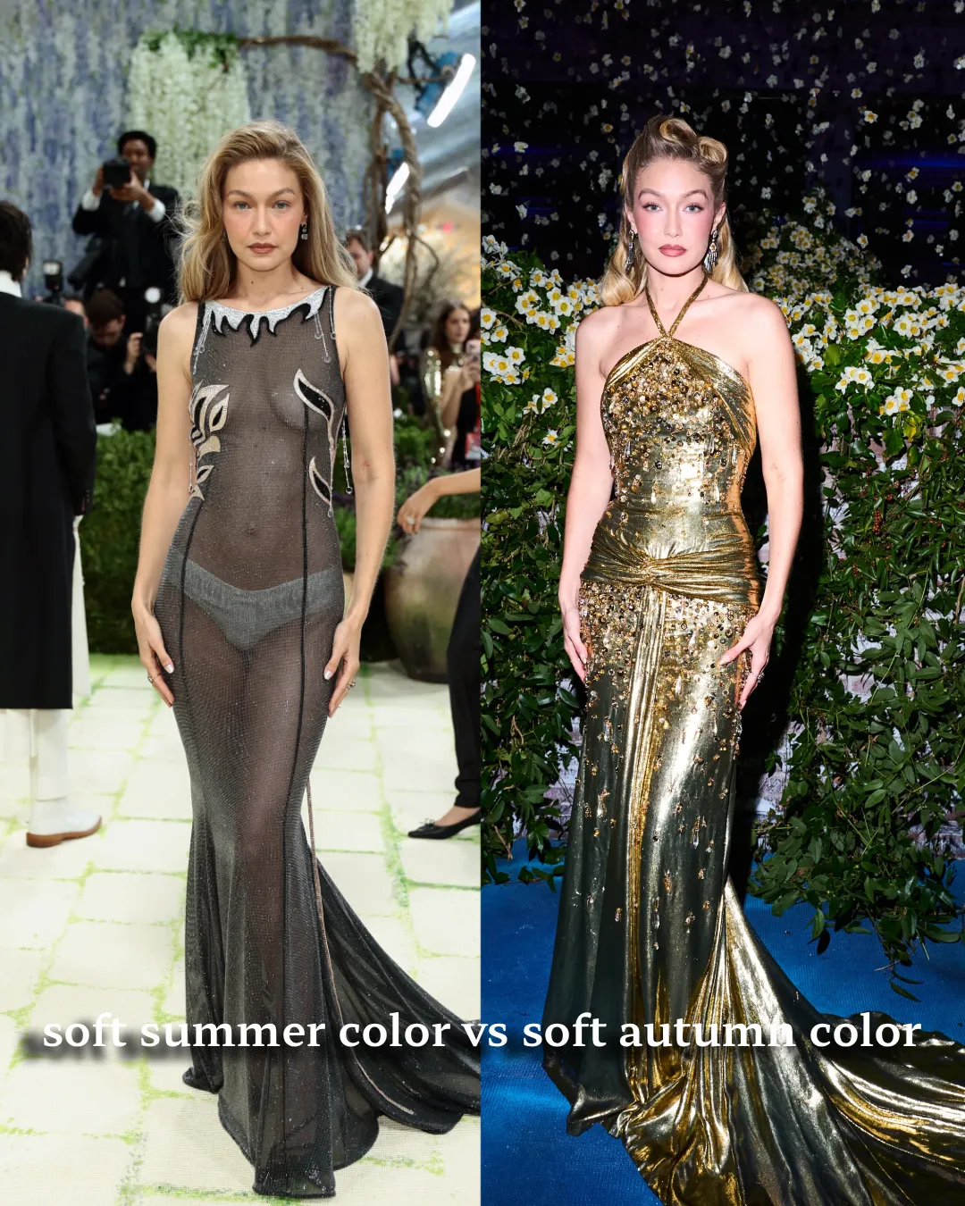
The two sisters are close in many ways, but side by side in the context of color analysis, their differences become clear. Same family, same background, completely different seasons. This is also one of the most useful real-world examples of why color analysis is not about ethnicity, culture, or general appearance. It is about how the specific parameters of your coloring interact with color.
Why Misclassification Between These Two Is So Rare
Given all of the above, Soft Summer and Soft Autumn are actually among the easier pairs to distinguish correctly when the full analysis is done.
The only reason the confusion exists is that most people are introduced to these seasons through simplified descriptions that focus only on the shared softness. When you read that both seasons are muted and blended, they sound alike. But muted cool and muted warm are not the same thing. They are fundamentally different directions.
The extremes each season can tolerate also point away from each other. A Soft Summer will struggle with anything that pushes into true warmth: deep earthy oranges, warm rusts, golden yellows. A Soft Autumn will struggle with anything that pushes into true coolness: icy blues, cool lavenders, bright fuchsia.
When draping is used as the confirmation method, the difference becomes physically visible. You do not need to theorize about undertone when you can watch the skin respond.
Still unsure which season you are?
Our AI tool analyzes your photo for undertone, contrast and chroma and gives you a starting point before going deeper into your season.
Try the Free AI Tool →Frequently Asked Questions
What is the main difference between Soft Summer and Soft Autumn? ↓
Can Soft Summer and Soft Autumn wear the same colors? ↓
How do you tell Soft Summer and Soft Autumn apart at home? ↓
Is Soft Autumn darker than Soft Summer? ↓
Can someone be both Soft Summer and Soft Autumn? ↓
Are Bella Hadid and Gigi Hadid really different color seasons? ↓
Why does Soft Summer get confused with Soft Autumn? ↓
ColorisLab Team
Color Analysis ExpertsWe're a team of color analysis enthusiasts dedicated to helping people discover their best colors and build confidence through personalized color advice.